Brief:
Unshackled is a client project that focuses on assisting individuals affected by sexual violence begin recovery in a safe and personal setting. Our client approached us as a university group in need of branding and a fully developed app prototype. I decided to take on this project because the client brief was jam-packed with information that she had already given considerable thought to. This client was very knowledgeable about her brand and was very clear about which aspects of design she wanted to include.
UX/UI Design, Branding & Identity
1.1 To start my design process I need to understand the problem my client has come to me with. The problem the client has: there are no apps that allows sexual violence survivors to completely feel at peace when documenting their recovery process. To understand what previous apps have failed to do, I needed to understand my target audience and what they want/need from such a specific app.
After doing some initial research into my user demographic I understood why my client was including inclusivity into her app. Targeting one gender would exclude far too many people. Although 1 in 4 women are raped, 1 in 20 men are victims too (Rape Crisis, 2022). It was vital for our app to be completely anonymous. Not only for safety and protection purposes but there is a high-percentage of people who were embarrassed to report a rape crime — giving our users the freedom to talk to others without linking it back to them gives a safe space for everyone.
Additionally, 1 in 3 people experience rape in the safety of their own homes (Rape Crisis, 2022). From this important discovery, it was vital to have an app that was locked by a passcode. Furthermore, as two-thirds of couples share passwords (Lenhart and Duggan, 2014), a passcode that was different to the one they use to unlock their mobile device would be beneficial.
And while 1 in 2 rapes against women are carried out by their partner or ex-partner (Cambridge Rape Crisis Centre, 2022) I thought of adding a feature where the app could be blank if a safety passcode was entered like “999” when being forced to share what the app is.
In terms of defining user goals, my client had already completed a thorough breakdown of all the features her users wanted. I had to take on my client’s desired app features and sort them into priority with the small timescale we had. This is why I heavily focused on how to help our users in ux terms. Our client wanted personal account, sos feature, chatrooms, mood tracker, calendar, journal, pop up affirmations, survivor support, helplines, app settings and goals.
1.2
Regarding system research, I investigated the features that my client desired to ensure that our app's users have the greatest experience possible. According to my research, six-digit passcodes are safer than the typical four, and enabling users to include special characters allows them to choose a more secure passcode (Mearian, 2018).
I also wanted to consider the thumb zone (Ingram, 2016), which serves as a guide to place your most critical components in the green accessibility region, where the user can reach them without experiencing discomfort.
As a personal objective, I wanted to develop the habit of utilising margins and padding while designing, so I designed my own margin template that I could use as a guide to ensure that all my fields and buttons were appropriately spaced (Zhulidin, 2020).
Empathise
Unshackled User Personas
2.1 I created user personas to better comprehend the user experience requirements of my application's consumers. Personas are used to produce products with a specific user in mind, as opposed to a general user (Faller, 2019) Empathy is a vital value that helps all who use it. Personas assist designers to comprehend and empathise with end-users by providing a comparable viewpoint. I found these user personas to be really beneficial when designing sitemaps and wireframes.
Unshackled Sitemap
2.2 As you can see above, I’ve created a sitemap. A sitemap allows me to see what features I need to include in my app, ensuring that no screens, such as onboarding or splash screens, are missing. I reviewed my clients brief, highlighted all of the features she mentioned, and added them to my sitemap. I’ve also included some features I think she’d like to include in her app design, such as a passcode screen for added security.
Create
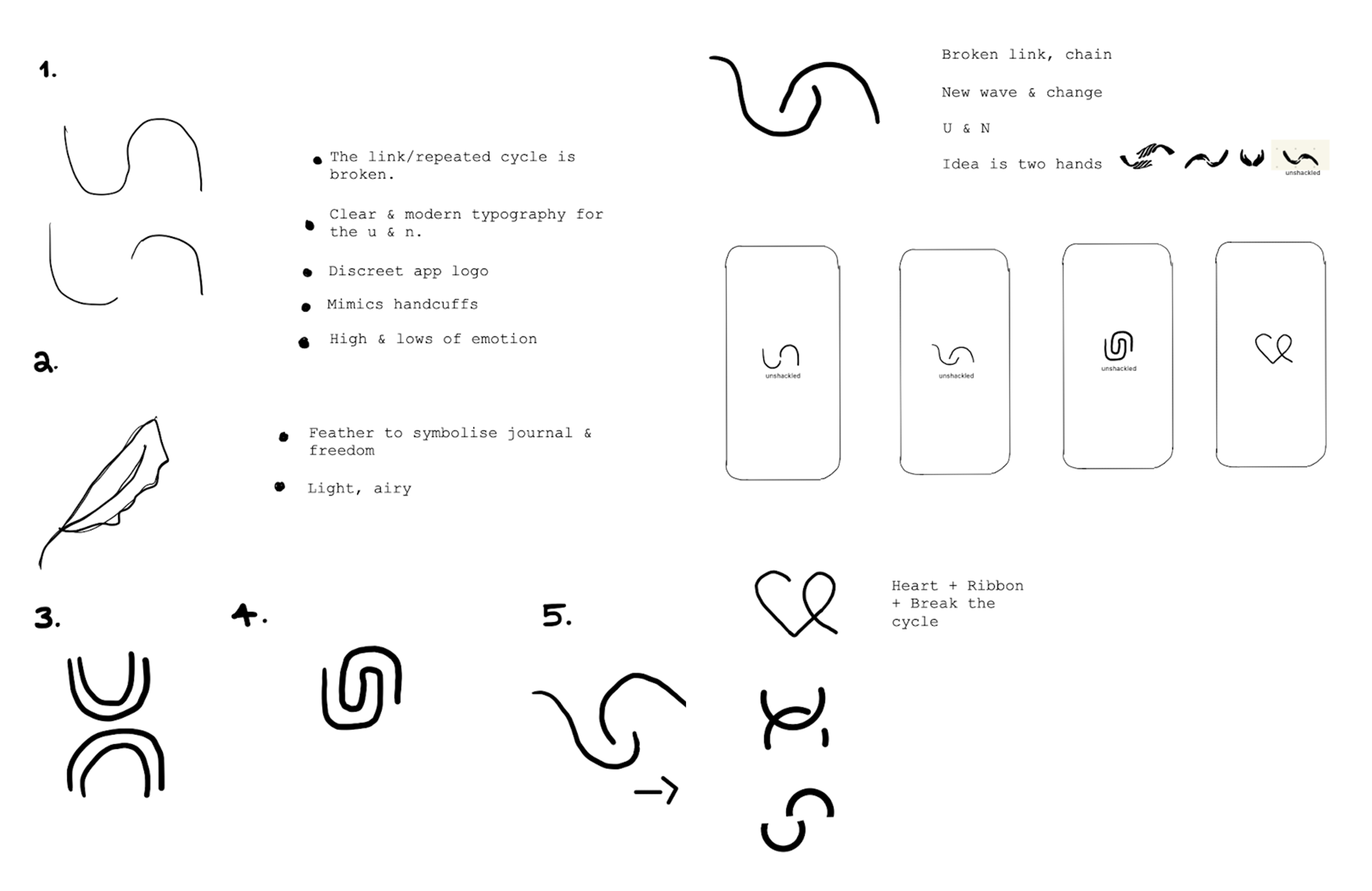
3.1 I started to sketch some initials logo that popped into my head. I wanted to keep the logos as discreet as possible; avoiding obvious conclusions it's a sexual violence app for the safety of our users. Using my research, being discreet was an important feature to stick by. I initially came up with some flowing logos, to symbolise a new wave and the end of cycle. I played with a few different concepts. I also went down the route of a feather to symbolise freedom and the journal feature of this app. A heart that links into a ribbon for sexual assault violence was also in my top three.
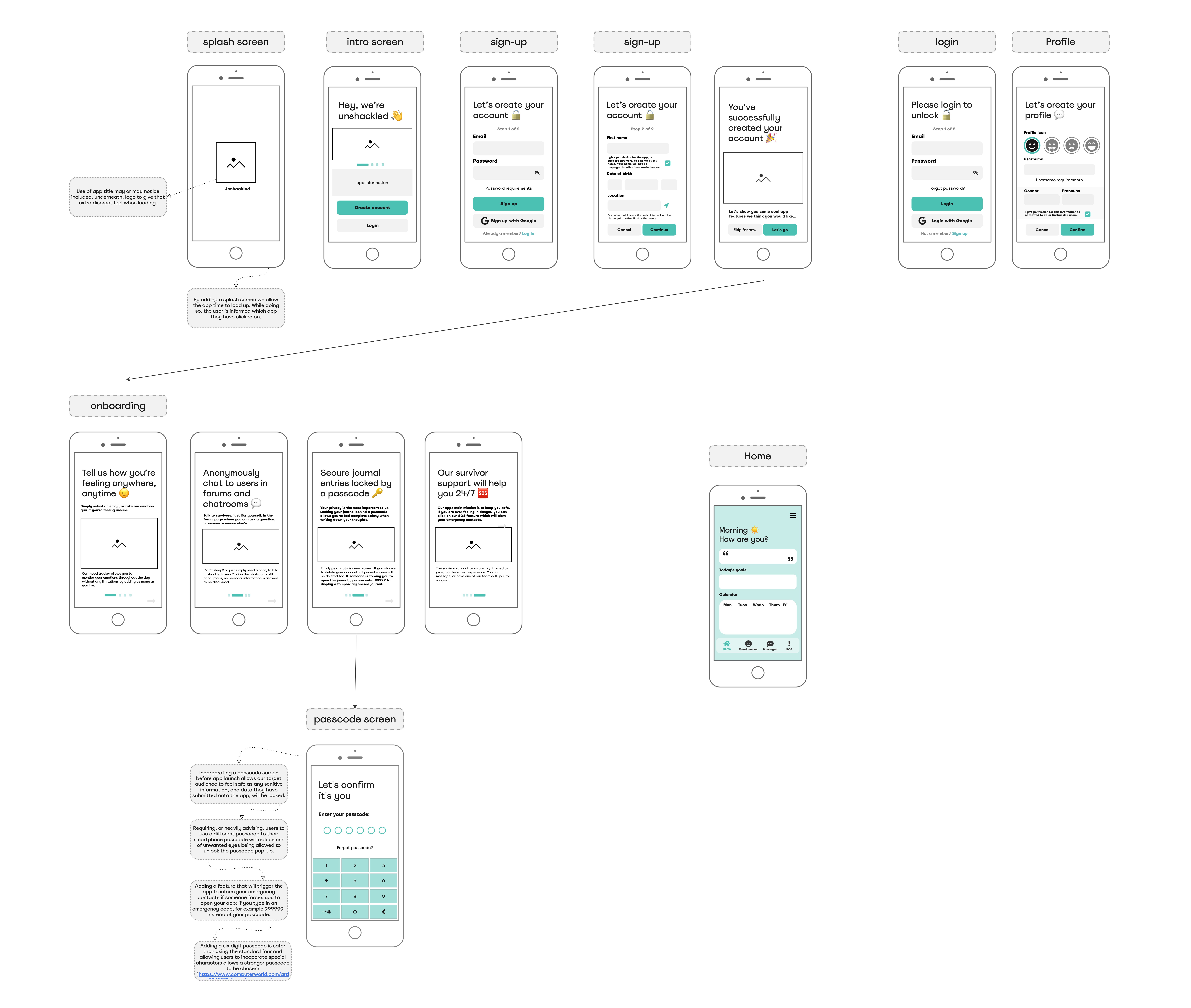
Unshackled Low-fi Wireframes
3.2 With the sitemap created during my empathise stage I decided to create some low-fi wireframes. If I have some basic wireframes already drawn out, it makes it a lot easier to prototype later on; low-fidelity allows me to easily change up the wireframes when needed and produce in a shorter timeframe. As you can see, everything is in monochromatic colours (black, white, or grey) so that I can concentrate on the user experience rather than the user interface at this time. However, I only used one colour (turquoise) because my client requested using it as a strong branding colour, something that can be used for the call-to-action buttons shown above.
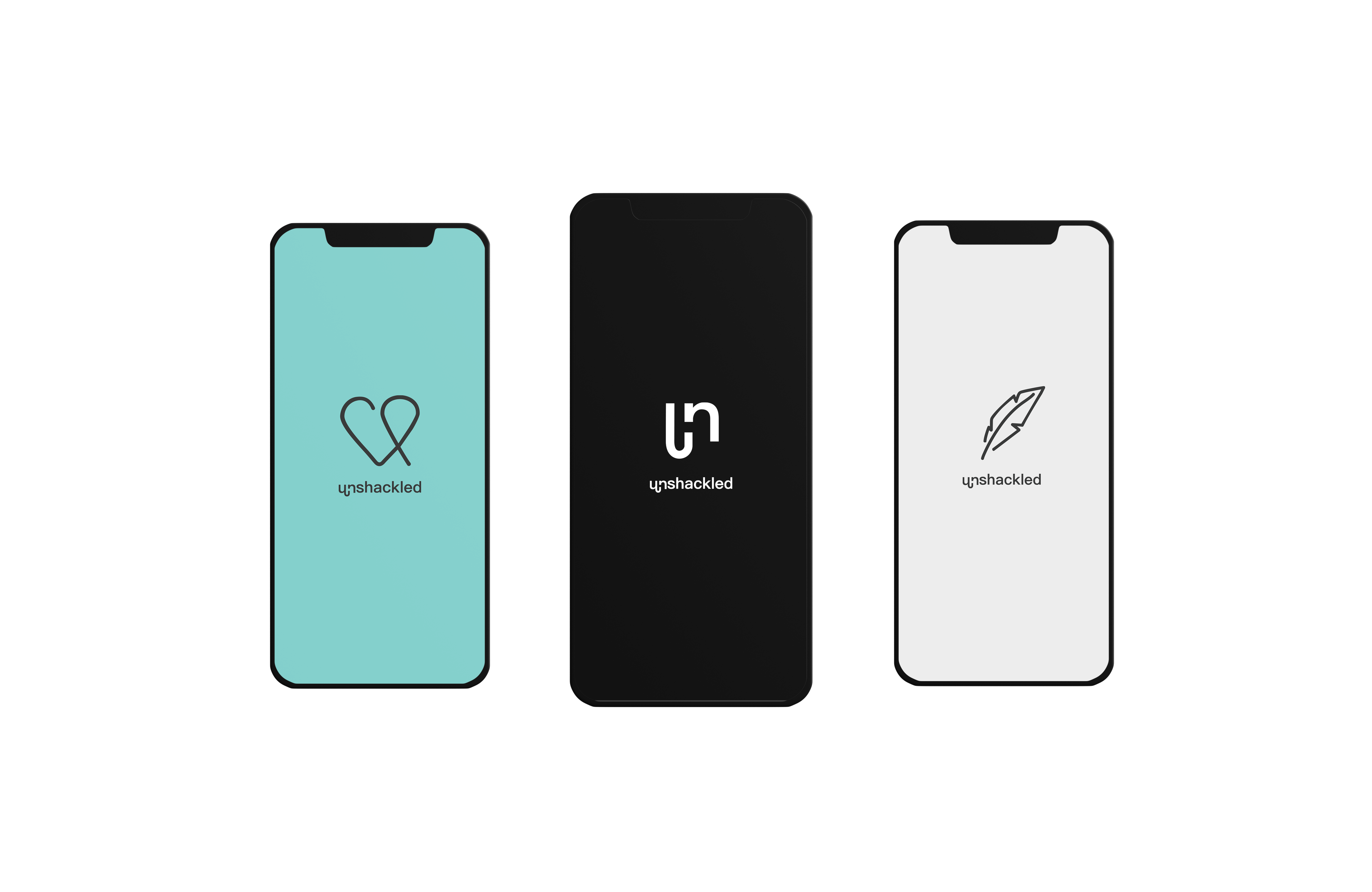
Unshackled logo mockups
Unshackled logo mockups
Client Feedback
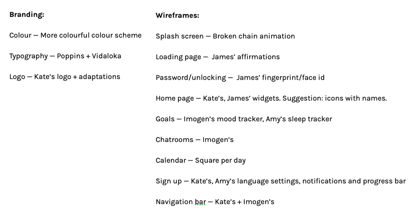
As a group we gave our client our individual low-fi wireframes and logo sketches in an initial presentation. This worked well as the client had many options to choose from. She gave us some in-depth feedback with what features stood out from each designer. I decided to take note of each comment she made and create a to-do list for the entire team.
In relation to feedback on my personal designs, she really liked my 'un' logo (in the mockups above, in the middle) but suggested I make some alterations as she was persistant on giving a "chain" animation to the splash screen. My colour scheme was also favoured but suggested the hues be lighter, the app needed to be fun for the user to enjoy their time. We had a lot more feedback, take a look at the criteria list I created below:
Client Criteria
Client Criteria
Prototype
As a group we decided to work on one shared Figma document which was very beneficial to the whole team. We collaborated in real time with one another, very much like a designer team in the industry. I was unsure on how to deliver our ideas to our developer but with help from my mentor it was advised we break up our screens into states of what the screen would look like when the user makes a click, etc. With labels and arrows justifying and explaining your thought process behind that design element. This really helped to unify the team as it made it easy for everyone to understand what was happening with each design state. Figma was also really useful when helping each other. There were situations where I could give tutorials to the team without needing to talk via teams or over a phone call. I knew how important it was to have a style library, similar to the branding guidelines, for everyone to follow to ensure our designs stayed cohesive. I linked the icon library the app needed to ensure all icons had the same stroke weight and style. All illustrations used were in theme with the app branding.
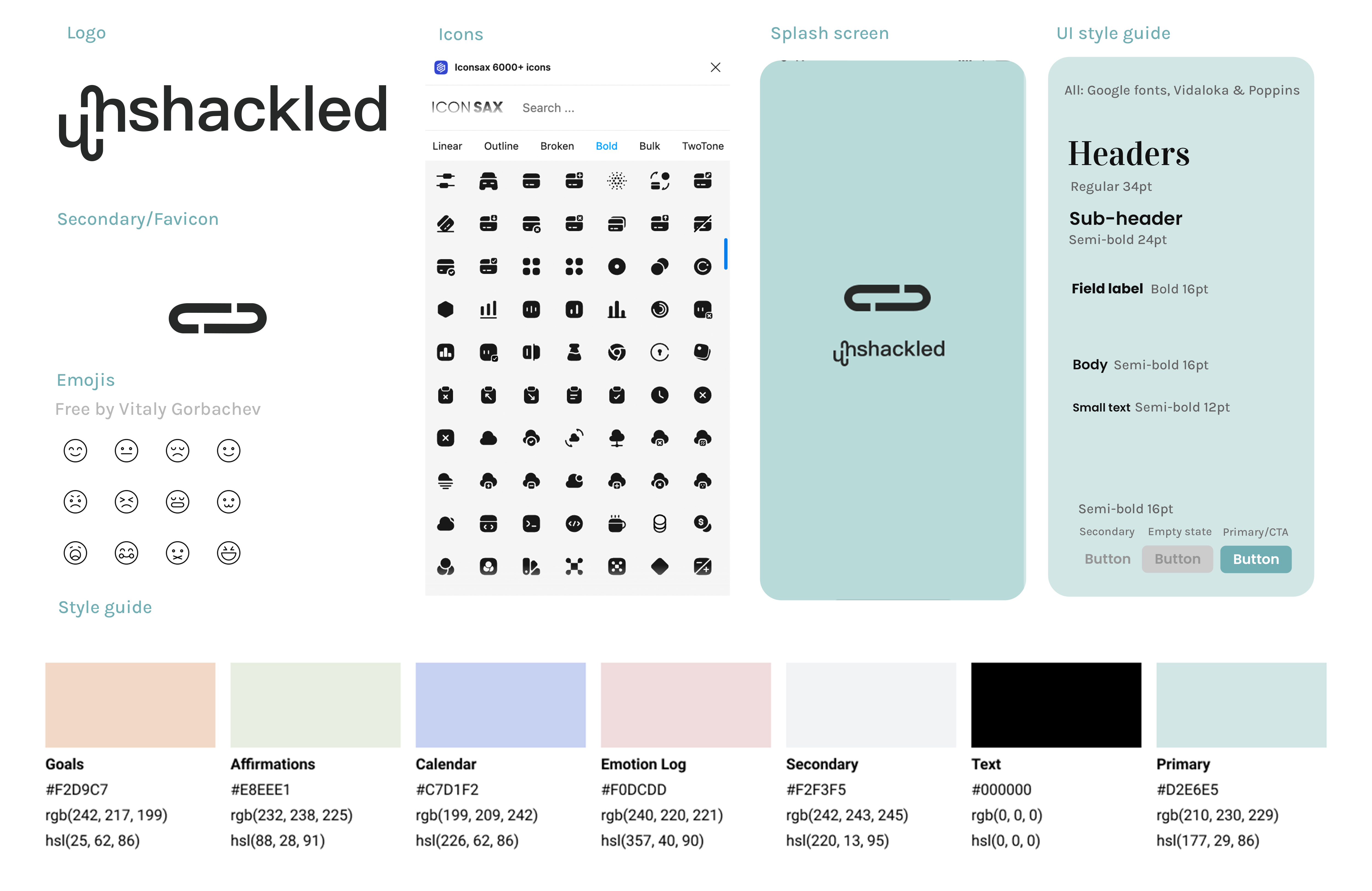
Unshackled Branding
Introductory screens
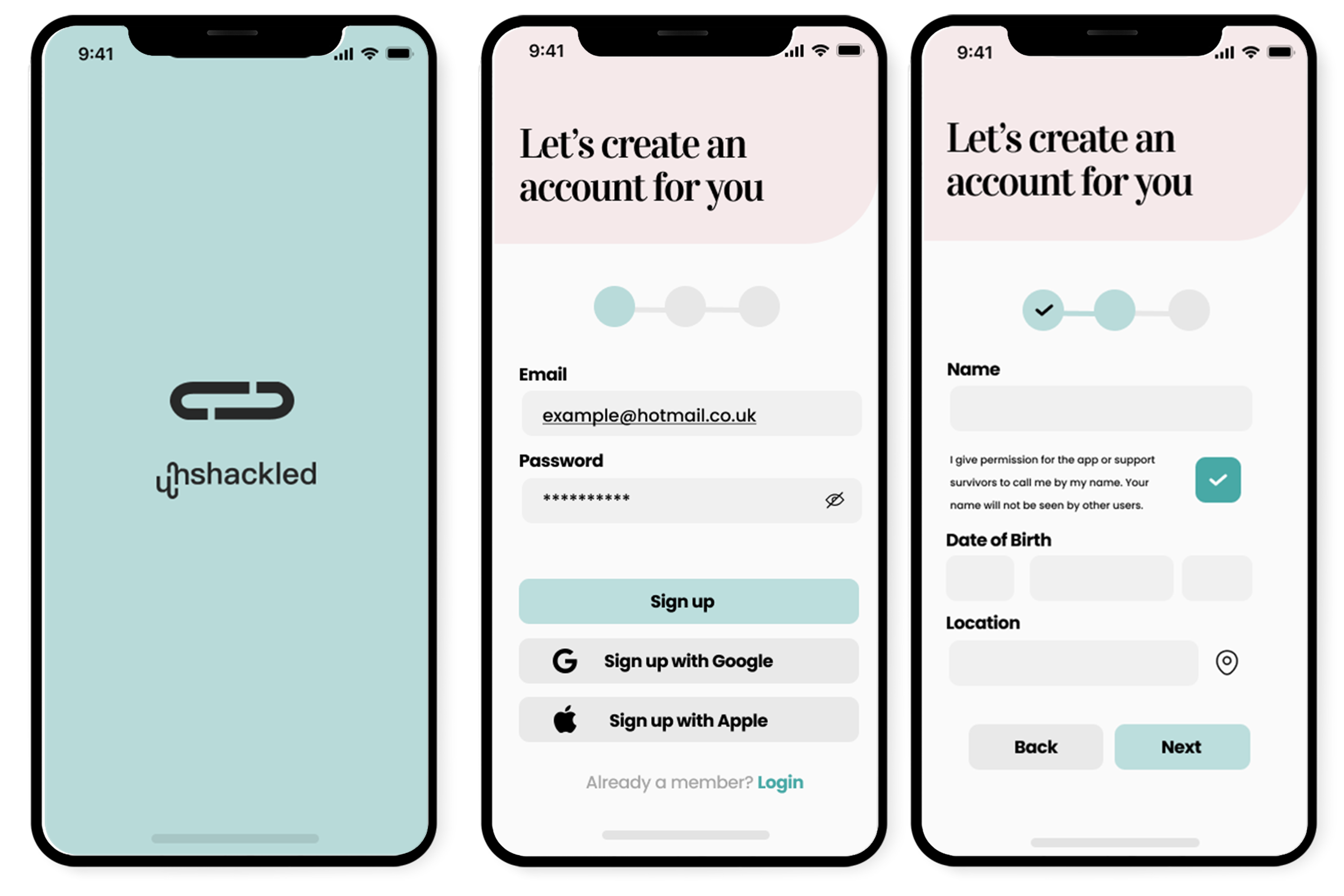
Splash Screen and Create an Account
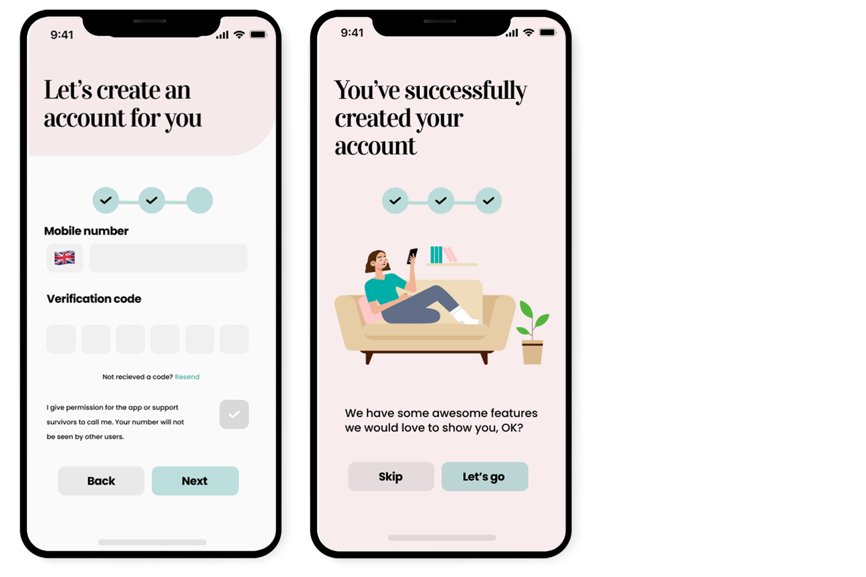
Success screen and Login
For the splash screen I decided to use a plain turquoise.
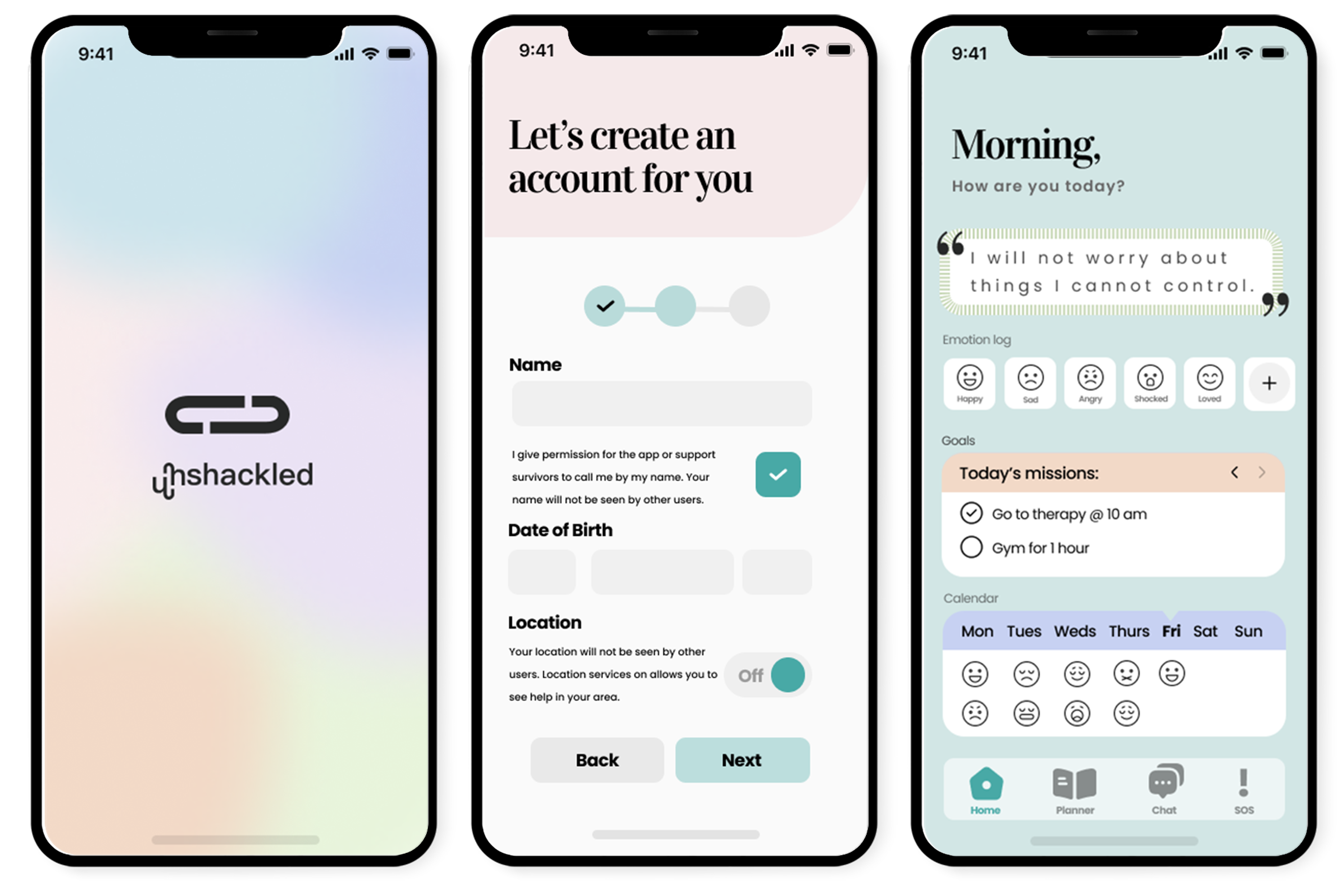
Create an account was an important part of the app because personal data was needed for the user to have complete security. I made sure to disclose why certain information was requested to make the user feel secure. Information like name and mobile number would not be displayed to other Unshackled members. I also thought it was vital to include a check box to say they give permission (with the background of these types of users I felt it was necessary to ask rather than demand). It is important to feature easy accessible options such as Sign up with Google or Apple as many users will not complete user sign up if there’s a lengthy process. I decide to not include Facebook as one of the options for this app as it’s common for apps to post on your social media account.
App features
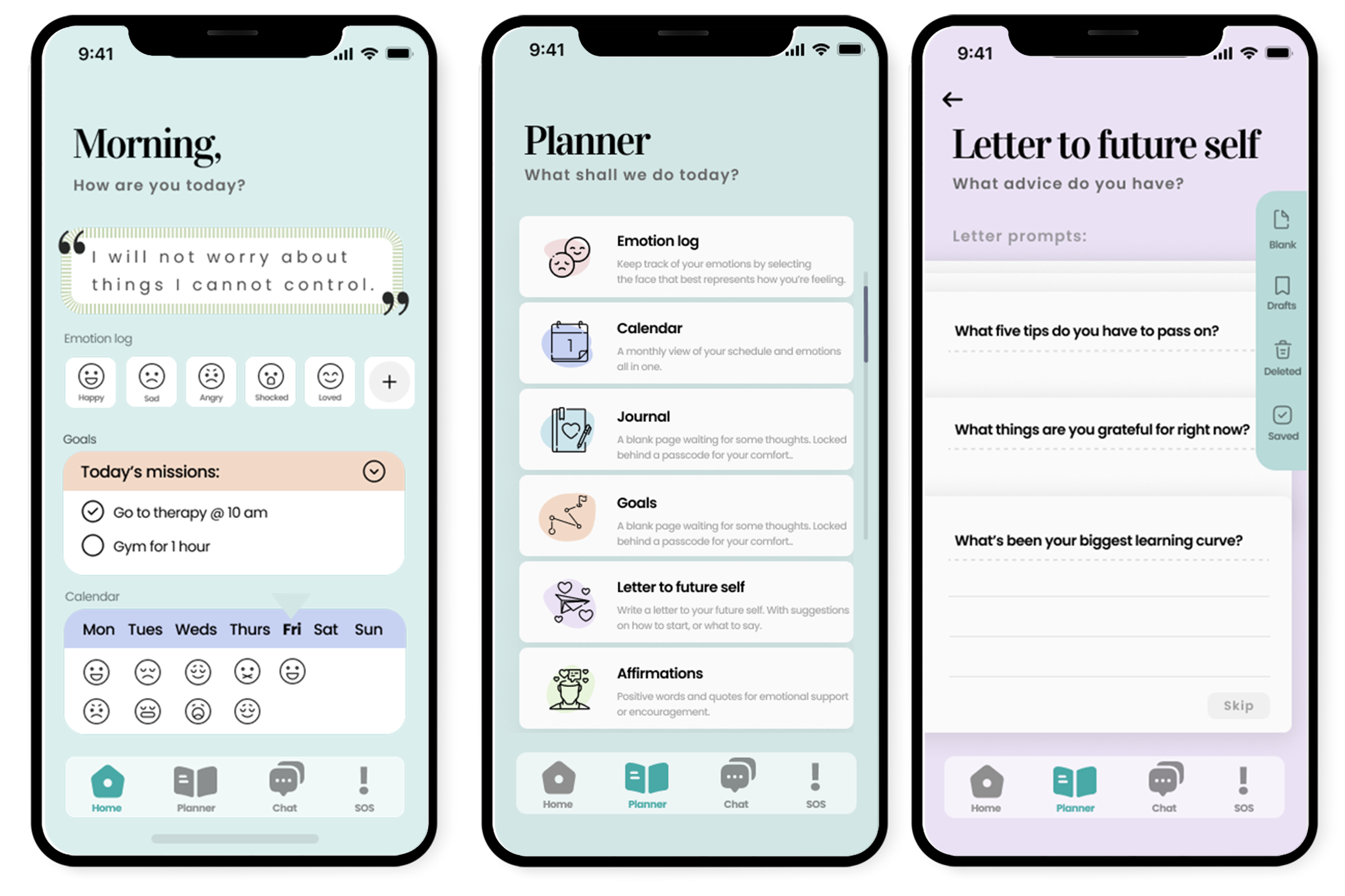
Home, Planner and Letter to future self
Home features a lovely greeting for the header, a sub-header that asks the user “How are you today?” which enables them to open up. Our comforting, personal tone was vital. I didn’t want to include a name on the header as the user may find it distressing to be constantly reminded this information is available to the app.
The home page features the four top features our client wanted on easy access. A nice affirmation to begin, an emotion log, goals and a calendar. The user can get an overview of the entire app from its home page. I originally used emojis from the Apple iOS keyboard for the emotion log but thought there was a benefit to use emojis created by an icon artist instead. I am aware that Jakobs Law states, "Users will transfer expectations they have built around one familiar product to another that appears similar". However, I think it makes sense for the apps branding, following the rule from the aesthetic-usability effect where users often use an app more for it's pretty UI. Each screen of a different app feature has a unique colour which is the background of all of those screens allowing users to quickly identify which app they are in by the background.
When testing our app design as a user I found it frustrating that I never understood where I was in the app, or where to go. Despite making a sitemap early on in the process, it was still jumbled. I came up with this idea to create a “Planner” which is ultimately a library of sources for the user to use. It allows the user to select where they want to go without having to do a specific journey. It features cards with a clear title and description for the user to make a snap decision. I also included visual description in form of an icon and a colour which would mirror the screen background of that feature.
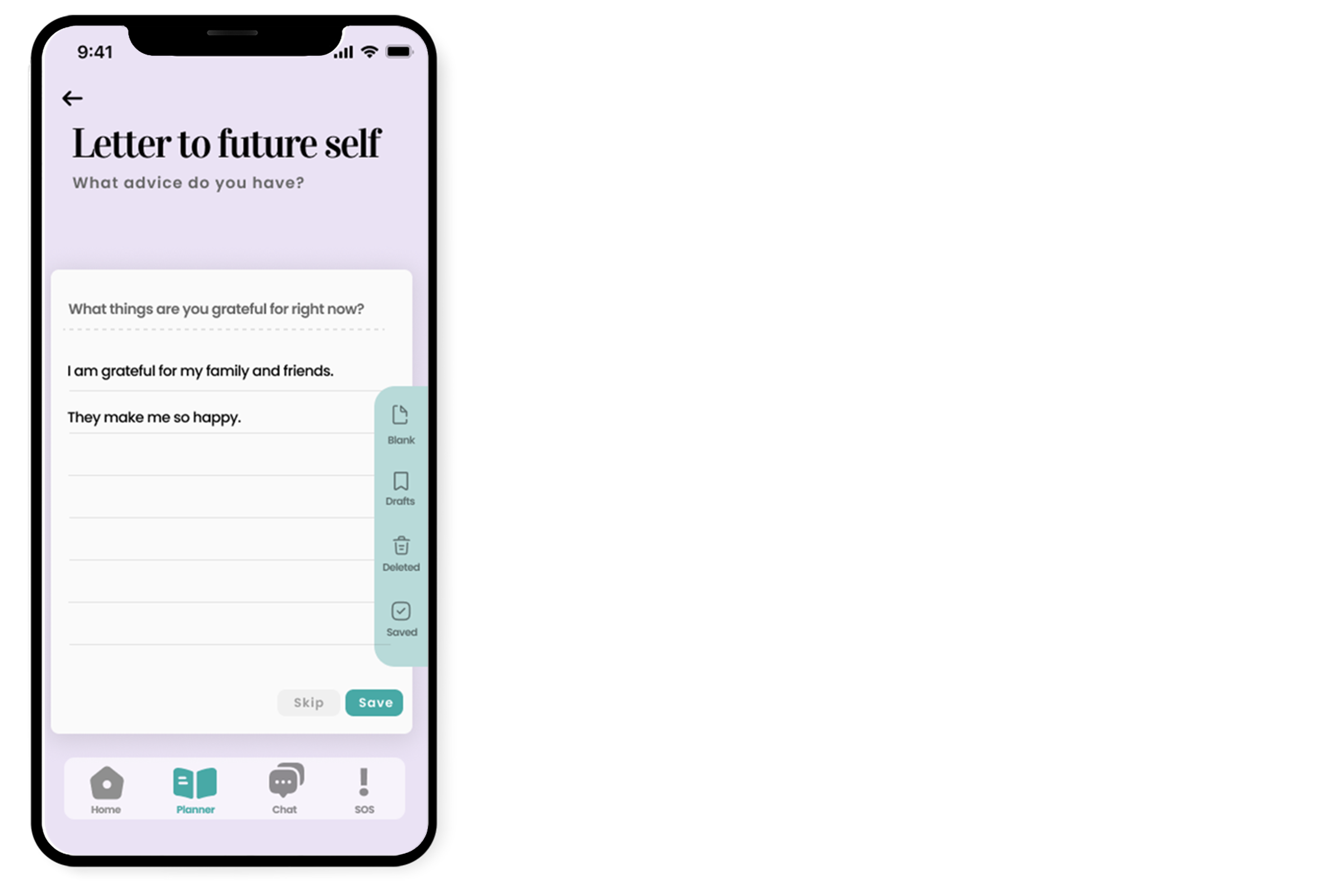
From my research I discovered that it is really helpful for any experiencing mental health problems, or trauma to reflect back on what they are grateful for. I decided to add this feature to the app where the user can do this, and even have some prompts to help them achieve this. The user can swipe through each prompt for something they would like to use. For UX purposes I added this little tab on the right hand-side, it allows the user to add a blank letter, see drafts and deleted.
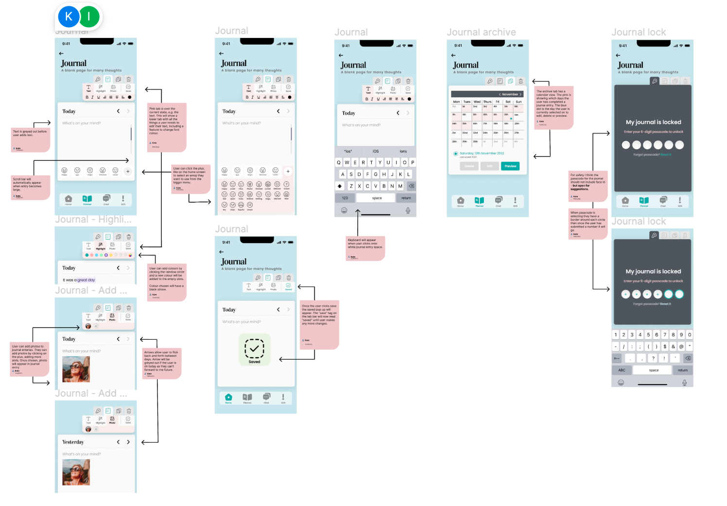
Journal
Journal, Add Emojis and Journal Archive
Highlight menu, Add a photo and Locked
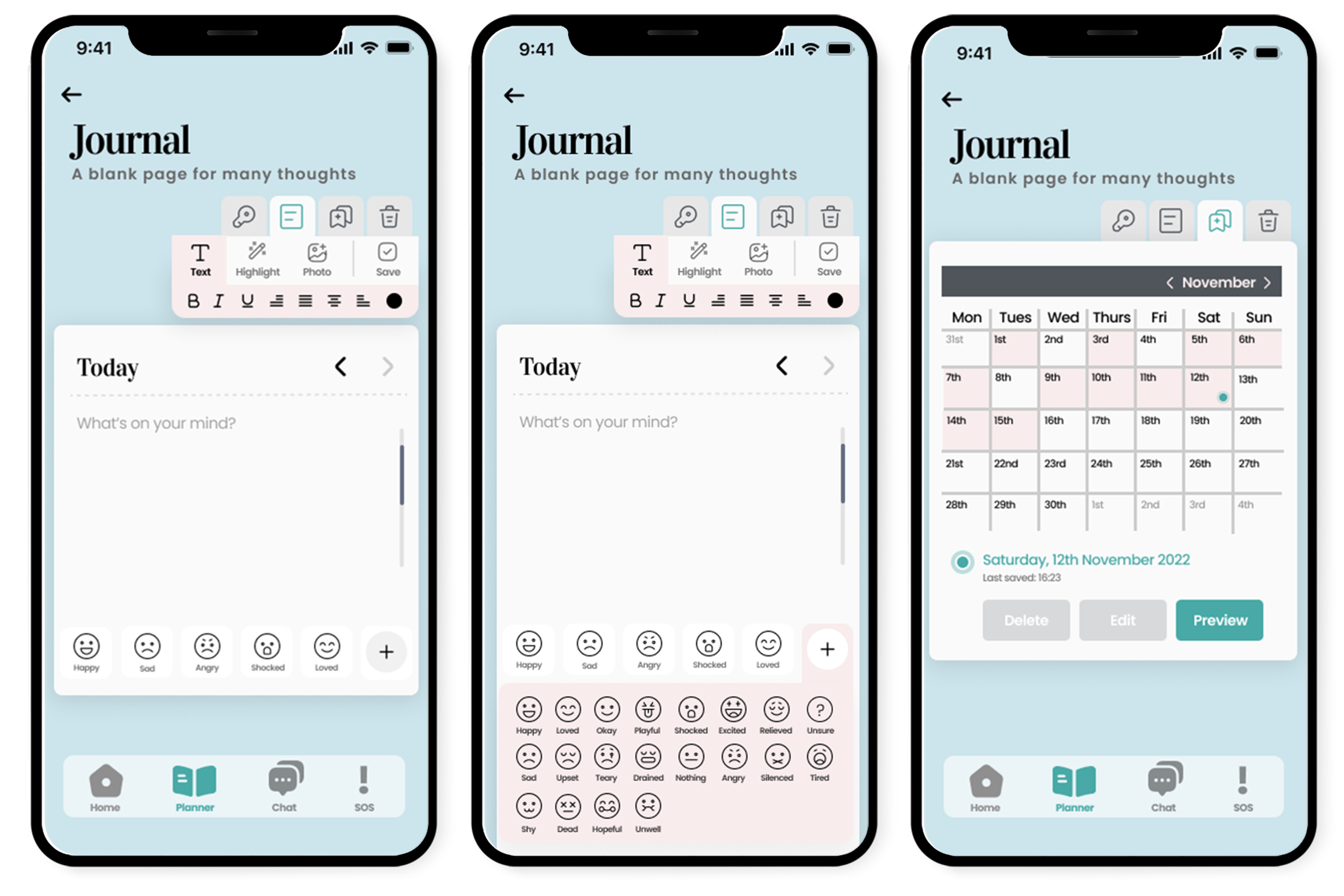
The journal was my main design goal in the app because it was an interesting concept to create. I looked at competitors apps like Daylio and Amaha to see how they achieved this type of user-interface and user-experience. I wanted to give an authentic journal look therefore I opted for a white paper background with a dashed line to mirror the top of the sheet.
My aim was to give a minimalistic feel to the journal. It asks the users "What's on your mind?” to prompt the user. I opted to use a “day by day” entry process rather than allowing the user to make random entries. This is because I wanted to get my users in the habit of using it daily, which explains my thought process behind putting “Today” so prominent.
The arrows on the right side allow the user to quickly flick through to yesterday, or the day before. This was for reflection, another important feature for my users. I allowed the user to select an emoji to go with the journal entry — this speeds up the users journey.
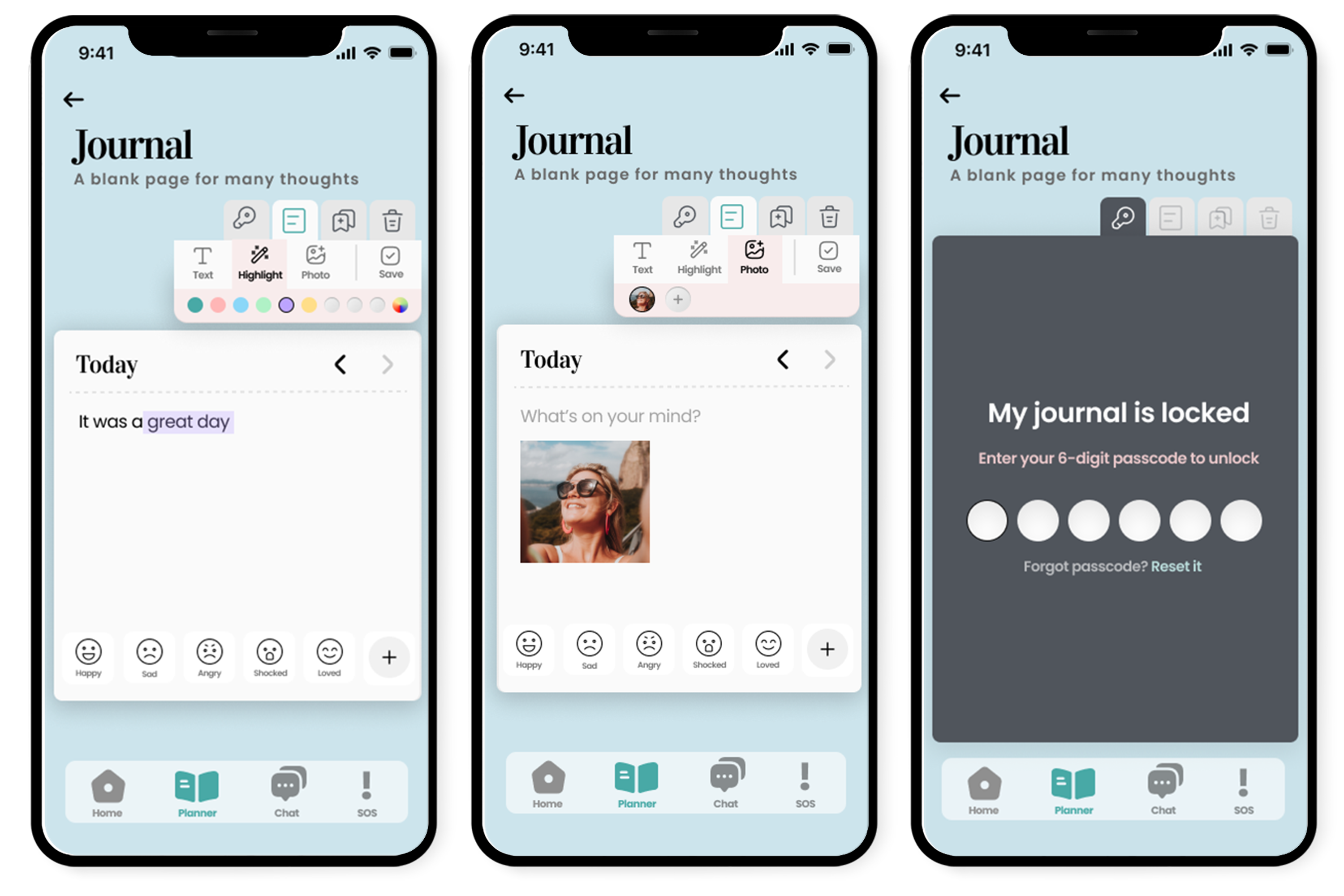
Personalisation to journal is key which is why format adjustments such as the bold, italic, underline and alignment were available in the tool bar. It features pen colour changes, highlighters and the possibility to add a photo (while researching domestic violence, it became so important to allow our users to document photos inside a locked journal. At the top of the menu bar we have a key tab which locks the journal quickly to secure important entries. It was vital for the journal to be a completely personal, secure feature for the user which is why I opted to give the user a lock feature on the journal. Once clicked it won’t open with the passcode.
And lastly, an archive tab for a monthly overview of the journal entires the user as completed. Trash bin for any deleted journal entries they wanted to recover. My user demographic often deletes notes or messages with mood changes and the bin feature gives them a second chance to recover.
Extra screens
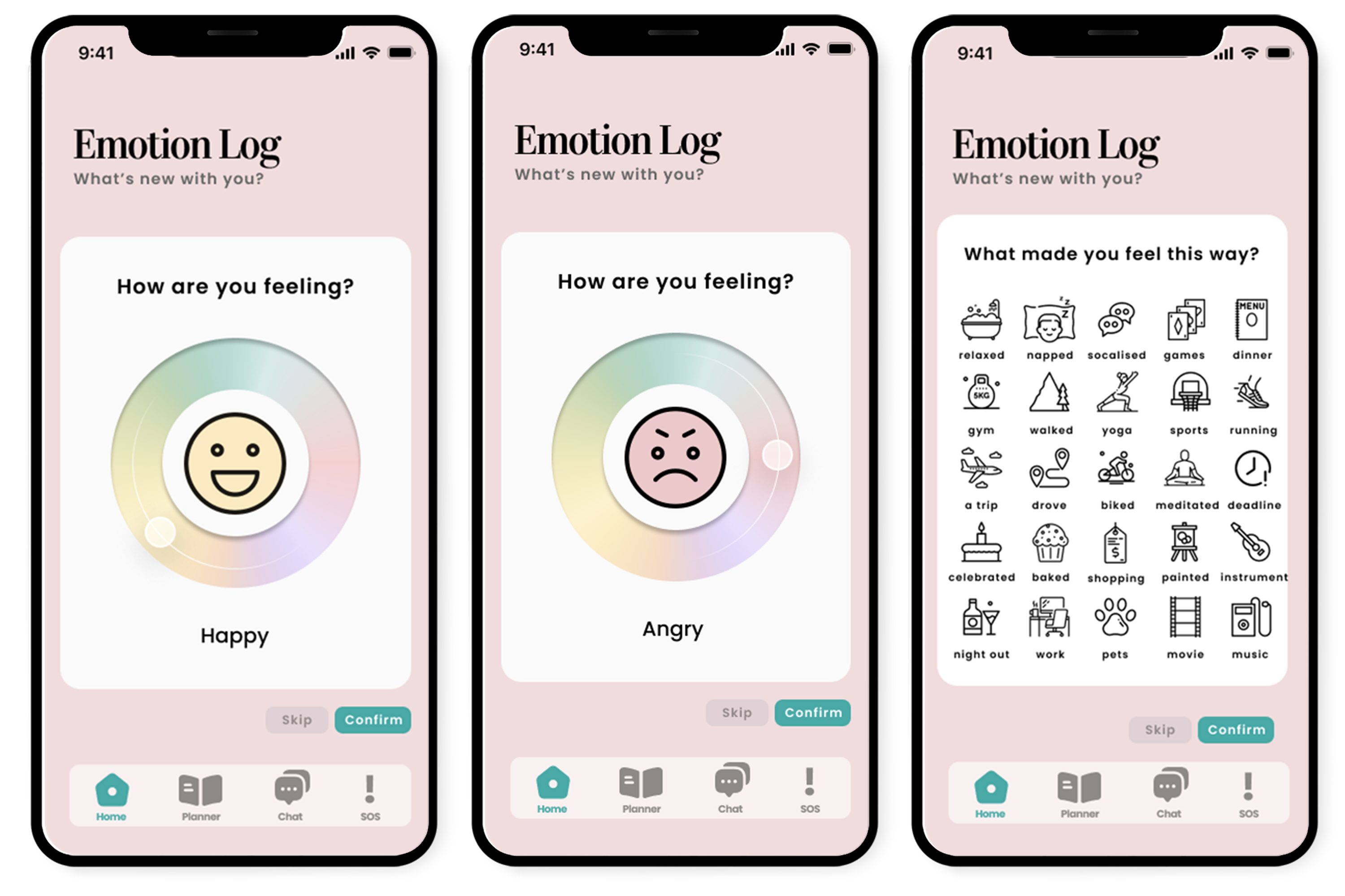
Emotion log and Task tracker
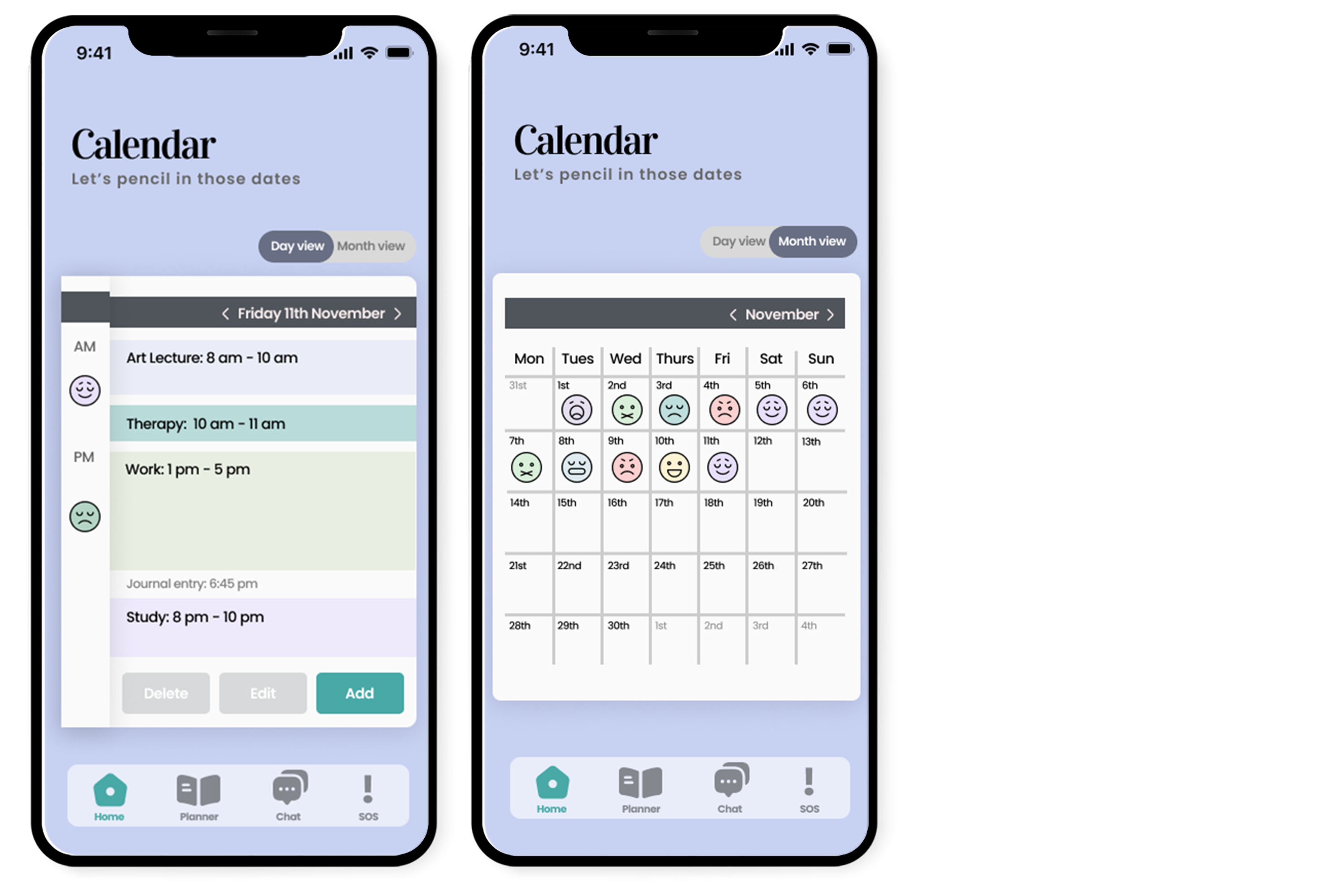
Calendar day view and month view
Although the calendar and emotion log was not my tasks I decided to create this screen because I liked this project so much and had some designs in mind. I decided to create a unique design concept where the user slides around the colour wheel exploring different emotions. This was a great design to focus on each emotion as it appears. The user can skip if they don’t have time to input an emotion or just wants to add a task they’ve completed. Which brings me on to “What made you feel this way?” Where users can note the task they’ve done today. For UI purposes I made sure to use icons with the same style and stroke weight.
The calendar design needed to be on a day by day view (requested by the client in the brief) for the user to have a complete overview of each day. I decided to spilt the day into am and pm for the user to get an understanding of how they were feeling for each half. I recognised the importance of having different colours for each task so they can quickly glance and understand what’s next in their day. I decided to add a journal entry input date, this helps the user know they’ve done a journal entry for today. I thought it was great to have three main buttons at the bottom, your call-to-action is to add another event. I made sure to have a day view vs month view too. For the monthly view I added a similar layout to the journal archive but focus on the main emotion for that day.
Client Feedback
The client was over the moon with the results, her email was very sweet: "You guys have absolutely smashed it! It is far better than I could have ever imagined! You guys took everything I sent in my last email and implemented it amazingly. I love the colours and the layouts and I love the logo so much and how it can literally be attached to the name Unshackled. My jaw is literally on the floor. You guys have done amazingly!"
Usability-testing
I was fortunate enough to complete a moderated usability-testing with my mentor. It was important to get to a professional level with my work and user-testing on my screens enabled me to do this. User-testing was all around positive, giving a 4/5 stars which is superb for a non-complete project in 12 weeks. It was the first time I had done user-testing and it was a great learning experience for future projects. It helped tremendously with gaining feedback from someone outside.
Some of the issues my user-testing made apparent:
Adjustments
Based on the results of my usability testing, I was able to implement a few minor adjustments to give my screens a finished appearance.
Revised screens
Splash Screen, Create an Account and Home
Journal and Emotion Log
I did experiment with this multi-color gradient, which I believe helps the app really shine; it also makes the apps overall atmosphere more joyful and cosy.
I modified the sign-up page to ensure that the user is fully informed about any information collected and to emphasise that it is their decision. I modified the home screen arrows to be more consistent with the rest of the application: Jakobs law (Yablonski 2022).
I stripped the journals tools from any unnecessary formatting options to give it a minimalistic appearance. This was a comment I received from my lecturer during our group presentation. I was skepitcal to remove at first because I believe in giving the user the tools for personalisation. However, I can see removing it allows the screen to breathe. And finally, I enabled the user to add notes under the tasks and to choose multiple tasks.
Developed Prototype
It's a passion of my mine to fully develop my designs. Although we had a developer on this project to create the app, I wasn’t sure at what stage the project would be complete therefore I went ahead a made a prototype on Figma. Sometimes I don't always get a spare minute at the end of semester to do it before submission but I wanted to make this app come to life. Here's a basic prototype of the app, all the screens used were my own and I wanted this to be a personal side project - especially as one of the main screens to animate was the emotion log which was not my screen.
I focused on making sure the screens link together and to include some micro-interactions. I would like to be able to do more but for the purpose of this project and the timeline we had, this is what I’ve done so far. I hope you enjoy.
Project Overview
In summary I thoroughly enjoyed this project. It was an amazing learning experience to deal with a real client and produce a product with a team. It was interesting to work with different designers that I have not had the chance to work with yet. For this group I felt that I took role of leader of the group which was my first time. I liked making sure the team was organised, I reflected back on my previous projects and where things could’ve been better. I created the basics of each group powerpoint then uploaded for our team to collaborate. As the most confident speaker amongst the group I opted to talk for the majority of presenting and answered any group directed questions.
It was a great project to work on, the research I had to gather from this project was very vital in my designs. This is something I will carry forward into my future designs. It was my first time doing user-testing, specifically moderated user-testing, where I got to ask open ended questions to my user; asking questions like, what the button might do. I was complimented by my mentor for being professional during the user-testing and understanding from the onset how to ask the user questions to gather more information.
I really enjoyed working for a client, it was a good experience to have under my belt. The client expressed how overwhelmed she was with the designs we had completed, she was over-the-moon. From my fantastic user-testing feedback I have managed to make changes to my screens and gain a new perspective for my users.
Timeline
Timescale This project had a twelve-week deadline, and we were all juggling a second project alongside a case study. I used a project timetable inside Figma to ensure that I had everything done in time for presentations or feedback. It was crucial that my screens were completed in time for the developer to begin coding. I chose the "create an account" screens since I knew I would be able to finish my ideas fast.
As you can see from the above timetable, I underlined crucial dates such as presentations and gave myself a week to prepare. It's fascinating to compare the two projects since both were highly significant yet worked differently than I anticipated; I thought their timelines would be fairly identical, but they weren't. One thing that was not added to this timeline was time to prototype my designs, or add extras because I didn't think I would have time but I found a few hours here and there.
Timeline
Timescale This project had a twelve-week deadline, and we were all juggling a second project alongside a case study. I used a project timetable inside Figma to ensure that I had everything done in time for presentations or feedback. It was crucial that my screens were completed in time for the developer to begin coding. I chose the "create an account" screens since I knew I would be able to finish my ideas fast. As you can see from the above timetable, I underlined crucial dates such as presentations and gave myself a week to prepare. It's fascinating to compare the two projects since both were highly significant yet worked differently than I anticipated; I thought their timelines would be fairly identical, but they weren't. One thing that was not added to this timeline was time to prototype my designs, or add extras because I didn't think I would have time but I found a few hours here and there.