Patient Portal
Client/Group Project
Brief:
The project is to produce an app to help people with disabilities communicate with the professionals looking after them in the hospital and help the staff with their work.
The app, named "Crystal Clear," is a communication platform for patients and medical professionals. Patients can access information, ask questions, and schedule a video or voice calls with their advocates. The app also allows patients to fill out accurate physio charts and export the information to their medical records. To ensure everyone has a voice, the app will include features for British sign language, Makaton, speech-to-text, text-to-speech, and other sign language options. The goal of the app is to give patients the time to think and voice their concerns without feeling pressured at the moment.
UX/UI Design, Branding & Identity
Plan
Brief Overview
1.1 To understand this project we needed to establish our target audience, the general message, top must-haves and the style/tone of the brand.
Design Plan
1.2 After this I then set ourselves a plan with objectives to make sure we had included everything for this project.
Design Plan
1.2 After this I then set ourselves a plan with objectives to make sure we had included everything for this project.
Research
NHS App
2.1 App Competitors:
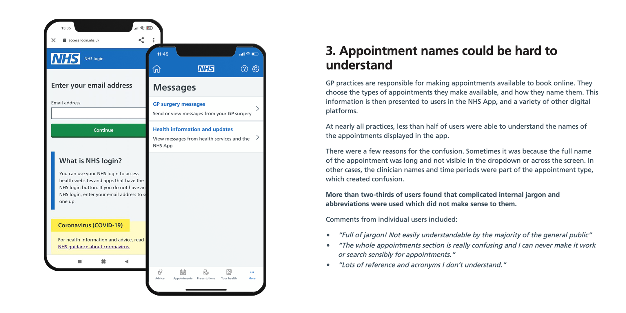
The first app competitor I looked into was the NHS App. The NHS App, not to be confused with the NHS Covid App, was developed in one year, released in 2018 but was the most downloaded free iPhone app in England of 2021 (Millington). Lead Product Designer, Rob Millington, describes the app a success and "A total of 1.1 million GP appointments booked through the NHS App since it was launched". However, I wanted to get a bigger scope of what features they had included into their app; their successes and faults of their UI and UX design. I found some data from user-testing, the NHS app development team had untaken, and it gave me a good understanding of what was working for their audiences which could prevent any potentinal recurring design failures on our end. Although the app now has over 22 million users, how many of the users are satisifed?
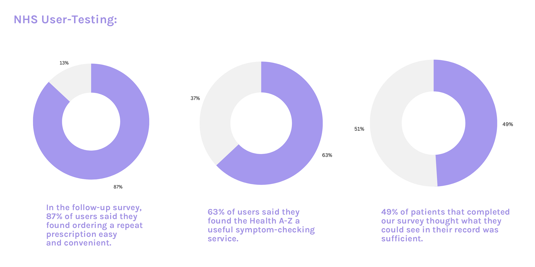
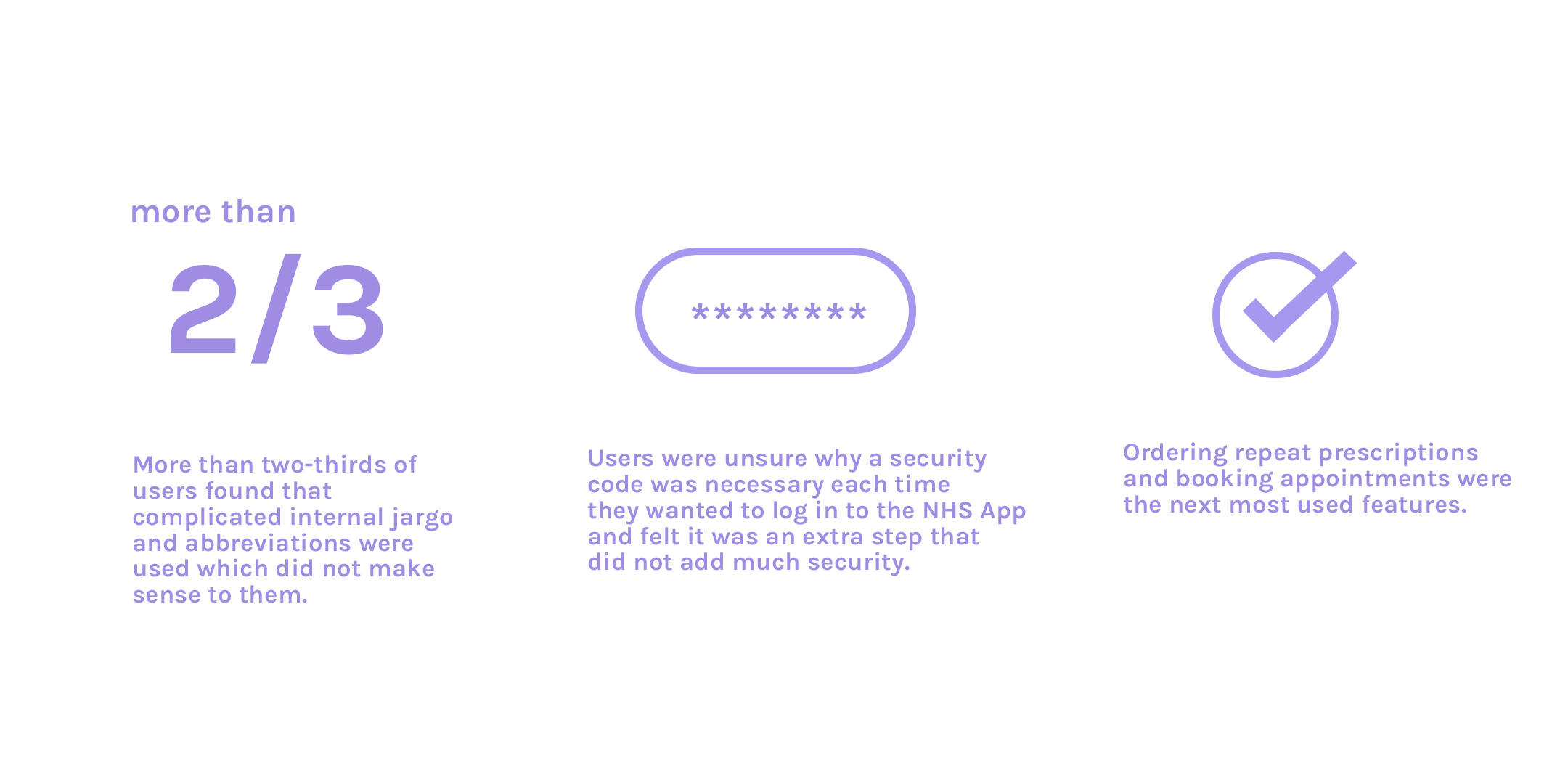
Most users used the app to view their record but enjoyed features such as booking appointments and ordering repeat prescriptions.
All information above was obtained via user-testing conducted via the NHS team (“What We Learned from Users”)
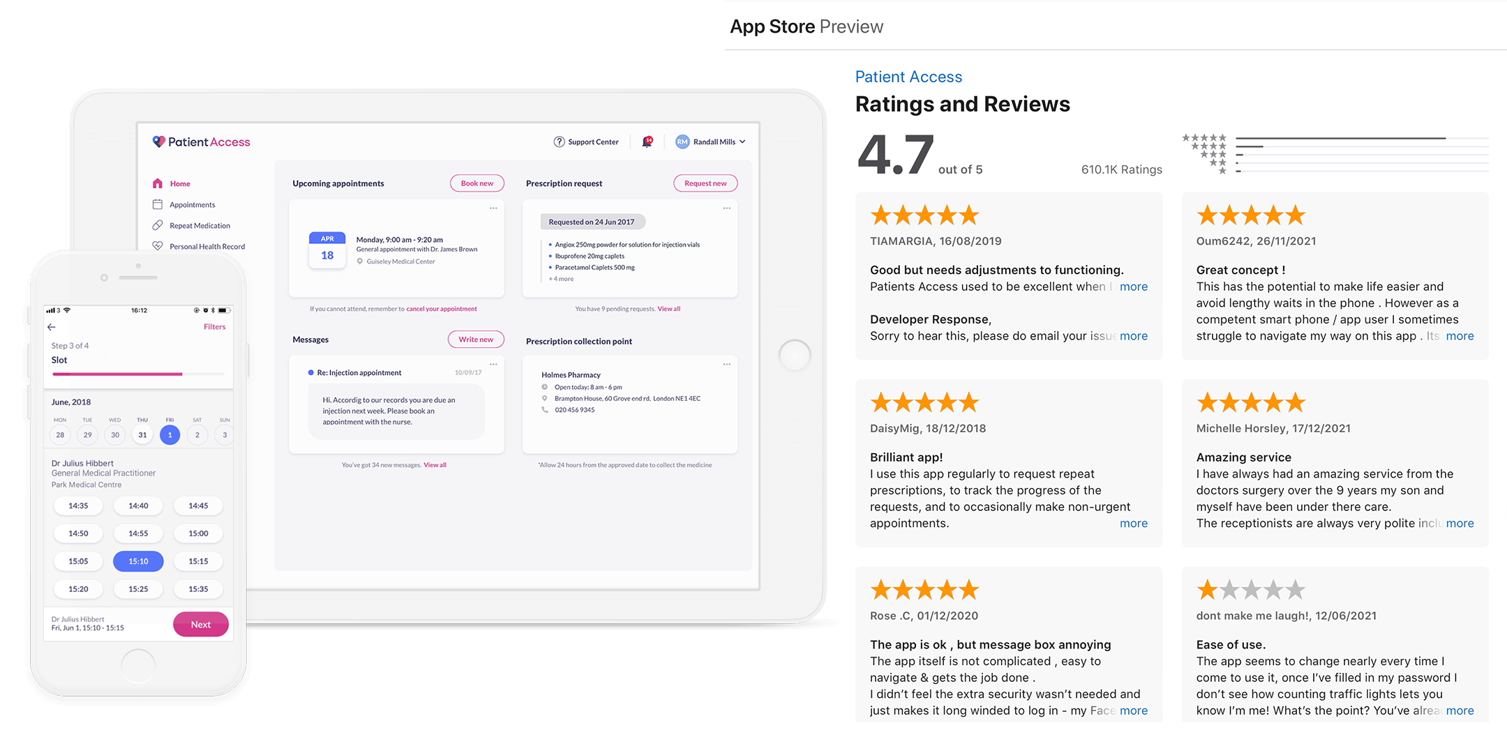
Patient Access
The second app competitor I researched was Patient Access. Patient Access is an application available through website, iOS and andriod. Patients may also use the app to securely message their doctor or other healthcare practitioner, allowing them to effortlessly engage with their healthcare team and get timely answers to their inquiries. Unfortunatley this application did not have user-testing available to view for my research therefore I used iOS app store reviews and Trustpilot submissions to get a general understanding of user-experience.
Although the App Store has a generally high rating of 4.7 stars out of 5 with 610.1K ratings, the comments had a lot of contructive criticism buried into their reviews. For example, "Good but needs adjustments to functioning," and majority of the 1 star reviews were the most frequent.
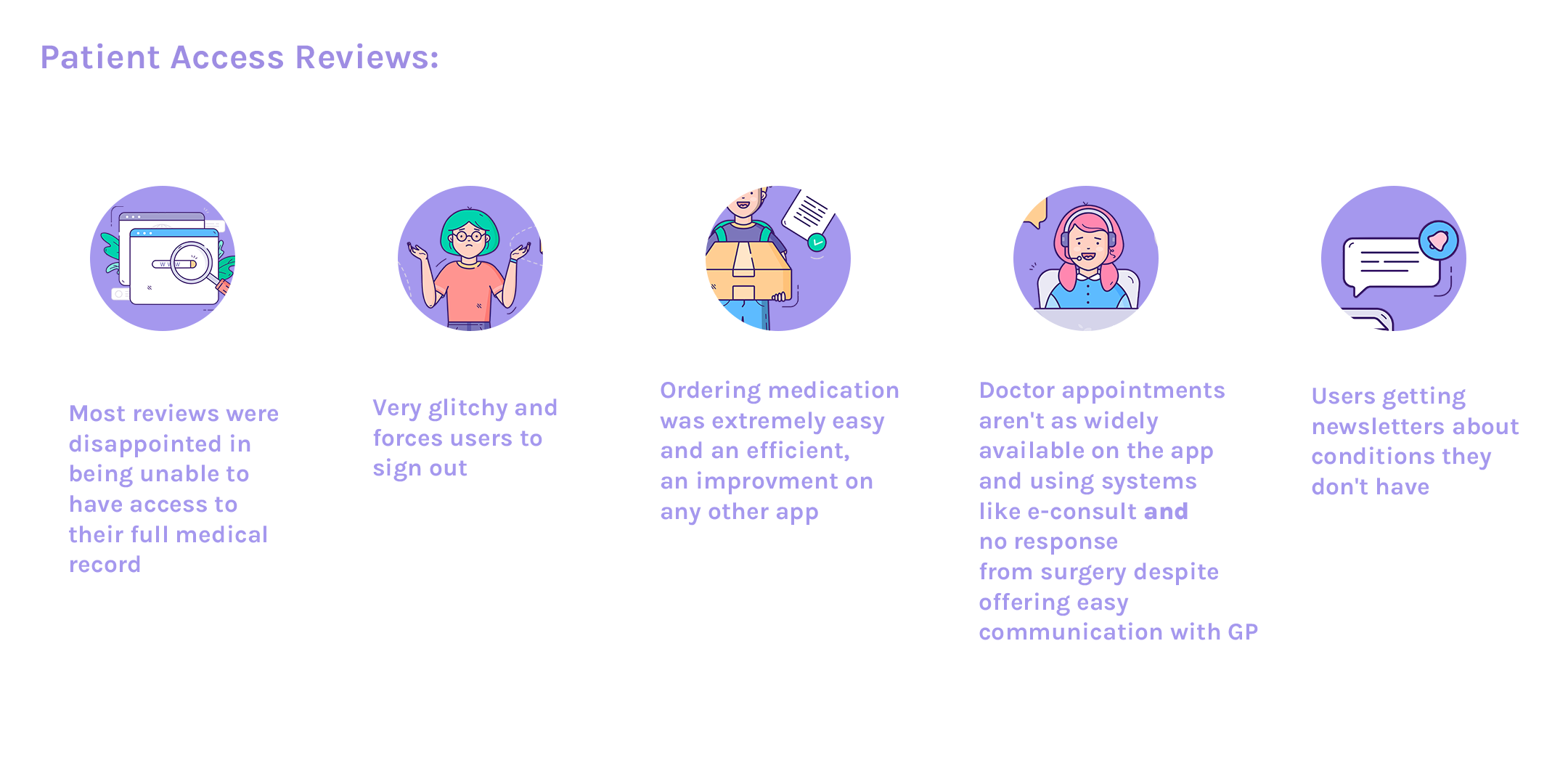
Patient Access Reviews
All information above was obtained via the App Store (“Patient Access”)
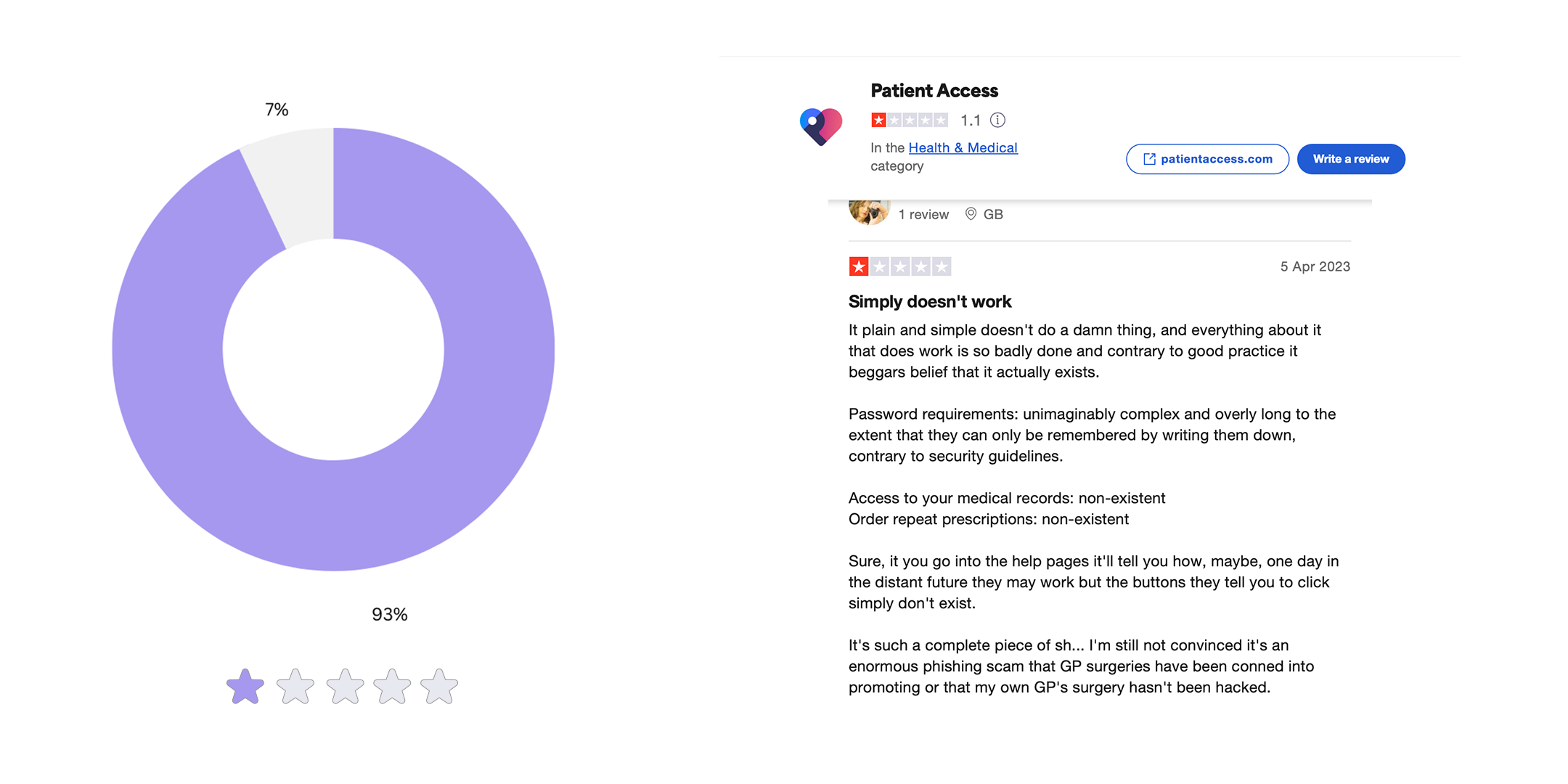
(“Trustpilot reviews of Patient Access )
93% of 700 reviews on Trustpilot were 1 star. Majority of these reviews matched the same problems as above but on a smaller scale.
2.2 Our Audience:
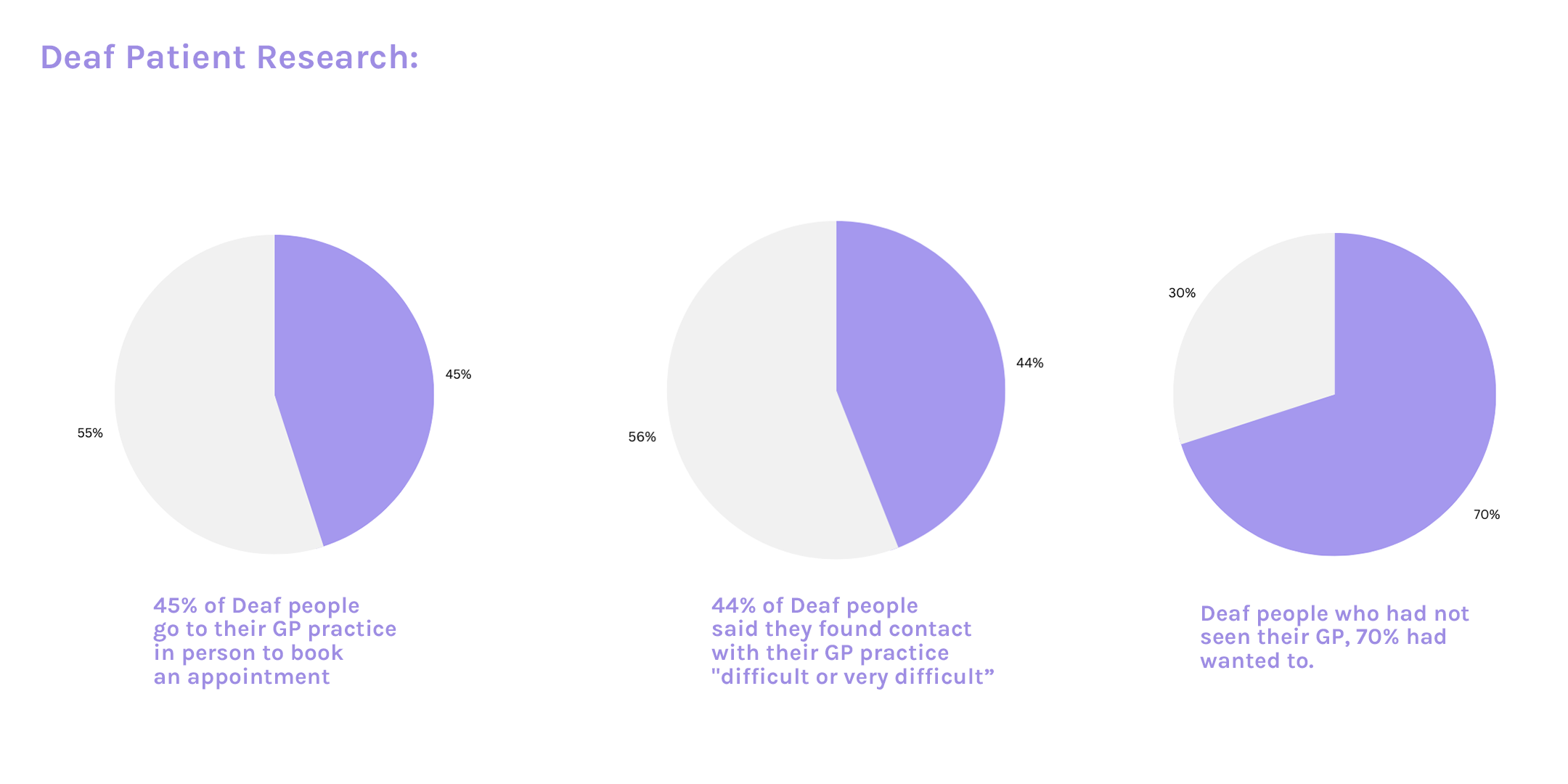
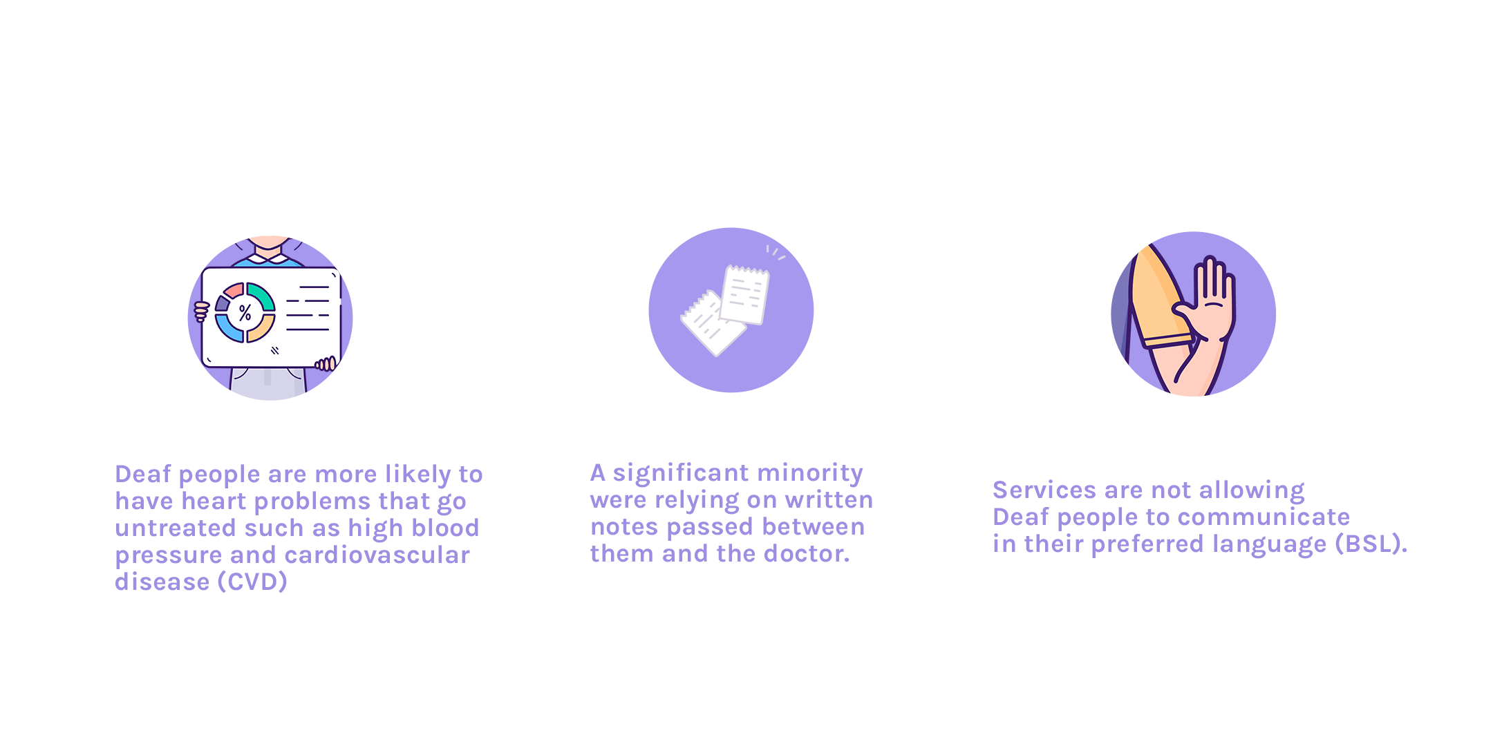
As our client wanted to focus on bringing BSL accessibility to our app it was crucial to understand our users in the deaf community. I found a great report about the healthcare of deaf people and it gave me a lot of insight I needed to be able to produce a user-persona for our deaf patients. Although we normally go off on assumptions for user-personas, there is need for background research into our specific personas.
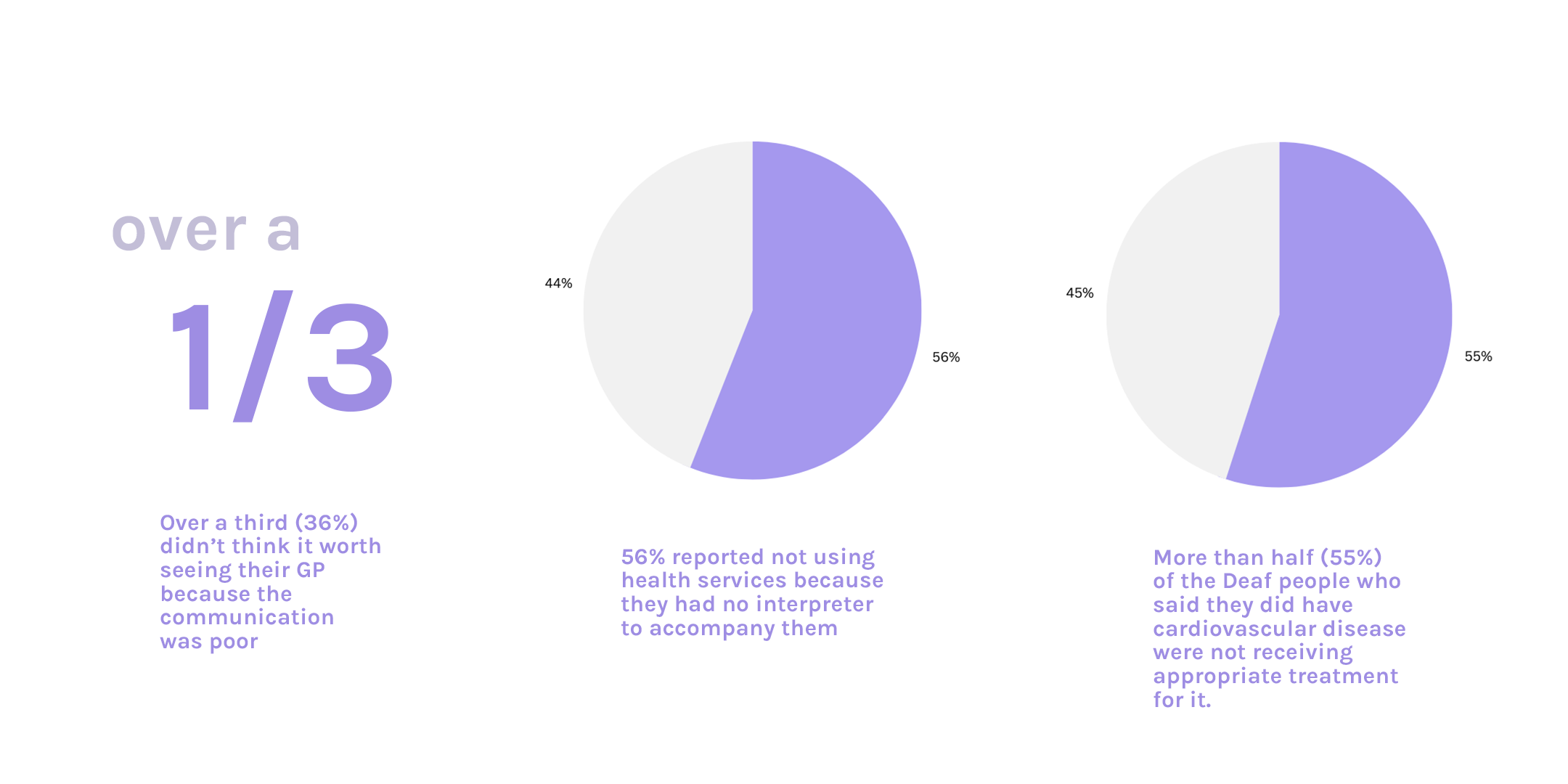
I found out that majority of deaf patients avoid most interaction heathcare which makes their medical wellbeing lower than the average UK adult. In the healthcare system, deaf persons frequently lack access to clear and effective communication, depriving them of crucial information and excellent health treatment. If healthcare practitioners do not offer sign language interpreters to be present during consultations, deaf people must sometimes bring family members to translate for them, which is a significant burden to place on them. Furthermore, family members are not qualified to explain medical diagnosis.
And more recently, the communication access restrictions that deaf people face have been drastically worsened by the COVID-19 pandemic. Many deaf and hard of hearing patients in hospitals were unable to interact with doctors and healthcare professionals because of the reduction of sign language interpreters readily available and the usage of masks. Masks restrict access to mouth movement and facial expression, heightening misunderstanding and feelings of anger and loneliness.
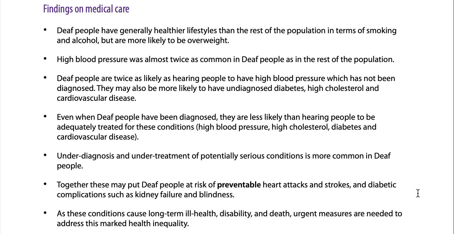
(Signhealth.org.uk - The heathcare of deaf patients)
(Deaf Patient Research)
(Signhealth.org.uk - The heathcare of deaf patients)
(Deaf Patient Research)
Design Thinking
3.1 Problems Identified:
(Deaf Patient Research)
3.2 Research Questions:
"What steps can we take to add BSL/Makaton into the app?"
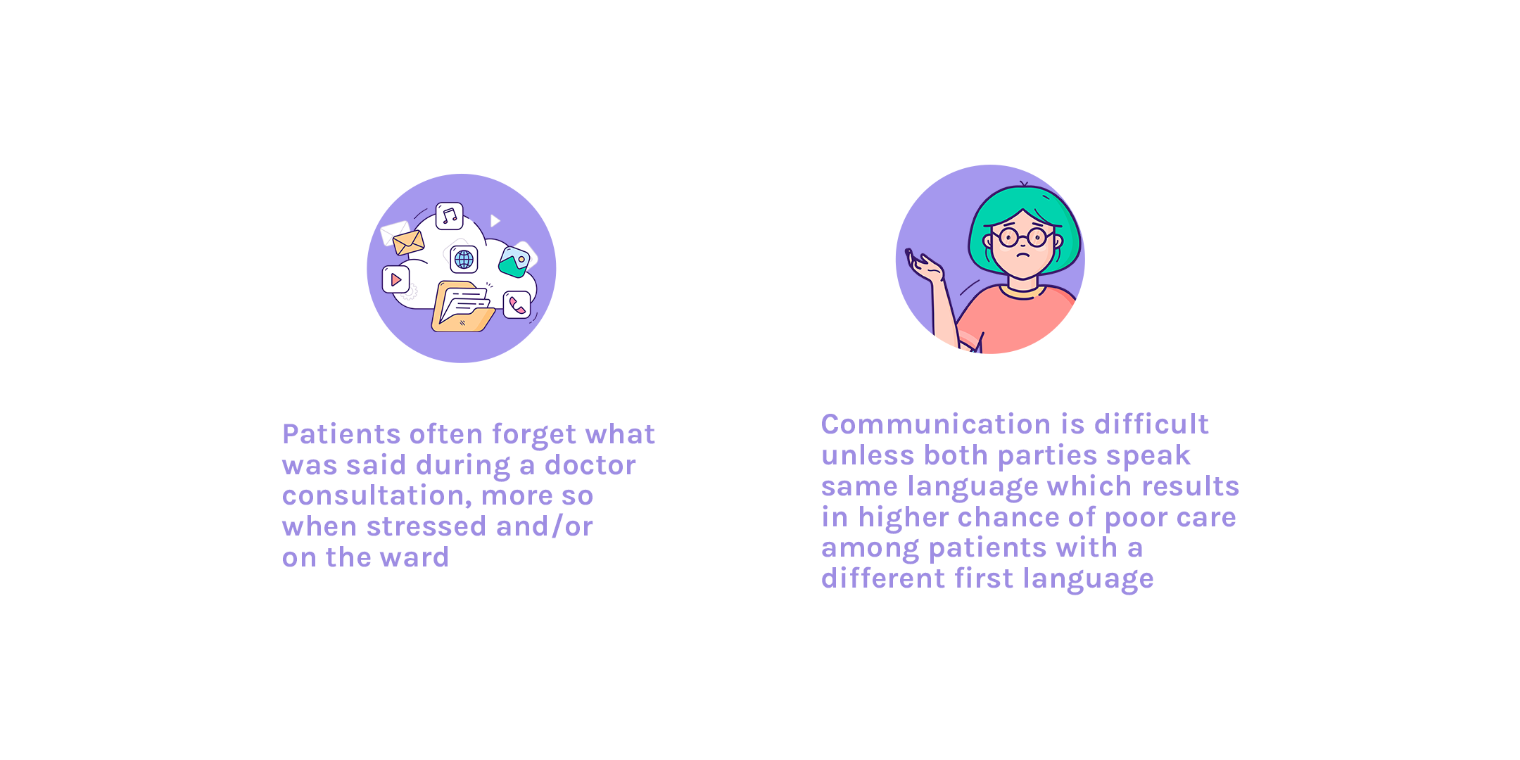
“How can we improve the communication of impaired patients with healthcare professionals? And could this directly help patients with language barriers?”
It was vital this app focused on improving the experience of deaf patients as their experience tends to be forgotten about. When designing for a long-term problem the outcome can affect many outer short-term problems too. For example, when researching what new technology could be used to solve the communication barrier we discovered a company called SignAll who have invented AI technology to recognise hand movements and transcribe ASL. This technology is supported on any device with a front-facing camera and is available on multiple platforms such as iOS and Android. Although the company is developing their own apps to teach ASL, they are open to integrating their technology with developers. Adding to this, with voice translation technology already widely used, it’s a possibility we could incorporate both into a video consultation for doctors and patients.
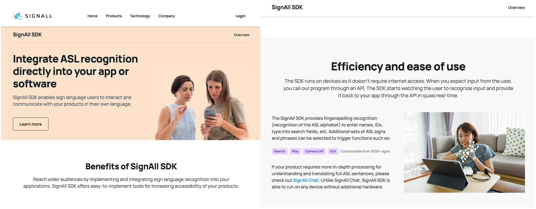
(SignAll Technology)
“What can we do to create an easy, user-friendly yet secure sign up?”
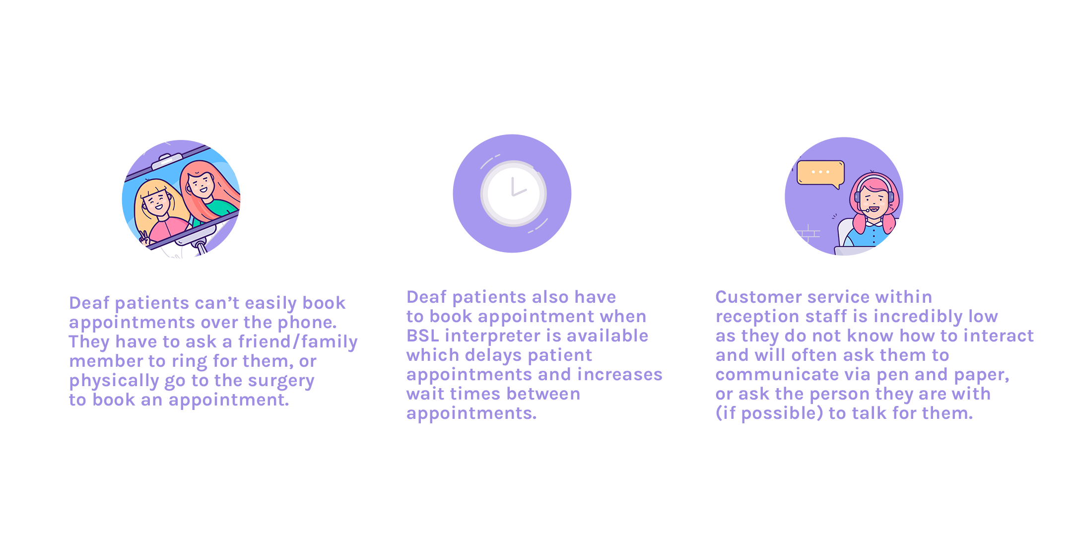
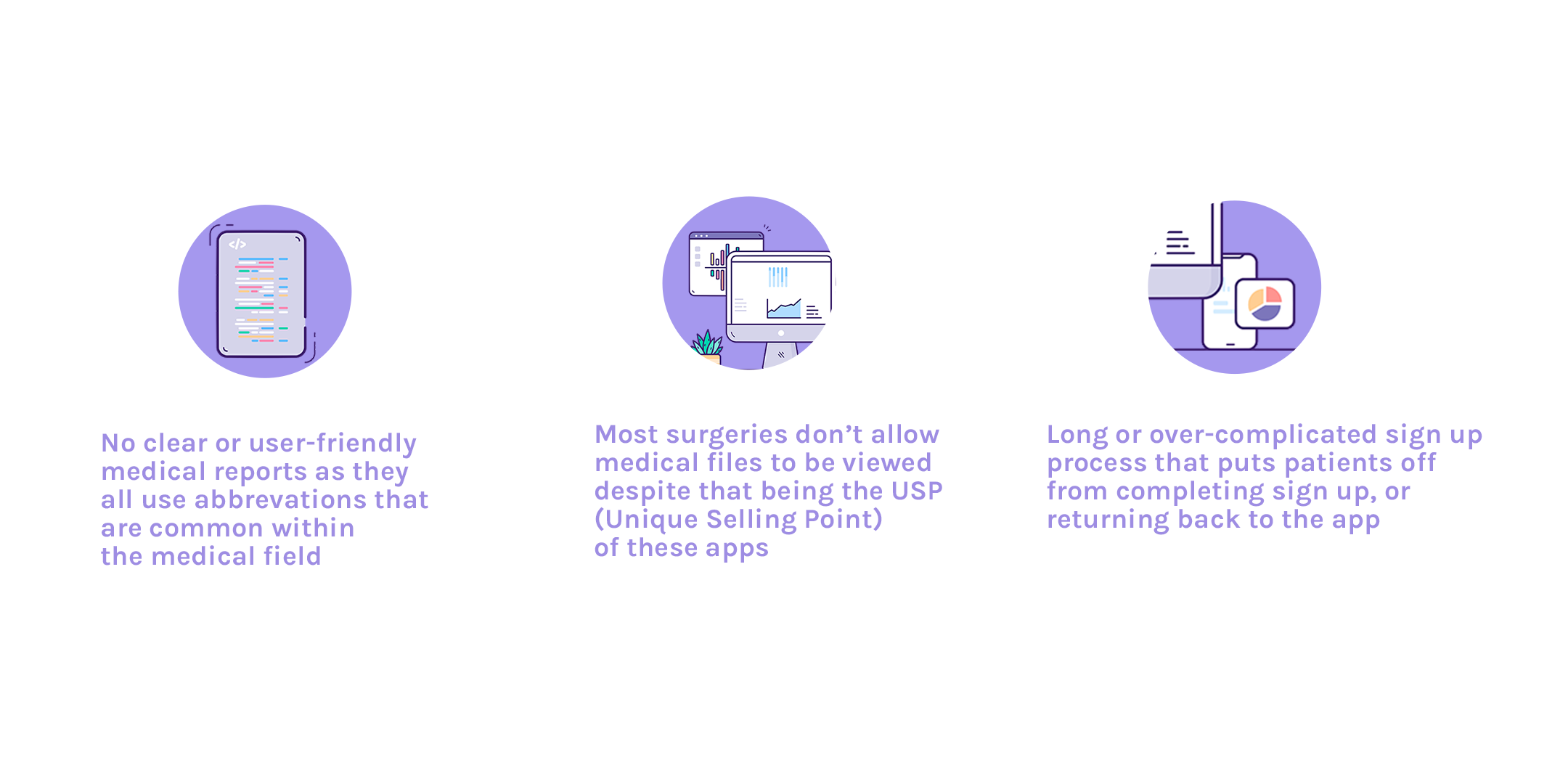
I asked chatgpt to organise the reviews of medical record apps already developed, like NHS app and Patient Access. With reviews from Trustpilot and the iOS App Store, the most common complaint was the sign up process which seemed simple but then relied on the patient to ring up their GP surgery for linkage key, ODS code or Practice ID and Access ID. With the advertising as reducing traffic to GP reception, it seemed to do the opposite.
When designing for this app, it was important to take the pressure off the user and reduce traffic to the GP telephone lines. This could be done through two different ways; one being a verification code sent from GP system to patients phone, or using ID technology such as Hooyu which uses KYC (Know Your Customer) tools (these tools includes ID card verification, face verification, document verification such as utility bills as proof of address, and biometric verification) for instant verification.
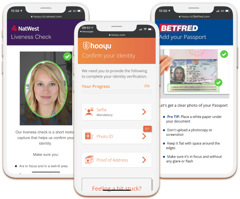
(Hooyu App -- KYC Tools)
“Which features could make medical records clear and user-friendly?”
Medical records have a high possibly of using medical terms that cannot be easily understood by the general public, and/or abbreviated terms for quick note making. Healthcare professionals would either need to adopt a different approach knowing that notes are available to the patient, or technology such as AI could be used in translating these words into user-friendly technology. NHS app has already faced this issue and tries to provide information for their patients to understand these terms however many GP practices have expressed a significant increase in patients requesting abbreviation help and logging “an error in medical record” over small details that don’t affect the overall diagnosis.
“How could we minimise the amount of information being loaded onto patients during tough appointments and/or on the hospital ward?”
As we explore video consultations and transcribing, it would benefit both parties to include a history transcription of the call that can accessed after and during the call. With a chat like feature, being able to scroll up and talk about points that were mentioned previously. This also allows carers, or family members who have access to be able to read what was said in a call when the patient can’t recall.
“Why are GP surgeries not allowing patients to access their medical record?”
GP surgeries are only giving a summary report when initial sign up has taken place. To be authorised to see full report, you would need to contact the surgery. However, information will be automatically available to patients from November 2023, with any new information available to view instantly.
Empathise
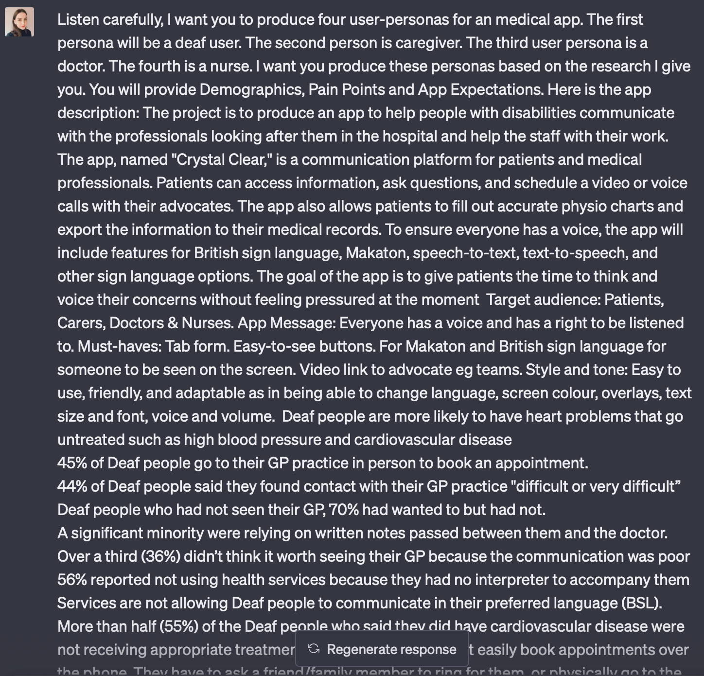
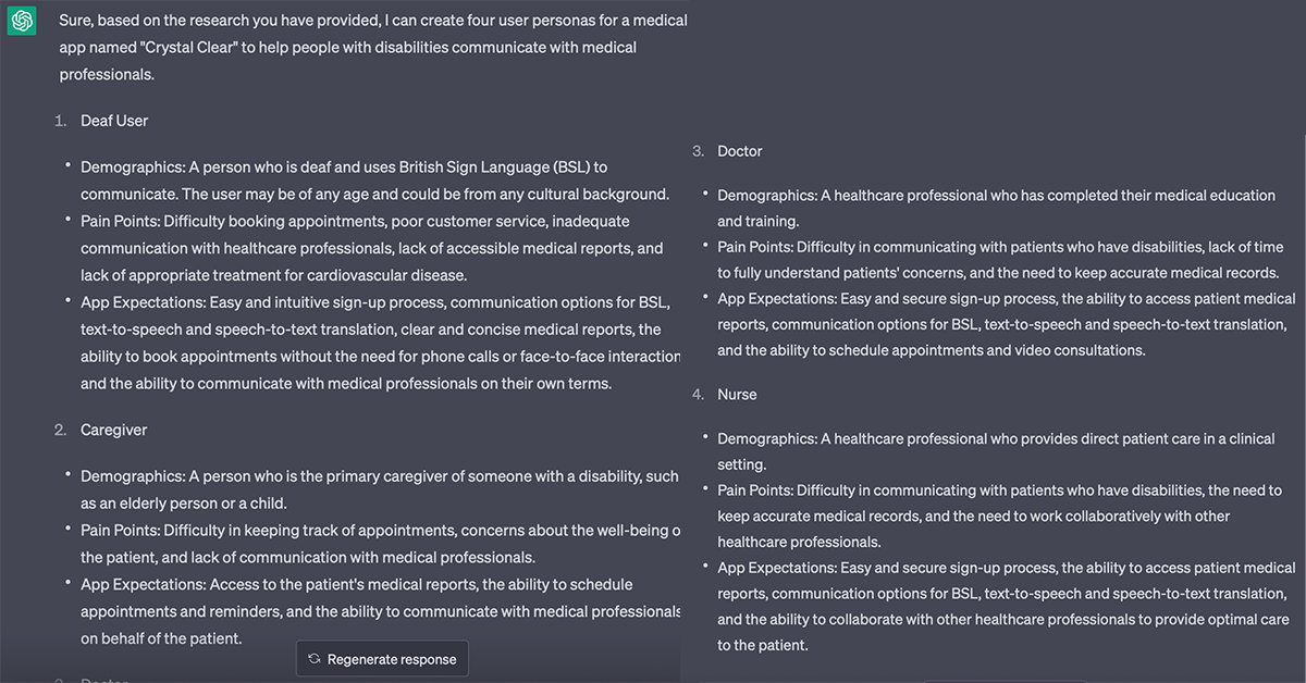
4.1 - Creating User Personas I opted to utilise ChatGPT, a popular Artifical Intelligence tool, to create user personas based on all of my research. This is an exceptionally successful and time-efficient approach to generating high-quality identities. It initially gave me a brief description of what I wanted. However, after having a very long conversation back and forth, adding more research and several commands (like asking for more depth) we had reached the final four personas. I would be very open to using ChatGPT to help with more tasks when designing as it speeds up the process and can be very efficient in giving you in-depth traits that I would struggle initially to think of.
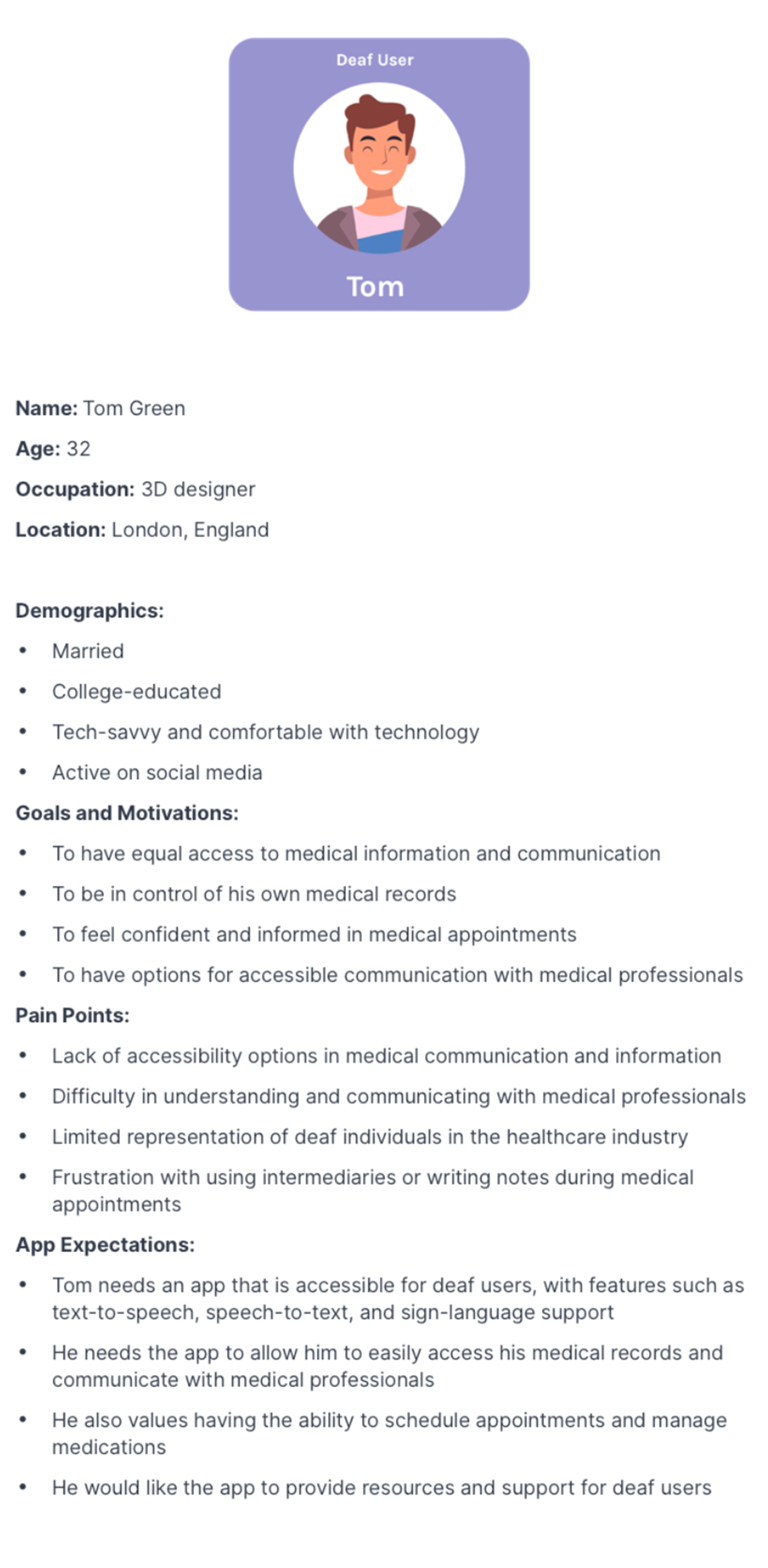
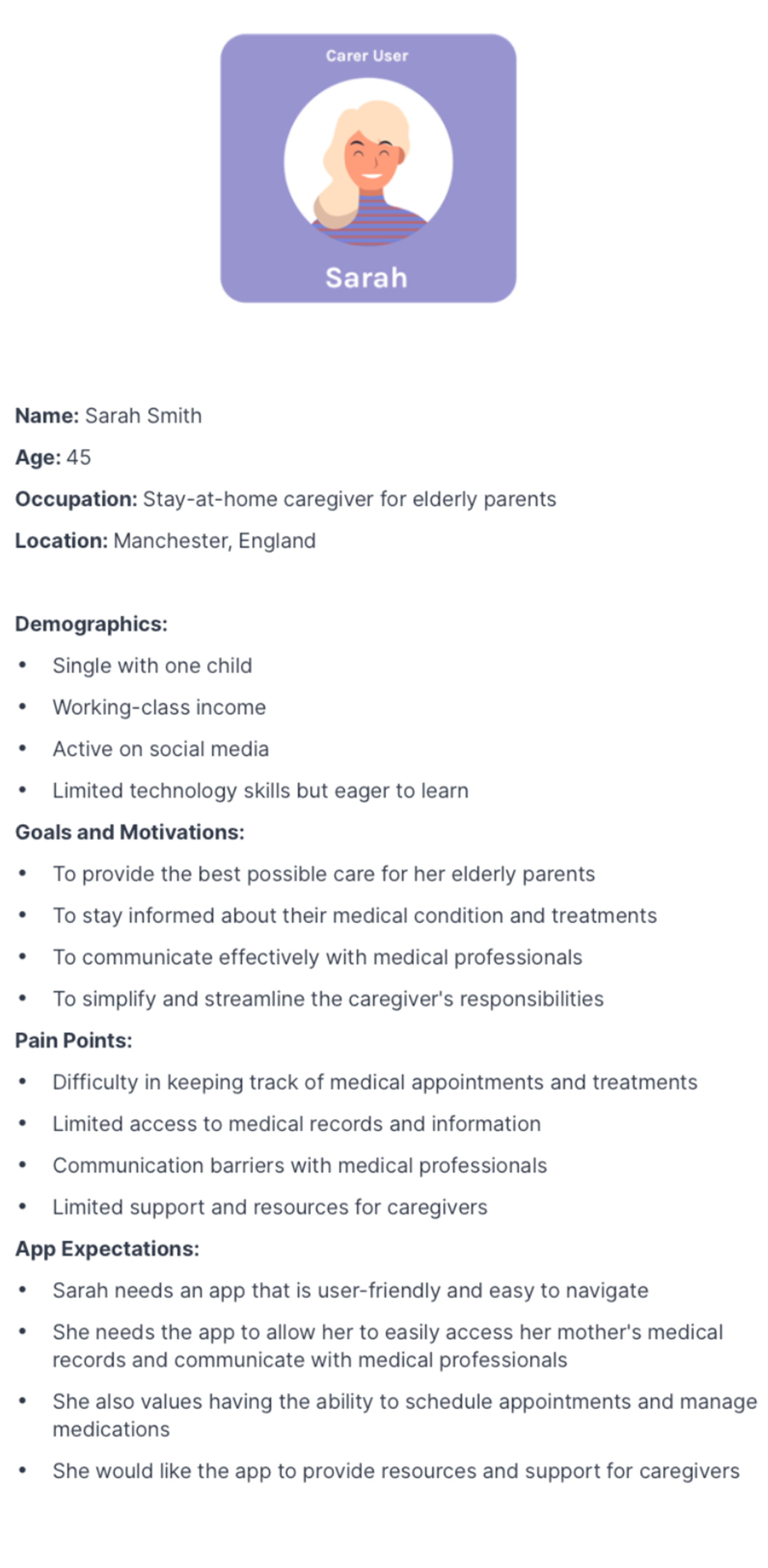
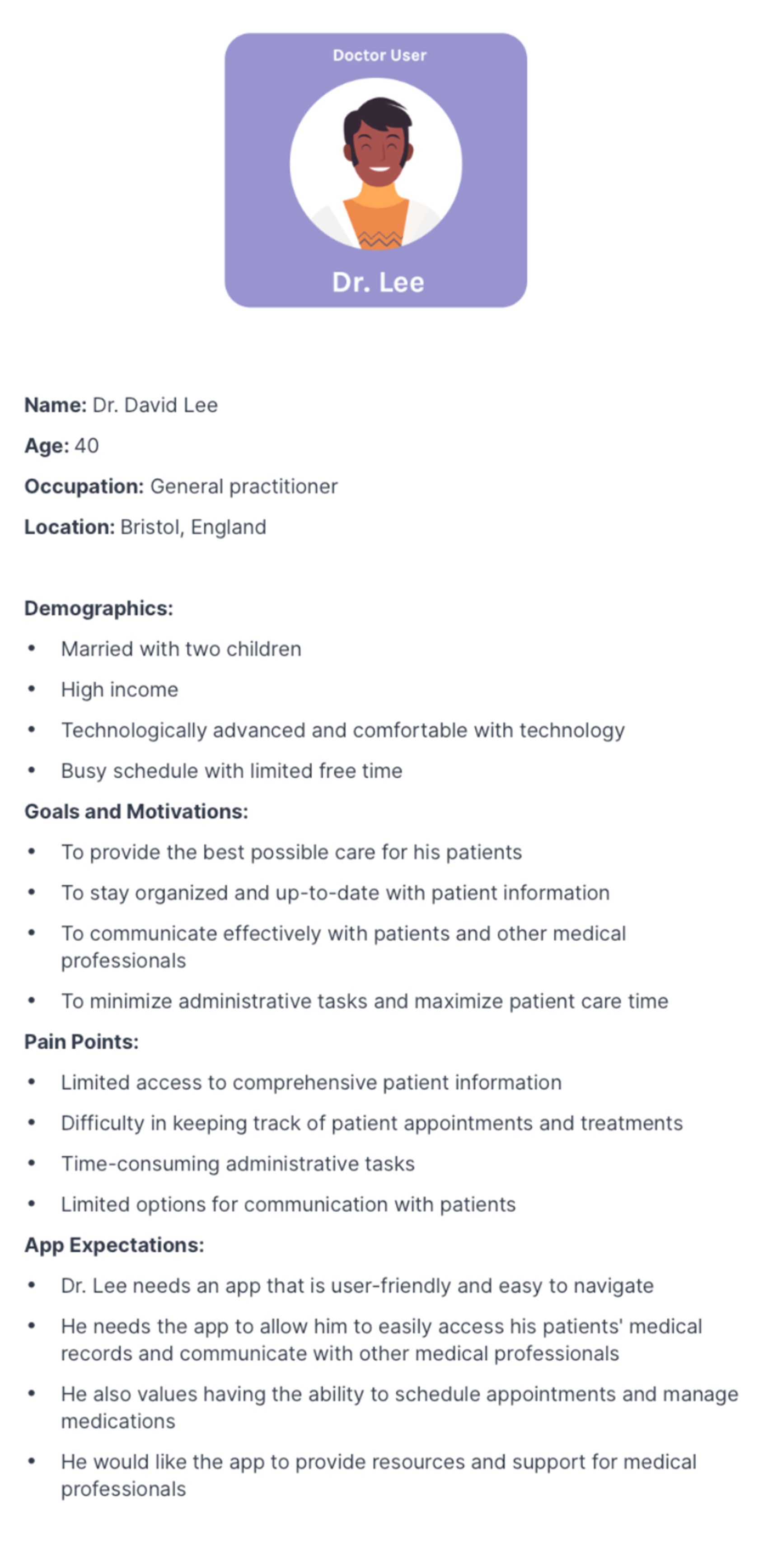
4.2 - Final User Personas:
I found these personas incredibly helpful when designing because I felt as though I was developing features for a specific person in mind, rather than a general group. We create personas in order to fully understand the user needs. Adding on to that, personas are helpful in developing products with a specific user in mind rather than a broad consumer (Faller, 2019). The features of these user-personas I felt more useful were pain-points and app expectations which I often referred back to when I felt my creativity was swaying me from producing good UX.
User Journeys
4.3 - User Journey:
Before I began developing a sitemap, I wanted to understand my user-journey with the current process users would take without an app. This includes booking an appointment, setting up an appointment reminder on their phone and then going to the doctor appointment. I used this traffic light system but with emojis to represent how the patient would feel at each stage. The stages of no expression would represent the issues that I wouldn't need to change but if I had a better solution then I could address. However my sad faces, were problems that needed to be addressed and the app needed to be a soultion to these problems. As you can see a sad face normally follows behind a expressionless face which indicates that mood of the user will worsen as time goes on and a solution hasn't been resolved as soon as possible for them.
Initial Sitemap
4.4 - Sitemap:
When collabrating my user-journeys and my user-personas, I could develop a sitemap. A sitemap allows me to see what features I need to include in my app, ensuring that no screens, such as onboarding or splash screens, are missing. I reviewed the project brief, made a bullet point list of all of the features they mentioned, and added them to my sitemap.
Low-fidelity wireframes
4.5 - Low-Fidelity Wireframes
My next step was turning each key element on my sitemap into low-fidelity wireframes. I used Miro to develop these sketches as I find it easier to select and drop elements from a published wireframe library than drawing each element out myself. A flaw of mine is to focus on whether the element looks professionally sketched over the importance of jotting down my ideas. Therefore miro helps my time effiency. As a standard, I sketch up in black and white to visualise the core functionality of the design rather than the aesthetics. It allows my designs to stand on their own without over-complicating the design at the start, and allows feedback from users and clients to be implemented far quicker than high-fidelity (which uses UI; images, fonts, colours and micro-interactions). I've circled and anotated each wireframe with important information I want to bring forward to my high-fidelity prototype.
Branding
5.1 Our client came to us with an app name already picked out, “Krystal Clear” named after a patient who had communication difficulties who inspired the app’s purpose. However, when doing research into apps that store secure data, many people reacted negatively to using an app with a human name. Businesses with human names often give users the assumption it’s run by a single person rather than a secure, trusted company. We wanted to stay away from any personal names than made consumers feel uneasy when handing over personal data.
Our biggest concern at this time was whether the client would be open to changing the name as we weren’t sure how flexible they would be. Before our initial meeting, we mocked up some Krystal Clear logos just in-case they shut down our rebranding conversations and still had some feedback to work on. We had also done some verbal user-testing of Krystal Clear which came back negative, some feedback was:
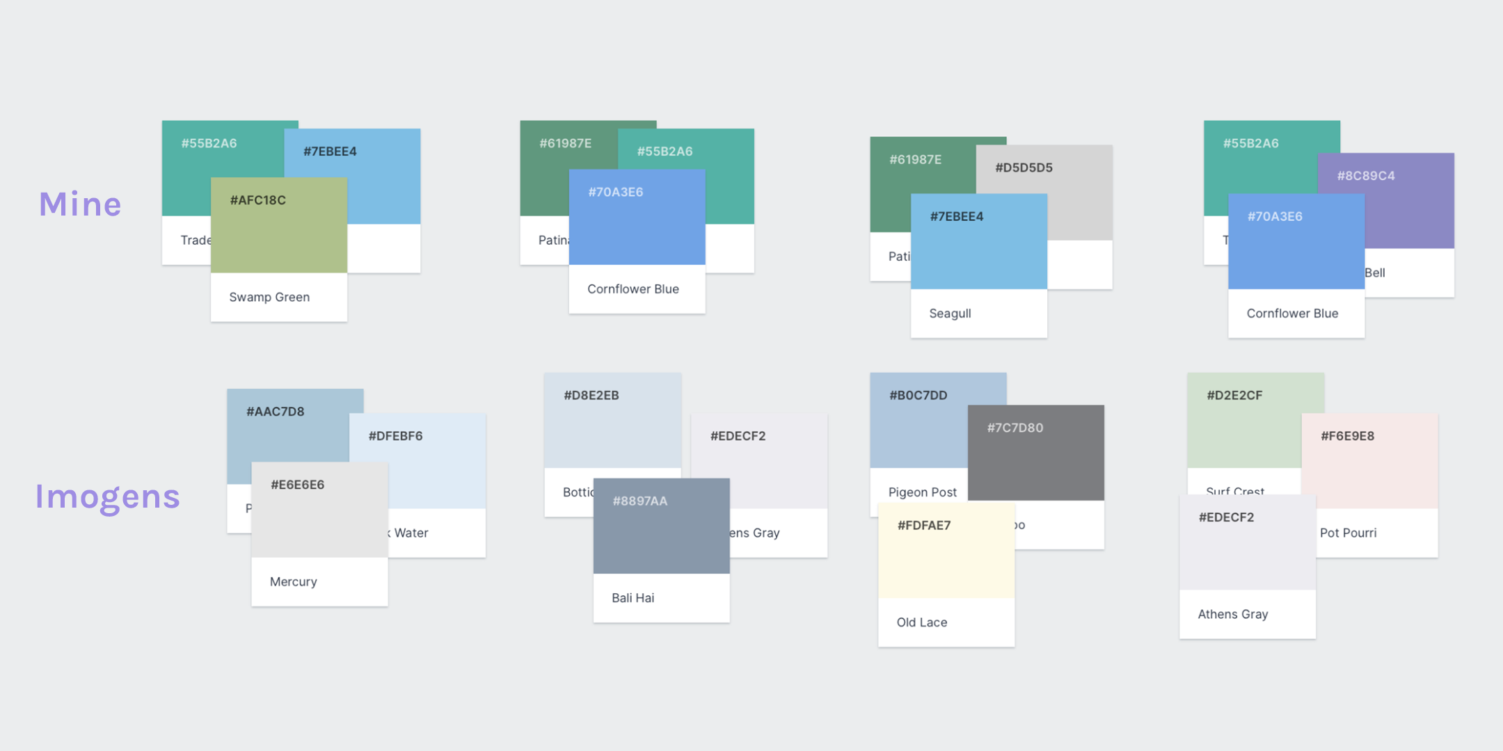
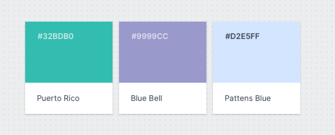
As our initial meeting with the client was upcoming, our group played around with colour options for our app interface and branding. I opted to use greens, blues and purple for our app. For a medical app, it should evoke feelings of trust, confidentially and security — but also compassion, comfort and health.
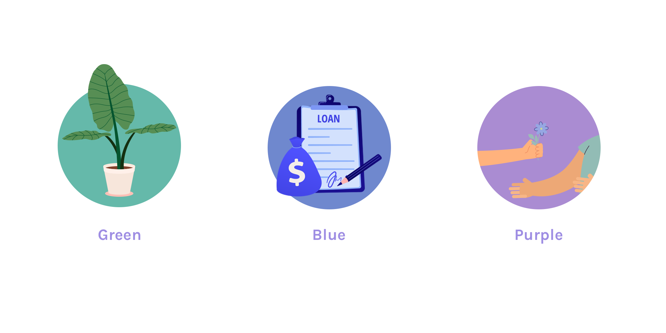
Health, regrowth = Green is used often to refer back to nature, natural elements and renewal.
Trust, confidentially and security = Blue is commonly used in apps that store secure data and provoke feelings of professionalism.
Compassion and comfort = Purple comes up top to provide users with a calming and comforting feel. It also makes users feel a luxury element to the app.
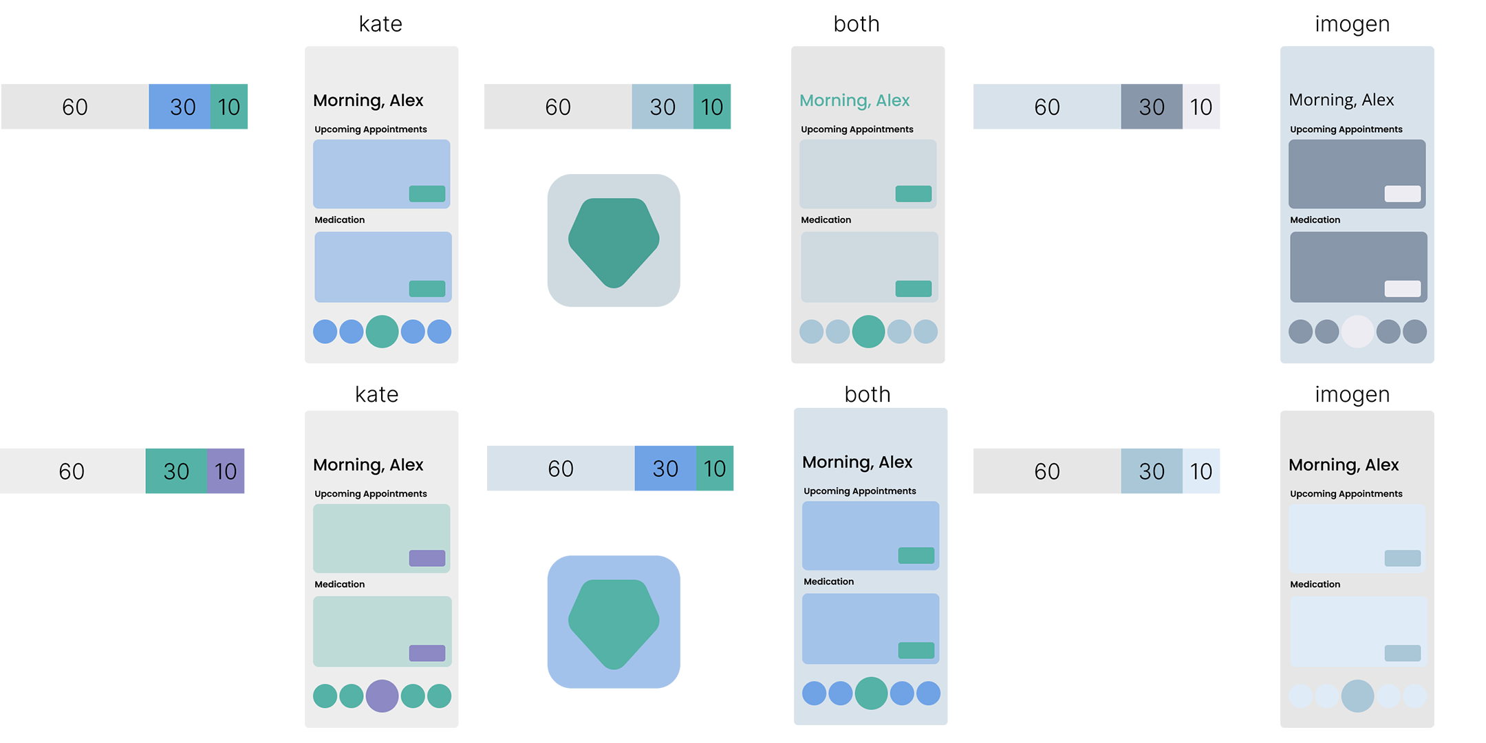
To test both designers colours I swatched them on a user-interface mock-up to better understand how each colour trio would look using the 60/30/10 rule.
60% is usually the neutral or primary colour. This portion will be used as the base colour of the design.
30% is the secondary colour. It is still visible and will be used for some medium components such as card, carousel, etc.
10% is the accent colour. This portion will be used for highlight of the design. For example, CTA button, pop up, and some important points of your interface.
With this, I was able to tell Imogen's UI was too pale, especially for our target audience, and mine was too dark. I then played with mixing swatches from both designers and getting this really nice combination of colours. With this we opted for blue and green as our primary and secondary colours and purple for the call-to-action.
During our initial presentation with our client, she loved the colour scheme we chose and said it was exactly what she had in mind. It's great that our client expectations were met and it coincided with our research.
5.2 As client supplied the app name to us, “Krystal Clear”, I went ahead a sketched up some logos for our initial meeting. Our client agreed with the name switch and was looking forward to hearing some alternatives.
We asked ChatGPT to provide us with words that users tend to respond positively to which convey a sense of trust and security. However these weren’t particularly screaming out successful app names for us to use. We looked at ways we could improve app name success and found that using alliteration has a positive impact on audiences by increasing the chances of them remembering the business name and giving an overall sense of consistency within the brand.
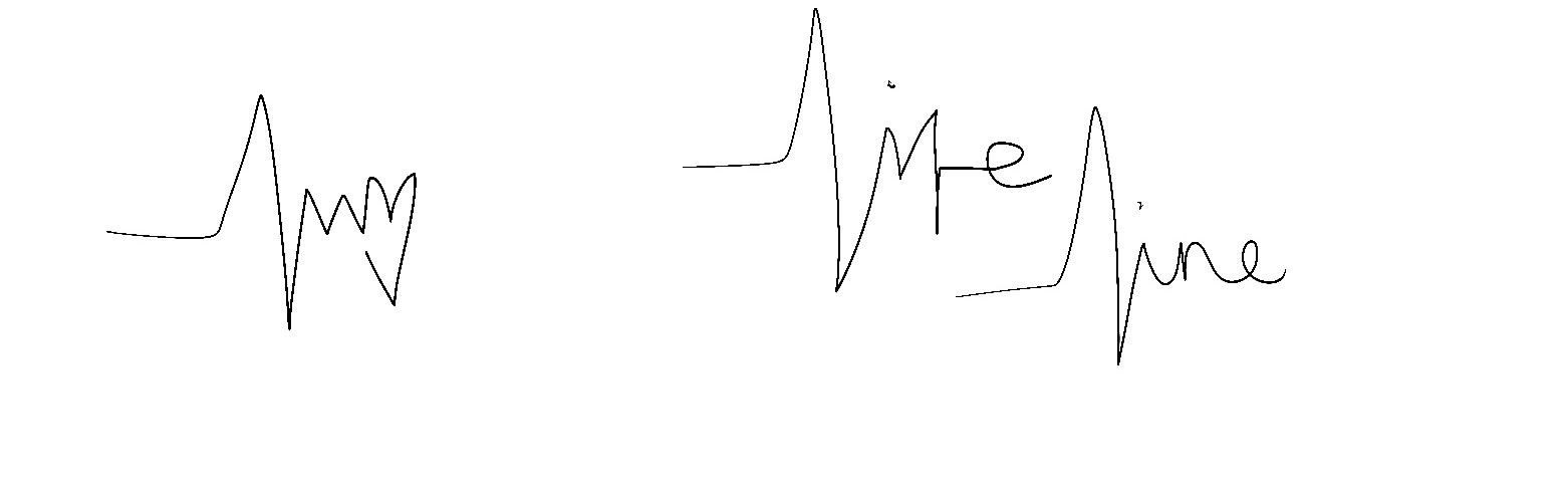
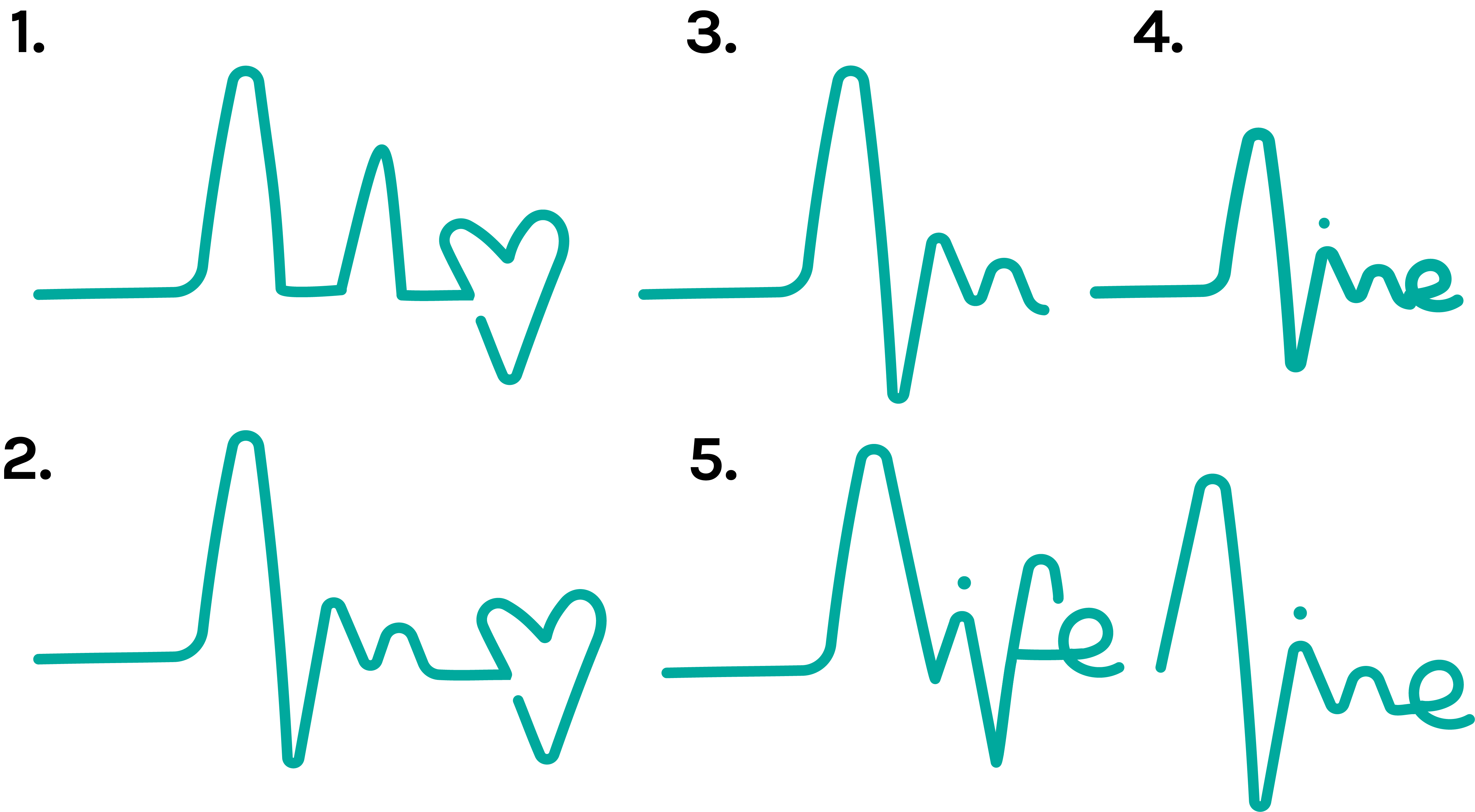
The name we liked was Life Line as its message was a combination of longevity of the app — being with you for life and the on-line, telephone-line conveying the strong message of communication. With this name, some logos were produced some strong initial designs. You can see the progression from sketch to pen tool on Adobe Illustrator, playing around with a heart-monitor line for symbolism. I liked how the ups and downs on the heart beat could spell Life Line.
Unfortunately, we discovered that Life Line is a popular medical equipment used, similar to panic alarms. We quickly swapped out life for patient, becoming Patient Line. This was a placement name until we could adopt a better name for our brand.
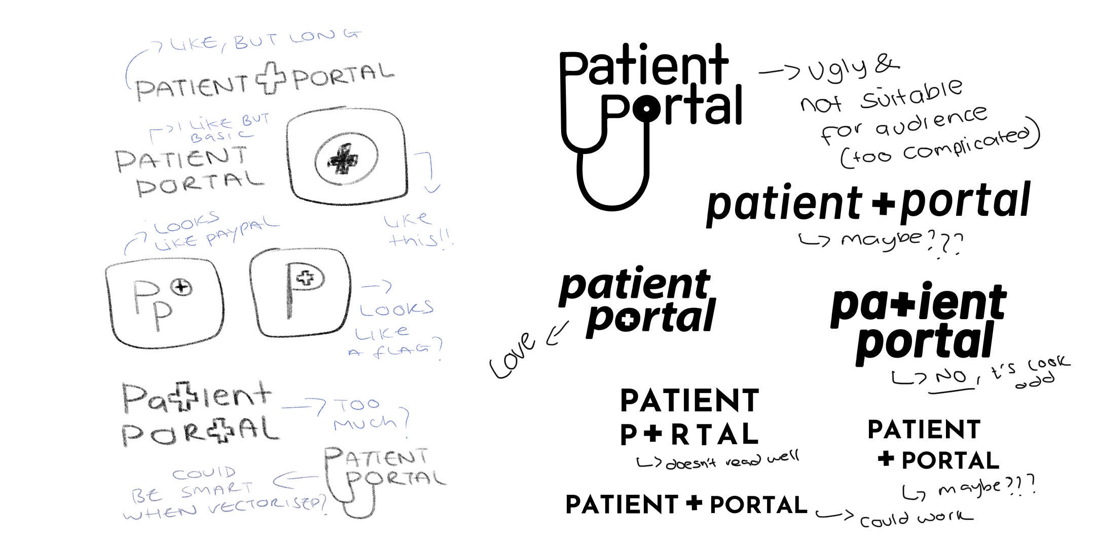
Looking back on our research, we opted to recognise the impact alteration would have on the success the app and chose Patient Portal.
Patient Portal implies straight away that this app is a medical application and for patient purpose. Alongside that, portal suggests this app has everything a patient would need under one roof which is what we wanted to accomplish. As this point in the process we had spent a lot of extra time on the branding and I felt rushed into making a logo as soon as possible. I played around with some logo ideas that I felt flopped.
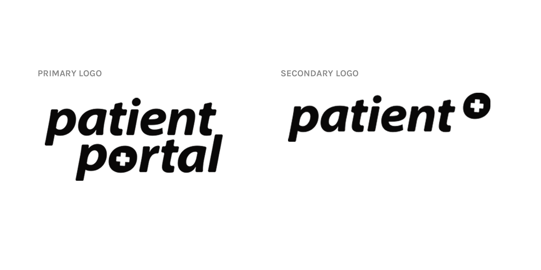
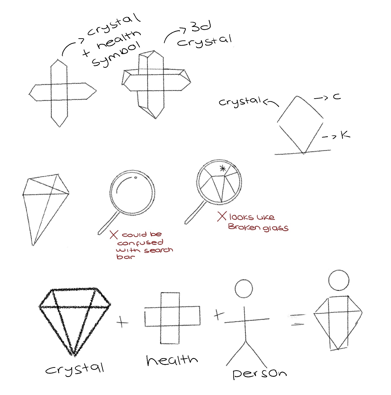
I decided to stick to something straight forward, easy to read and not to confuse our users with "smart" logo choices. Using the plus icon in the nav-bar (featured in my wireframes above) I played around with this symbol in the logo too. I had an idea that using something unique in our interface could also be the icon users recognise in our branding.
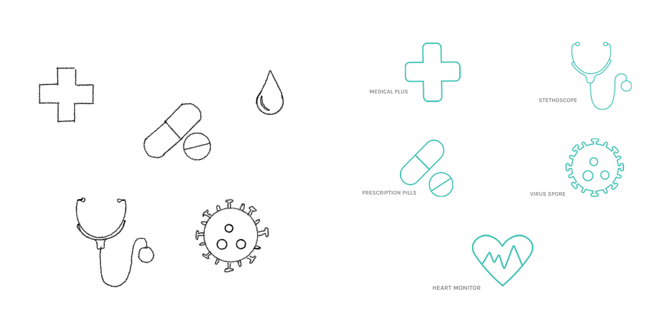
As we opted for a simple yet effective logo choice, I wanted to create some personalised icons for the branding which could be used as a pattern in the app interface. I sketched some icons in Procreate then exported them into Adobe Illustrator where I used shapes and the pathfinder tool to finally produce these seamless and minimal icons. I did decide to not produce the blood droplet icon because it looked like a water droplet in the green colour shade, and after getting some feedback, blood droplets may trigger some users. Therefore I opted to use a heart icon with a heartbeat line making a heart monitor icon.
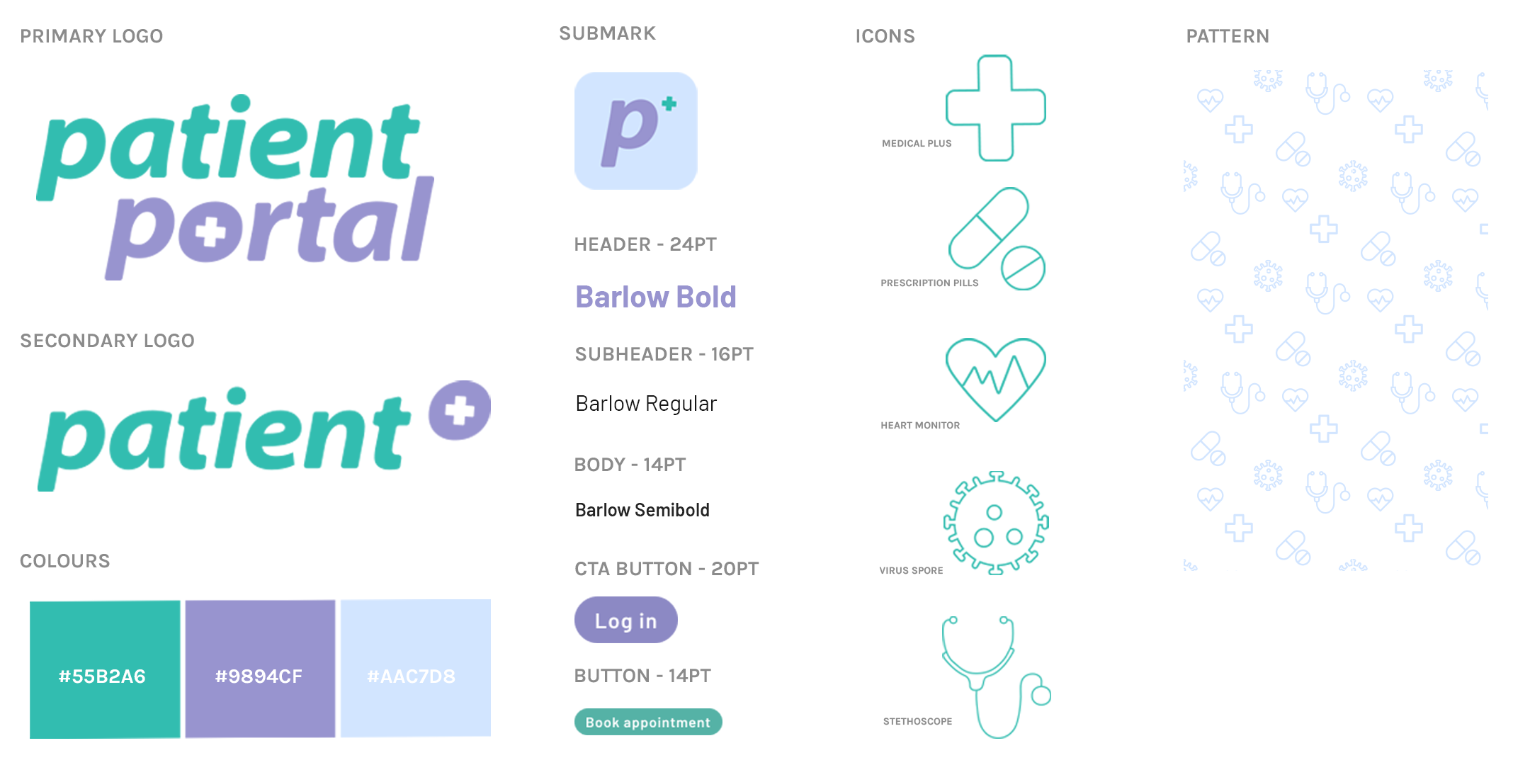
Overview of Branding Guidelines
I produced a set of branding guidelines, or a mini design system, for us designers to refer back to when designing our user-interface. We opted for a sans-serif font as our branding research suggested that sans-serif fonts were the most accessibility friendly, taking into consideration users with sight problems and dyslexia. Barlow is the font I used for the logo choice, but in italic - Using the same, or a similar, font choice in your UI allows the user to recognise which app they are in at all times, consistency is always important in establishing a successful brand. I opted to use different weights of the font Barlow to allow us, as designers, to use hierarchy in our designs without over-complicating our UI.
Adopting hierarchy in our designs allows the users to read the important information first and not be over stimulated by big groups of text.
Team Collaboration
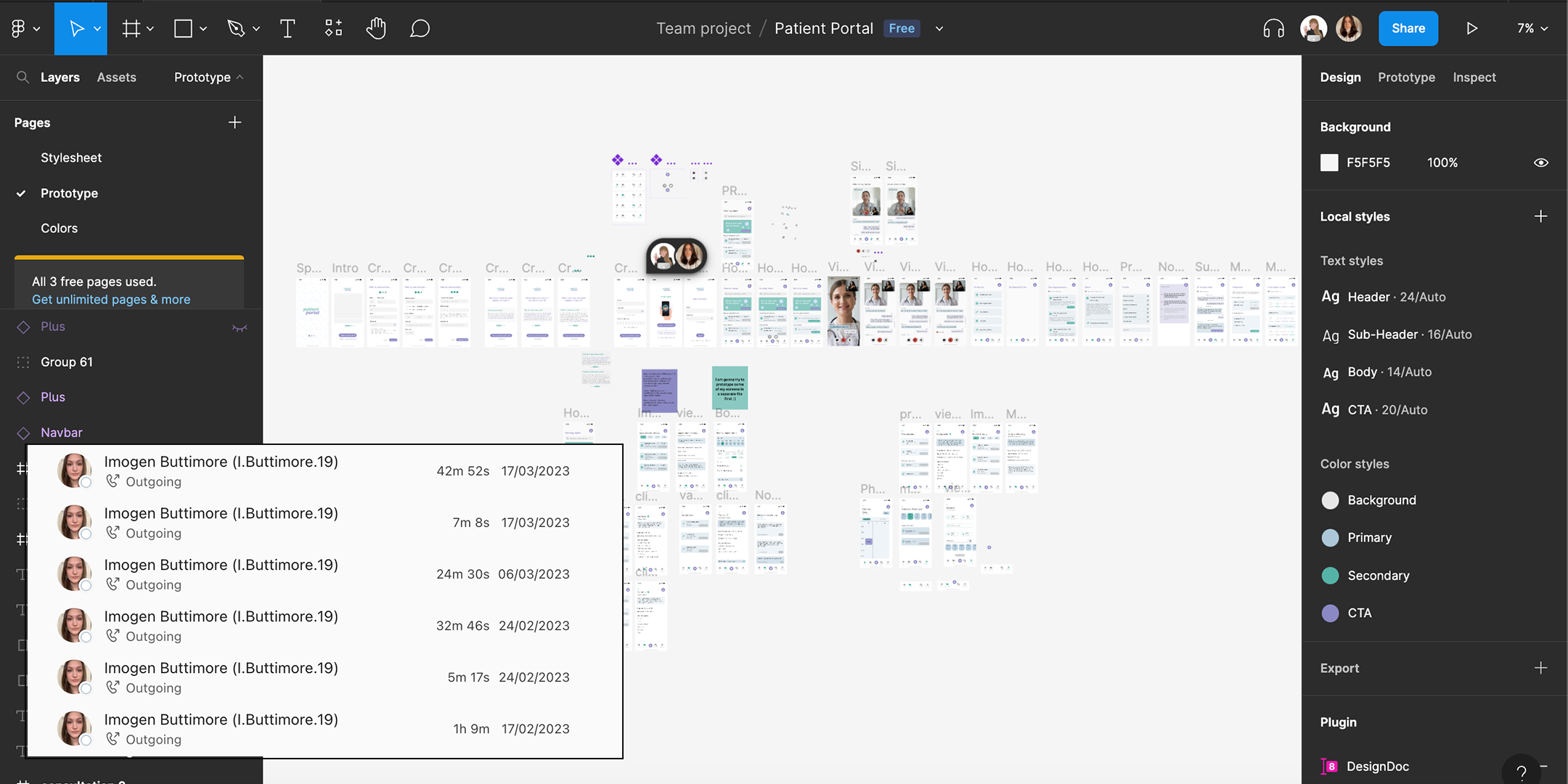
Figma Document
We decided to use Figma to produce our high-fidelity app screens as this software allows real time collaboration. We worked in our seperate spaces but we were often working at the same time and would leave messages for one another to reply to.
Using Figma allowed us to be completely transparent with our design process, where we could bounce ideas of each other and help one another too. It definitely created a industry level team project. We often scheduled a teams meeting so we could talk to each other through our designs instead of leaving notes which was something new to us both and found super useful.
As you can see on the right hand side we utilised Figma's local styles feature which allows us to pull the correct colour swatches and the right font size and weight for a specific use. On the left hand side you can we used optimised the ability to use multiple documents, so we have a stylesheet on the first page, our prototype and then a colours page which is where we brainstormed our user-interface. In the future, I would like to use these pages for wireframes, and seperate prototyping.
High-Fidelity Screens
Splash Screen, Intro Menu and Log In
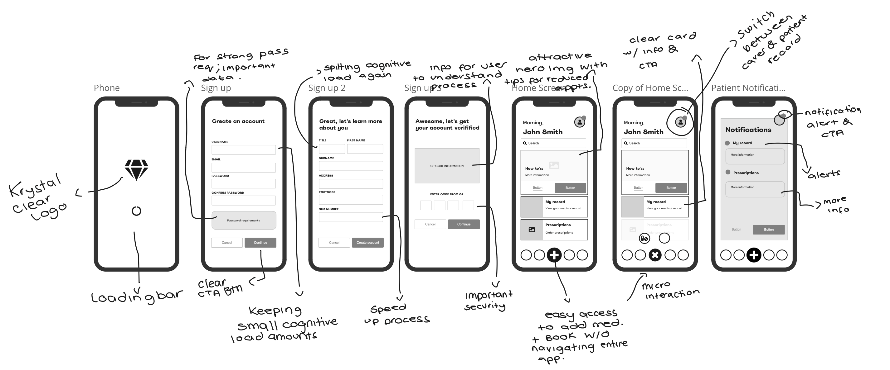
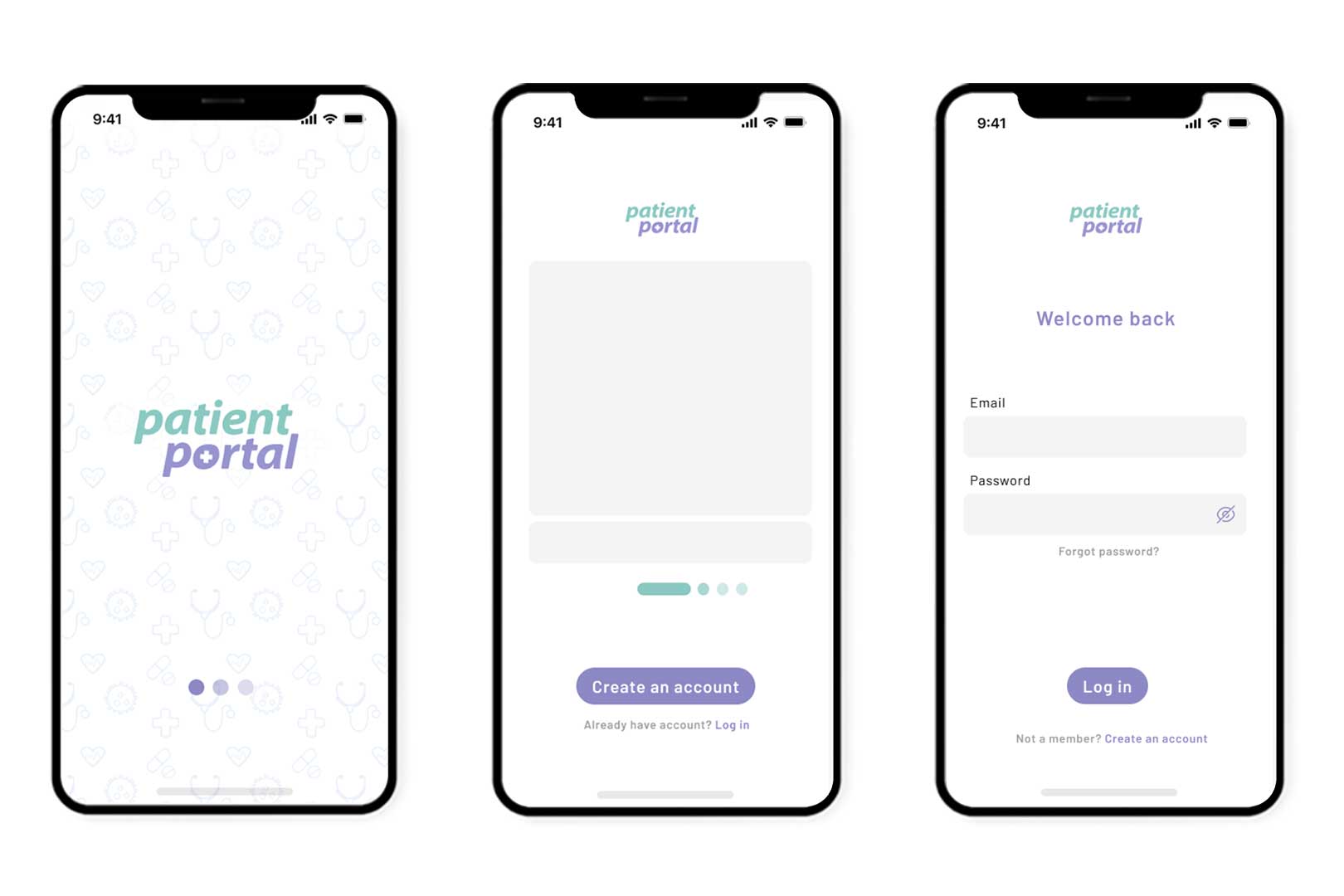
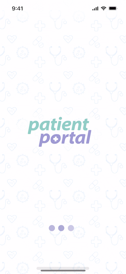
Splash Screen: A splash screen is an necessary part of an app as it allows the app to boot up. It's important to showcase our primary logo while loading up, this helps users know which app they are currently active in. For the loading side, we could have opted for a smart animation, however, I opted to use this simple loading bubble which alternates opacity of each circle - reason being is that this style of micro-interaction would definitely be recognised by our target audience as a loading animation. It is a standard loading feature on many websites, apps and technology.
Intro Menu: An introduction menu is what the user will first see once the app has finished loading. For this design I have opted to showcase some of the app features which give the user insight to what the app can do, increasing interest in creating an account. The main call-to-action is to create an account but we also allow previous users to log in - this screen is usually only shown when the app is first downloaded, or the user has completely logged out.
Log In: If the user clicks log in from the intro menu, they see this screen which is very minimal, simple to navigate. Here we feature a view password icon (the eye) which allows our users to double check they have entered the right password. This feature reduces delay in using the app, using the forgot password link and overall user frustration.
Create an Account
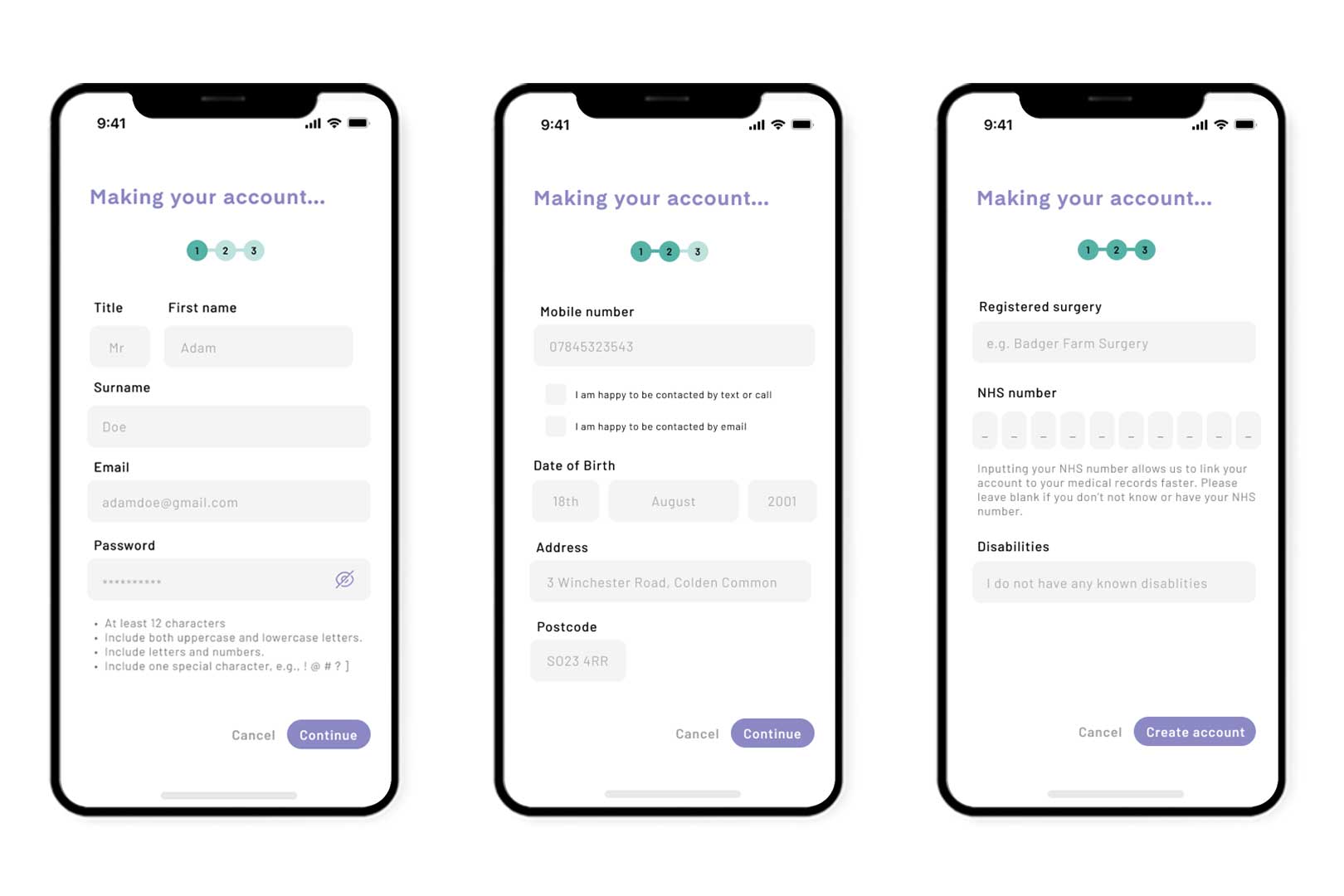
Create an Account: When designing for these screens it was crucial to keep the user's cognitive load low. To achieve this I spilt the sign up process into three screens, I even tried to reduce down to two but it was cramped and left out important information. As you can see from above I have set out password requirements, these intructions are proven to create the password to reduce freud and hacking. As the app is containing important patient data it was vital I include this and keep to the three screen sign up if it meant data protection would be high.
Adding to this, it is necessary to give reasoning for asking for private information. User's often feel reluctant to handover information, however, giving them an explanation to how the app will be using this information often resolves this issue; as you can see in the third screen when asking for their NHS number.
Another way to reduce hesitation is to include checkboxes for the user to specify how they would like their information to be used. In this case, the user can opt in and out of mobile communication.
We also have the progress bar at the top, this allows the user to judge whether they are in the right sitting to complete this form. Allowing the user to see how long this application will take to complete reduces user dissatisfaction.
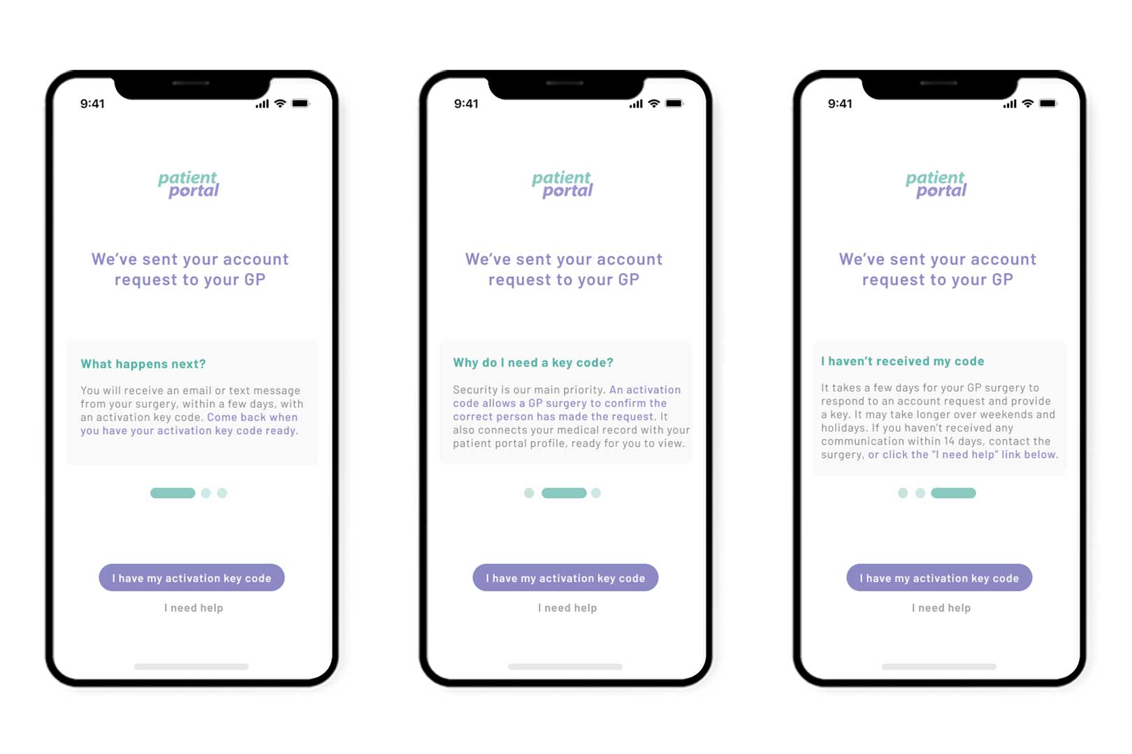
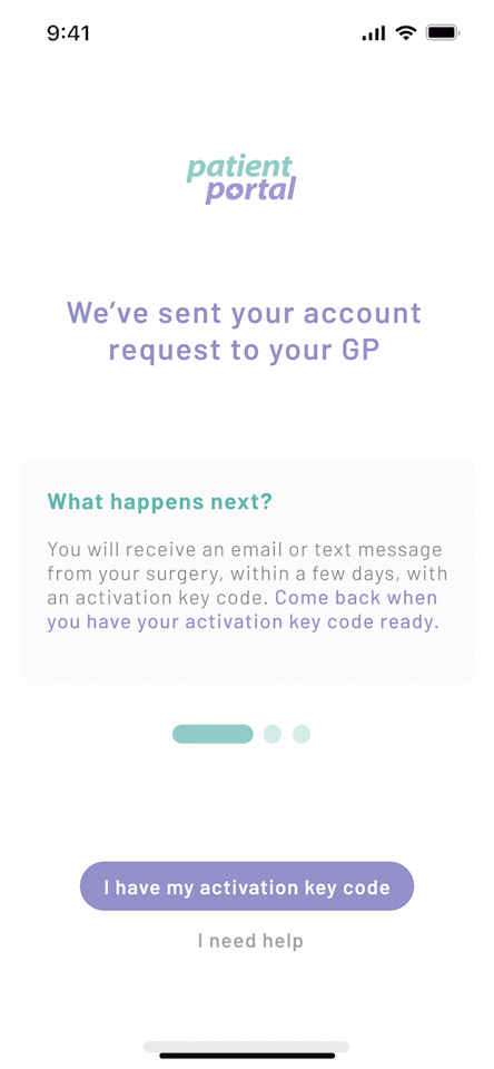
GP Code Explanations
GP Code information: These sets of screens are a result of going through the app process as a user rather than a designer, similar to a user-journey, and noticing I needed to give a "question and answer" style feature after the user has completed creating their account. While the user is awaiting a confirmation code from their GP, their user-experience will be negative with not being able to use the app straight away and an unspecified wait time. To reduce this negative experience, I opted to answer some questions the user might be wondering.
The first set out of questions that pop into my head as a user was; "What happens now, can I use the app?", "Why do I even need a code?" and "What if I haven't recieved a code?" I structured these into a simple explanation with purple (our call-to-action colour) highlighting the important information. I made sure to include a "I need help" button to allow the user to get the best support.
Key Entry Screen, Face Id Screen and Profile Settings
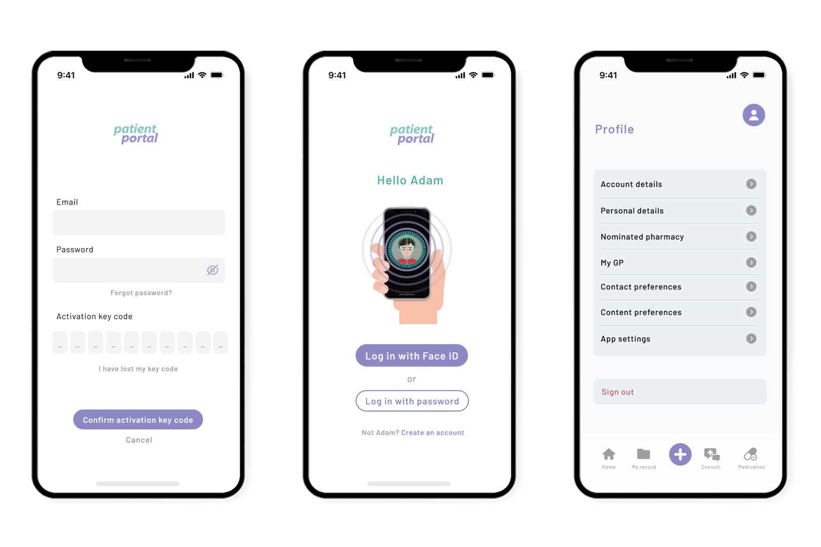
Key Entry Screen: Once the user has recieved their code, they will be able to click "I have my activiation key code" and directed to this screen. For data protection, we ask for the users email and password which they created during sign up and then the code. We've included "I have lost my key code" in-case the code timed out and they need a new one, or they accidently misplaced the code. Also included a cancel option because as a user I would most likely click "I have my activiation code" out of curiosity, or impatience if the GP took longer than anticipated.
Face ID: This screen is what the user will see when they have successfully logged in but has exited the app. I have included two options for users, Face Id and Password. If the case Face Id fails, they can input their password. I have also included a "Not Adam? Create an account" which allows the user to exit to the introduction menu and begin new sign up. I featured this illustration of face recognition for users to quickly understand without reading text.
Profile Settings: Once in the app, as part of brief profile preferences was a must-have. We incorporated all details a user would need to tailor their experience. Account details would be email, password, etc. Personal details would be name, address, date of birth and disabilities. Nominated pharmacy allows you to change your pharmacy and see who you are currently sign up with. My GP is your registered surgery and your registered doctor. Contact preferences allows the user to change anything they submit during sign up, including mobile and email. Content preferences is removing any features of the app the patient doesn't want to see, this could be patient records. App settings is where accessibility is the main feature, changing font, font size, colours, etc.
Home Screen, Nav Bar opened and Blank States
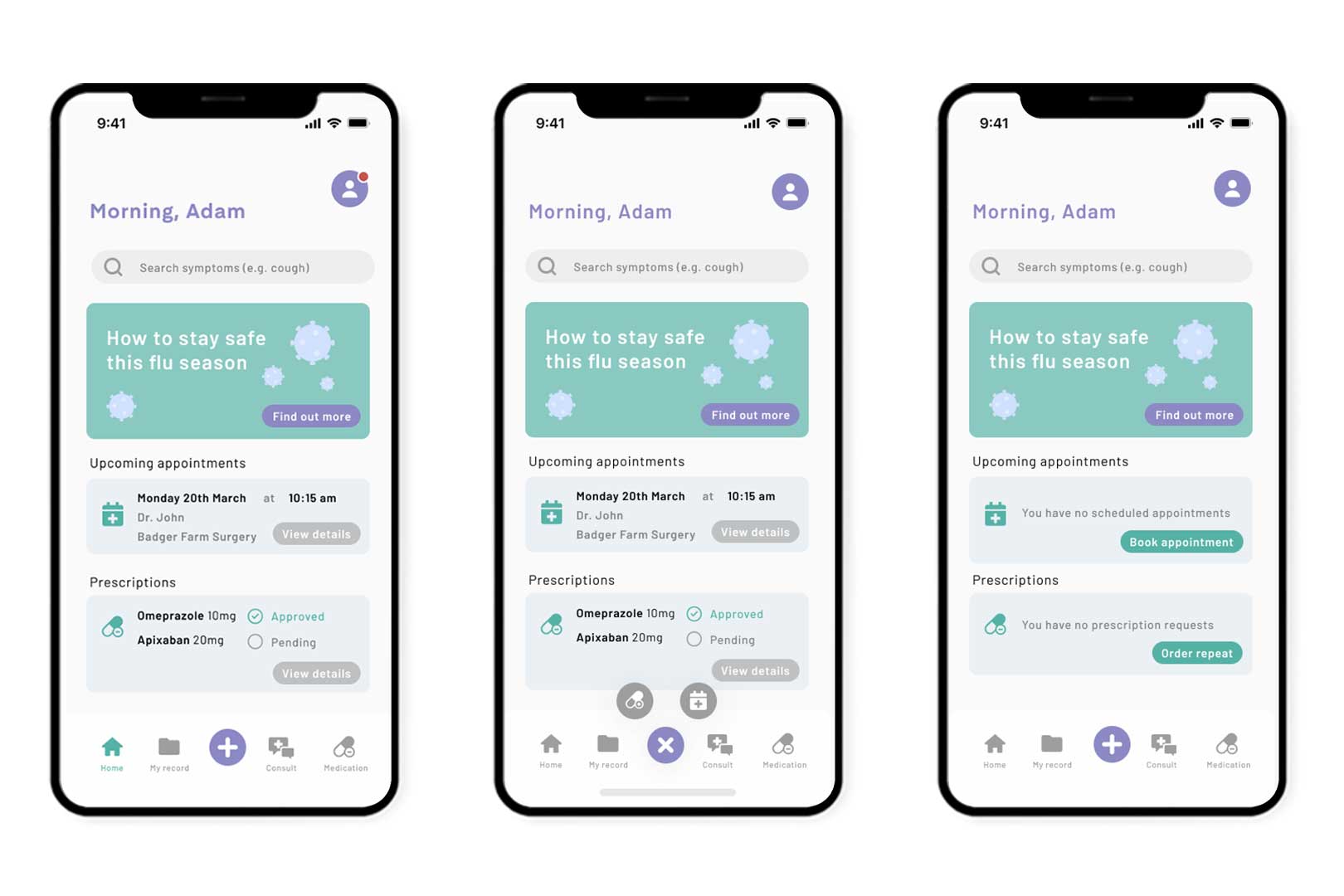
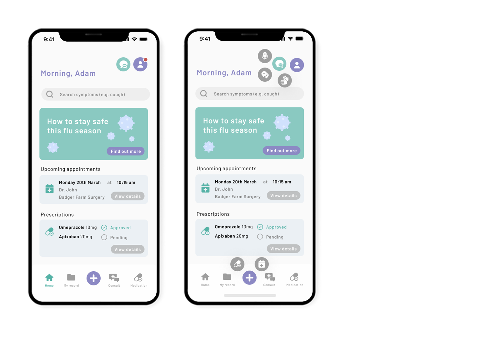
Home Screen: These screens may look exactly the same, however, they represent different stages of the user experience. Firstly, the home screen features a bold header in our call-to-action colour, using the patients name. Initially I had the full name however I felt this was a cold approach. I wanted it to be clear this is the patient's portal but opting to seem we're on a first name basis, fitting well into our friendly branding. I opted for a search bar where users can explore their symptoms, similar to WebMD and our app competitors, this reduces users searching online for answers and the possibility of reading an uneducated diagnosis. It was important to feature ways our app can benefit our healthcare system by reducing the overload of patient appointments. One way I found we could achieve this is giving our users information that could prevent them from being ill. I used an eye-catching hero image that fit seamlessly into our branding, featuring ways the patient could prevent catching Flu.
As we have unqiue nav-bar feature of the plus icon, the second screen is what this would look like clicked on. The plus acts as an "adding" feature, adding another prescription order, or appointment. I initially had some back and forth between what this nav-bar should be, you can read about this below.
Lastly, the blank states represent what the user will see if they have no prescription orders or booked appointments.
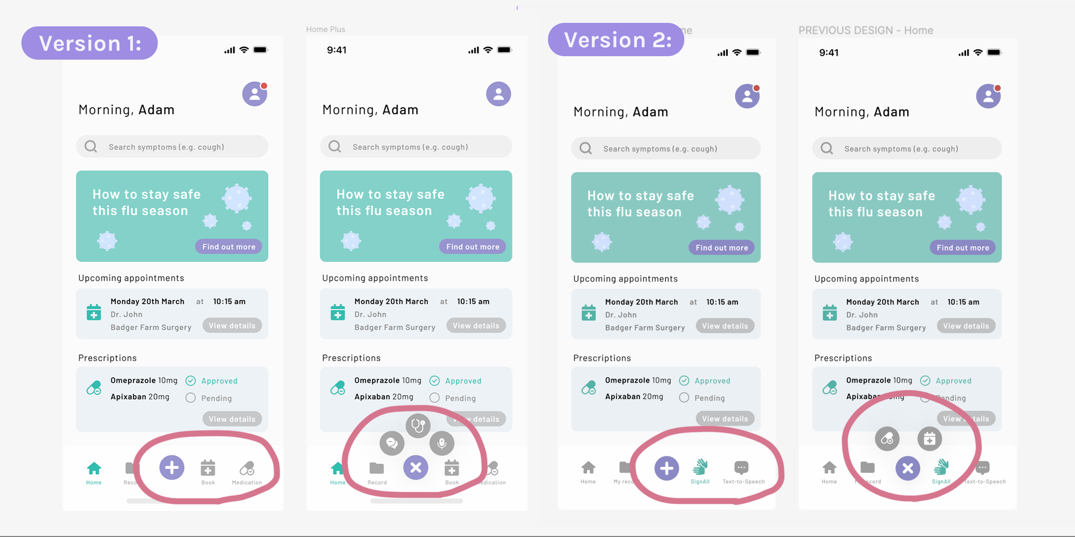
As explained above I had some indecisiveness on what the nav-bar would be feature. I carried out some small user-testing with my design mentor, Anya who is a Product Designer, she reviewed my screens at "Version 1" and suggested I was hiding the main features of the app (video consultation, text-to-speech, speech-to-text) behind the plus button.
I agreed with this and swapped to focusing SignAll (AI transcribing technology software) as a main nav-bar button. However, I felt conflicted as this meant one of the app's main nav-bar buttons would be used solely for a small group of individuals. I opted to go back to my sitemap and resolve any confusion I had which lead to me adapting my sitemap into a much bigger yet clearer project.
I did however like the idea of the plus representing "adding" a prescription and appointment which was discovered solely from this play on designs.
Final Sitemap
With there being a slight back and forth between options for the nav-bar; whether the app focus should be on a specific group or designed for everyone. I decided this hesitation needed me to go back to the sitemap and make adjustments. I spent some time looking over possibilities and made the sitemap more in-depth. I included icons too which helped me think into what the user would see.
This was a breakthrough for our project and I felt more capable designing for this app with more background into how the app would function. I added a communication feature which will be used for users who specified they are deaf at the sign up process. This is also a feature you can turn on in content preferences, if for example you are a non-native speaker and would benefit from these different types of communication.
Video Consultation, Minimise Window and Chat History with Message Alert
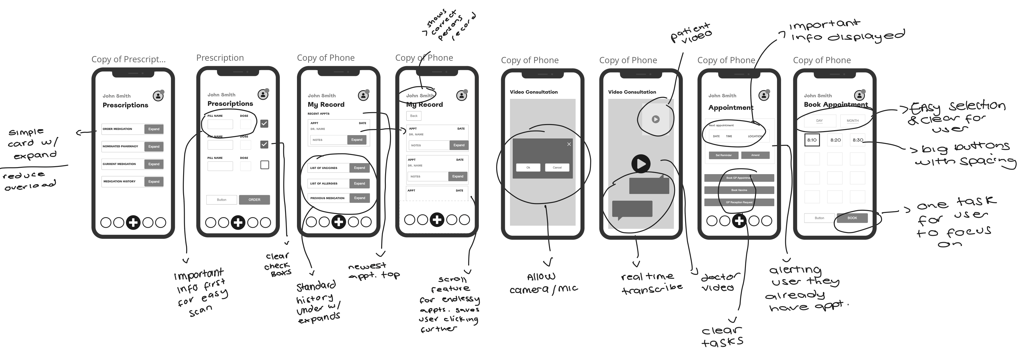
Video Consultation: I tasked myself with the unqiue feature of this app, the video consultation which is a brand new feature never been designed for. I initially played with different ways this could work but following Jakob's Law of Familiarity, I opted to use a design similar to iOS Facetime. This allows users to instinctivly use this feature without needing to learn something new. I included the same layout of video settings; end call, turn video/mic off. Some important features of these screens is the ability to see who you're talking to (i.e. doctor/patient) on the entire screen, which is benefitical for sight issues and giving a more realistic consultation experience.
Although I still needed to prioritise the transcription feature, I opted for a glass like background to minimise distraction and still have the ability to see the person if their head was covered by this box.
I included this scale icon which allows the user to view the entirety of the chat history/transcription. This allows the user to scroll up and down, with the scroll feature placed on the right hand side. One issue I had was how the deaf user would know the doctor had said something if they were looking into the chat history which is why I created this "new message" alert that pings up. I did play around with forcing the chat to pull back down to the new messages but decided against this for user-satisfaction.
My first version of this feature had a smaller scaled video, prioritising the transcription. However, I decided against this as I mentioned above. I unfortunately had to use a different doctor image when increasing image size as it pixelated.
My Record, Consult, Book an Appontiment
My Record: This is what the patient would see once they click on "My Record" on the nav-bar. I spilt them into cards, using a strong visual label of what each one was. I didn't think it was necessary to add a description as this over-complicated the design and increase user workload.
Consult: When clicking "Consult" the user would have this selection to choose from, whether it's to book through the surgery, explore services or send a message to their surgery.
Book Appointments: Once the user clicks book an appointment, from various different paths in the app, they will arrive here. I have made it very clear that video consultations will only work when send an invite code. The user must complete an e-consult (a medical questionnaire) for the app, or surgery, to determine whether they need to go into the surgery for a face to face appointment, telephone or video consultation.
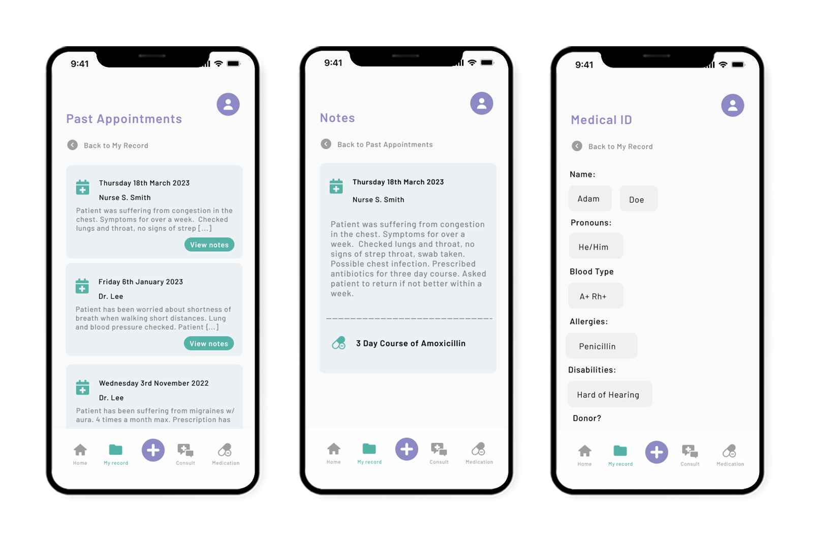
My Record, Past Appointments, Expanded Doctor Notes
Past Appointments: A look into what a user would see once they click on one of these tabs, it opens into a seperate page where they can see an overview of the patient note from each past appointment. This would be an endless scroll feature which is proven to increase user-experience, rather than making the user click in and out of unnecessary screens. I have featured a back button with a clear discription of where this leads back to.
Notes: This is the expanded view of each past appointment tab. It features date, practitioner and their notes. With the prescription underneath for clear understanding of how this appointment was resolved.
Medical ID: I included a medical ID for the patient to use, including blood type and identity preferences. Thinking about the doctor and nurse persona's using this they would find this information handy to view before consultations.
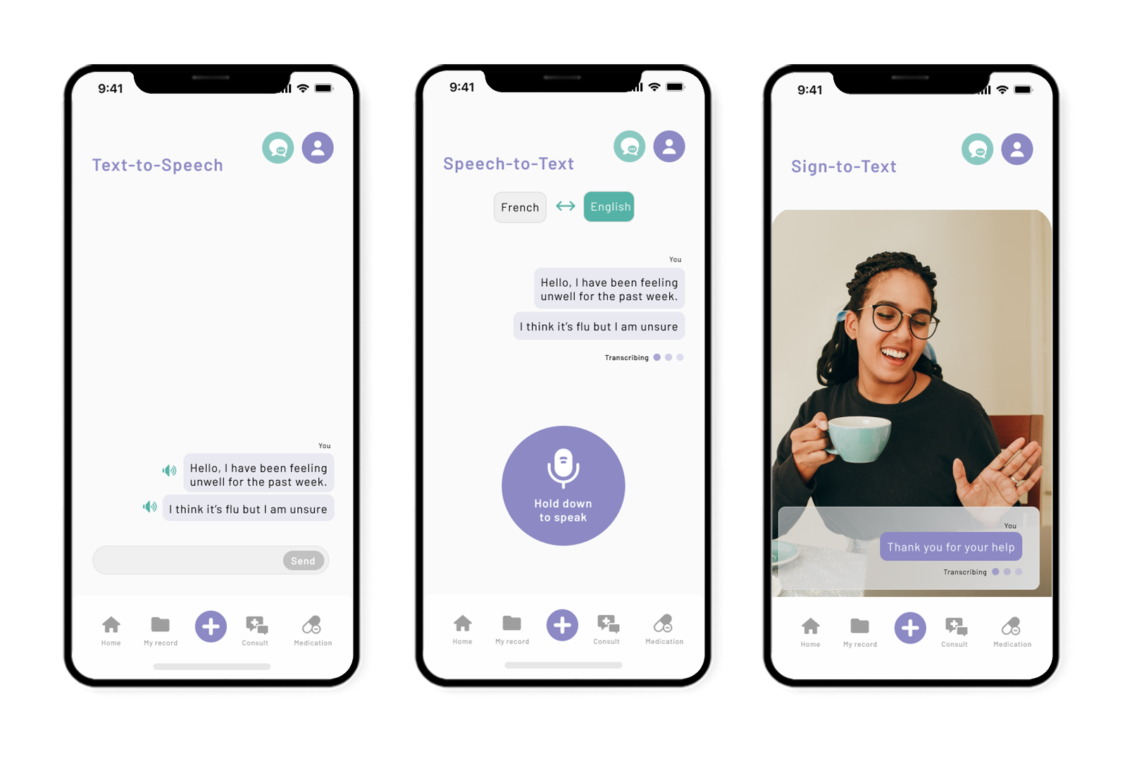
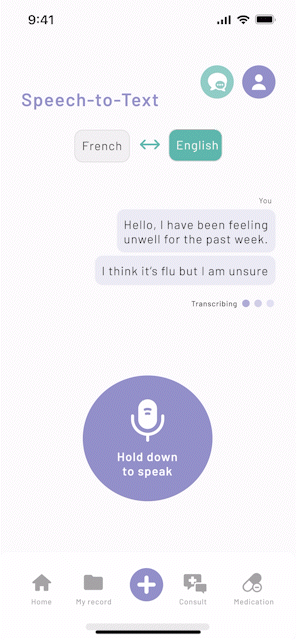
Text-to-Speech, Speech-to-Text and Signing
View from deaf user's experience
These screens capture what it would be like for my deaf patient persona Tom. He would be able to say he's deaf from the disabilities drop-down in create an account, or add later in profile. He would see this icon by his profile and when clicked, opens a nav selection for him to choose from. I have included all the features our client wanted and demonstrate how I would envision these to look and work.
Surgery Chat, Medication and Prescription Progress
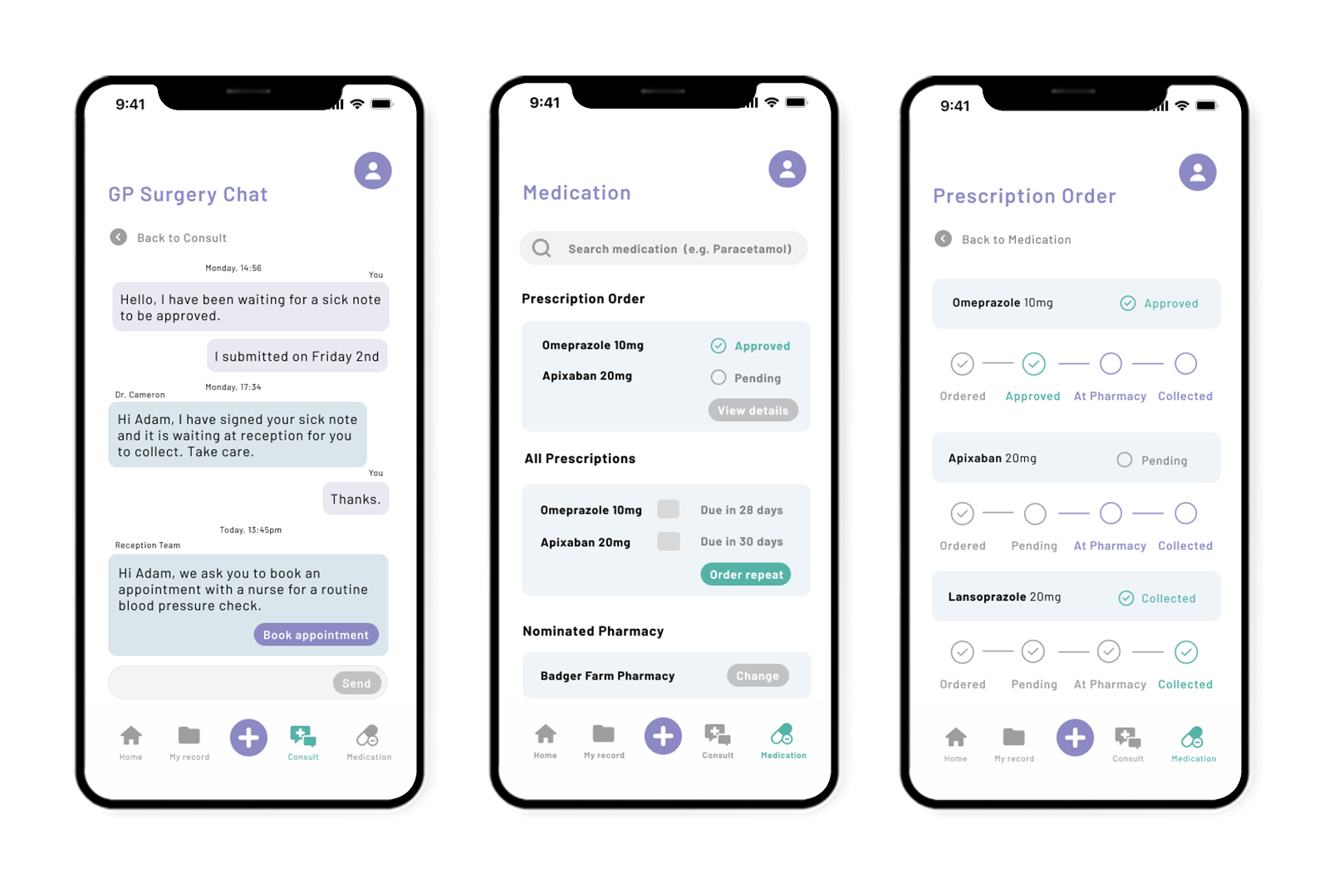
Surgery Chat: Another feature of this app we wanted to include, and asked by our client, was the surgery chat feature for open, clear communication. Within this feature both surgery and patient would be able to message, reducing telephone wait times for reception staff. I've included features like "Book Appointment" where the reception team can ask the patient to make an appointment in app, by simply clicking on this button.
Medication: This screen would be what the user would see once clicking on the medication tab. It features a search bar where they can search up their medication, giving them detailed information. It also features the same prescription order card on the home screen. Then a summary of their prescriptions, current or past where they can request a repeat.
Prescription Order: I had this idea when going through the screens as a user myself, during a user-journey, and found that "view details" button on the prescription order should be insightful to where exactly their medication is and at what stage they can expect to go-to the pharmacy. While at the Transmedia Event, a member of the public told me that she often has to ring both the pharmacy and her GP to check the stage of her prescription. This screen solves this issues for all parties.
Prototyping
Despite delays in the project I was still able to get achieve some quick prototyping. I focused on mirco-interactions to guide users. "Micro-Interactions are used to communicate feedback to the users because a user has to constantly know what happens when an action is performed. It’s a user's expectation to see something to happen when you click a button, scroll a page, swipe a card." (medium - uxdesign)"
These are just some of the micro-interactions I included. We have the loading bubbles on the splash screen, the swipe through cards and the microphone listening to you
I have completed a fully working prototype that you can see me demonstrate in the left-hand video below, but if you wish to have a go yourself there's the prototype on the right too.
User-Testing
Unfortunately, I was unable to complete some user-testing on this final design. I initially had plans to go onto forums like reddit, or discord and find groups within each of my user-personas and ask them to go through my prototype, leaving any feedback. I also was hoping to ask the lecturer in nursing, who was a nurse, to do the same. To perform user-testing I could either perform this moderated or unmoderated; moderated would be with me probing questions to my user, and unmoderated would be unsupervised, leaving the user to answer questions and try features out on their own.
Set of questions I had prepared: How simple was it to navigate the app? Was the information and features easily accessible? Were there any features in the app that you expected but did not find? Did you have any problems or confusion when using the app? Did you like the app's overall look? Were there any design features that drew your attention? On a scale of 1 to 10, how would you grade the app's overall user experience? And with finally thought of: Is there anything else you'd like to say about your app experience?
SDG 17
For this project we were required to think of how United Nations Sustainability Development Goal 17 could fit into our project. Patient Portal allows partnerships with healthcare providers give medical access to all (SDG Goal 3). By allowing patients to use services like booking appointments and ordering prescriptions online we are reducing excessive need to drive to their surgery. Virtual consultations allowing patient who are unable to walk to their surgery, who often have use a car, stay at home which improves accessibility but also emissions.
Project Overview
In reflection, I found this project to very challenging. In the 12 weeks we had I felt I have successfully researched, brainstormed and produce high-quality work I am pleased of. I feel have a learned a lot during this project and enjoyed diving deep into implementing new technology such AI. However, I suffered a loss during the 12 week project and found it very difficult to keep to my time schedule while grieving.
We also had a lot of time wasted doing multiple logo designs because we had not settled on an app name. Although I felt I dealt with this well by continuing on with project with no logo or name, I wish we had discovered the name sooner and this would have helped with schedule problems (like above) when I needed to be absent from work.
Aside from the design outcome, I thoroughly enjoyed the team side of this project. Our collaboration was incredible, we worked together every single week and leaned on each other a lot. Team communication was constant and there was no stage in this project were we failed to work together.