Brief:
Freebe is a project solution in response to the Royal Society of Arts brief one in the 2022 RSA awards. This project is an app that allows local businesses to offer free or reduced well-being services to their local community. With the decrease in community support it was important to get the community connecting again and regain helping one another. I choose to focus on well-being services as it matched brief one’s criteria, and it’s important that everyone has access to improving their mental health. This app aids in the success of local business, improves well-being of individuals and regains connectivity between neighbours.
UX/UI Design, Branding & Identity
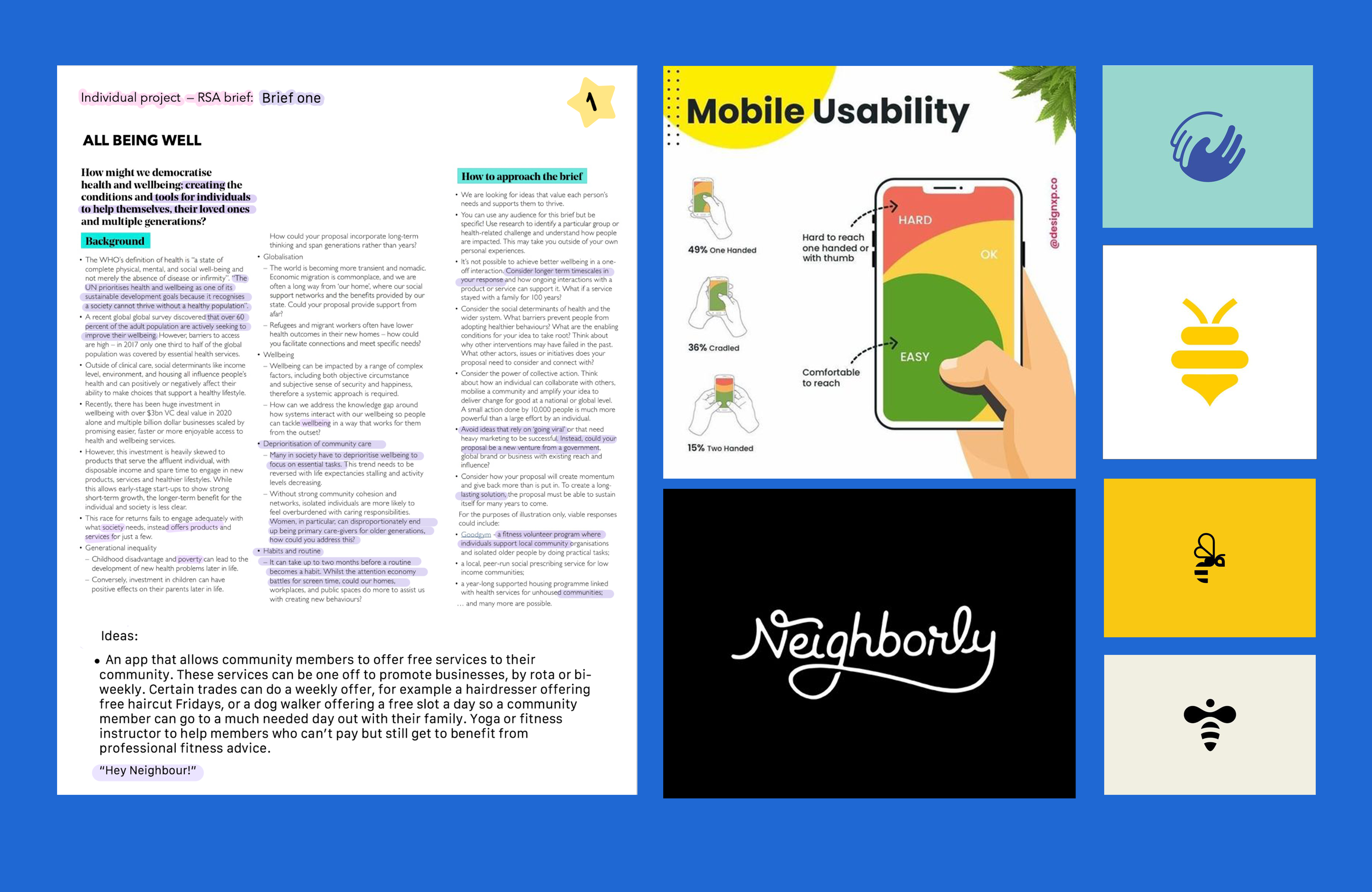
1.1 I highlighted keywords in each of the eight briefs to inspire solutions for this project. I addressed a few briefs, but after gaining a second perspective from my peers and lecturers, my response to brief one, All being well, appeared to gain interest. Brief one covered well-being, low income, and community support. Integrating all three was crucial. I researched each topic and discovered a connection. Since the COVID-19 pandemic isolation phase, community support had declined dramatically and remained low. Many people's mental health deteriorated during this isolated time (Singh et al. 2020), and with the financial crisis, they can't afford gym memberships or treatment.
1.2
In terms of viability, I needed to know where businesses would get their funding. I initially wanted businesses to offer these services for free, resembling local media success stories, however this seemed unfeasible. I tried government job-seekers benefits, but just a few benefited. I explored a subscription service. However, "Eat out to help out" was beneficial for restaurants (Nunez et al.), so I explored a similar scheme. "Eat out to help out" was a government initiative that encouraged people to eat out after the pandemic lockdown, however what about other businesses that were still suffering? It seems vital to have encouraged UK individuals to return to their well-being hobbies. All these services improve well-being. Similar to food businesses after lockdown, businesses should be able to claim back a portion of the discount by offering free or reduced services to neighbours. Government mental health programmes get £112 million. This app helps mental health, local businesses, and societies. For initial growth and success, the app should receive some of this funding. I discovered that businesses are using alternative marketing tactics to avoid paying Google and Facebook for ads (Sekyere, 2020). If local businesses set aside their advertisement money to support themselves to give free services it promotes a better image of the business and helps their community.
1.3
I found this proposal unique and unchallenged during my initial research. I analyzed the UX/UI of relatively similar applications like Olio, Karma, and Too Good To Go. Olio is a marketplace app that enables people to provide free food or furnishings to their community (similar to Karma). These apps have various UIs but similar UX. Due to their significant research and possibly paid user-testing, I ought to follow their standards and procedures. I used margins and Apple's iOS rules while designing. To accommodate user fingers, I utilised 44px (Fitt's law: Touch targets should be large enough for users to accurately select them, (Yablonski)) and a UX thumb zone to place critical functions in easy-to-reach areas (Ingram, 2016) . To maintain stroke weight, I chose icons and illustrations from one artist. All fields have 4px padding (Zhulidin, 2020). Branding, fonts, and colours passed user accessibility testing.
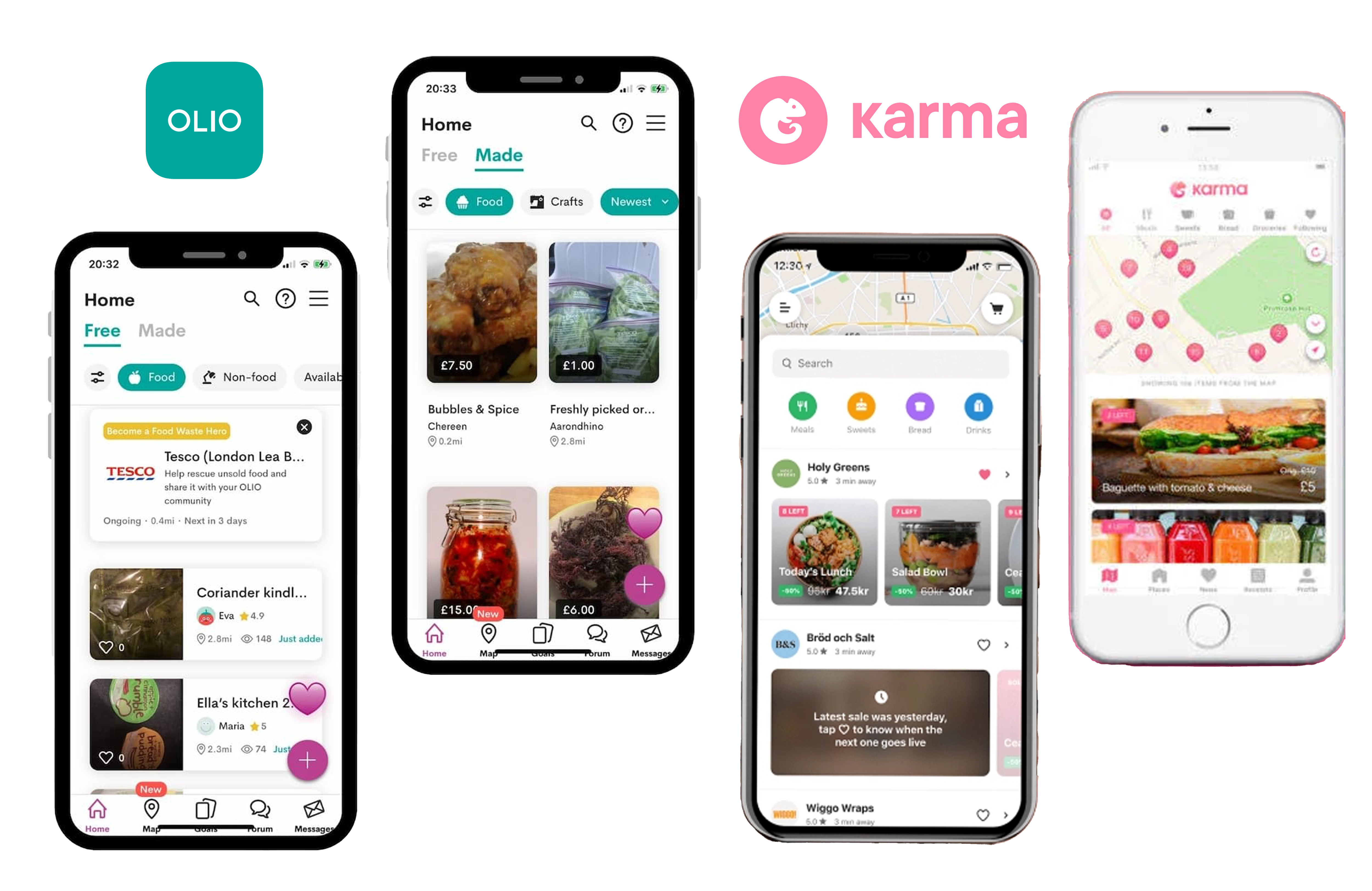
Olio App (2022) and Karma App (2022)
Empathise
Freebe User Personas
2.1 I developed user personas to better comprehend what my application's users would need from its user experience. Personas are used to design products with a specific, not generic, user in mind (Faller, 2019) Empathy is a vital value that helps all who will use it. Personas enable designers in understanding and sympathise with end-users by delivering a similar perspective. When creating sitemaps and wireframes, I found these user personas to be extremely useful. They enabled me to enter the head of my user. I often referred back to them to confirm that I was developing with the user in mind.
Freebe Sitemap
2.2 Above is my sitemap. A sitemap will assist me in determining what functionalities to add to my app and ensure that no screens, such the landing or introductory screens, are left out. I opted for apps over websites or print advertisements to reach an extensive audience for my product. I wanted local residents to help each other, however without the "What's in it for me?" mentality, it's difficult. A local yoga class may offer a free Friday afternoon session on Freebe. An individual may be ignoring their mental health whilst also working full-time and raising a family. They notice the post/ad that offers a free yoga session, begin addressing their wellness, and turn into a potential client.
Create
3.1 For my logo designs I wanted something symbolic to represent a bigger picture. I initially struggled to come up with a unique app name that wasn’t already taken. I used some websites to generate names but the names generated seemed too long. I did some light user testing with peers to gain perspective and none of them stood out. That’s until I started playing around the most important benefit of this app, the free services. To really capture user attention I felt it was necessary to focus on the word choice of free or freebies. I did some research into bees because I was aware of their strong will to be in a community and work together. Freebees seemed like a good name but after consulting with my peers again, “Free bees” could imply something entirely different. After my feedback I dropped the double e in bees, and settled on Freebe. I kept the initial bee concept and this definitely sparked some interesting logo concepts. For my first logo I wanted to portray a kind, relaxed theme so I adopted for a line drawn bee. I then played with a very strong structural bee to compare and finally a bee that had a body of a location tag which tied closely to the features of my app. I did some logo user testing and found that the line drawn bee did in fact give a playful, comforting feel to my app. With the logo chosen, I decided to stick to bee theme (black and yellow) when choosing a colour palette to create a strong brand. I then opted for a sans serif font to balance out the line drawing.
Freebe mocksups
Freebe Low-fi Wireframes
3.2 Based on my sitemap, I made some low-fidelity wireframes. It’s much simpler to prototype later if I’ve previously created some basic wireframes; low-fidelity allows me to quickly alter the wireframes as needed and produce in less time. You’ll notice that everything is monochrome (black, white, or grey) so that I can focus on the user experience at this time rather than the user interface. Recently, I’ve experimented with utilising yellow as an accent or call-to-action colour. One aspect of this design that I immediately adored is the progress bar for sign-up, which I made to look like tiny yellow bee hives; this keeps the branding strong throughout the app.
Freebe Initial UI with Yellow & Black
3.3 Initially I started mirroring my wireframes into Figma screens, supported with my sitemaps and user personas. However, when I started to get further into the app (mainly the home screen) I found my colour palette was swaying peer feedback to negative. I decided to investigate the colour yellow and found that because yellow is a warning colour (amber traffic lights) people prefer to stay away from this shade (the Aesthetic-Usability Effect: Users often perceive aesthetically pleasing design as design that’s more usable.) My app will be dealing with important user data, payments and bookings I need to gain user trust from the beginning; which is my branding.
I decided to look at the colour blue (a popular colour used in apps that process payments and hold important data). Research into blue gave me the confidence that changing to blue would be a good step forward, but I was worried changing colours would lose my theme of the strong bee community. I wondered if there was a bee that was blue, and by chance there was. The blue bee likes solitary but thrives in small groups, which fits my user personas perfectly. I started to gather inspiration for advertisement and taglines further down the road.
I picked a blue colour palette with light and dark hues, accompanied by monochrome shades like grey, white and black for my empty states and text. I liked the look of the call-to-action colour being a light blue however my mentor reminded me it is important to stay to bold shades and comply with accessibility testing. After passing all my colours through the user accessibility screening I finalised a colour palette.
For these screens I used a margin template (created by myself with information from UX guidelines) to make sure that I was compliant with iOS guidelines.
Freebe Styleguide
Freebe Styleguide
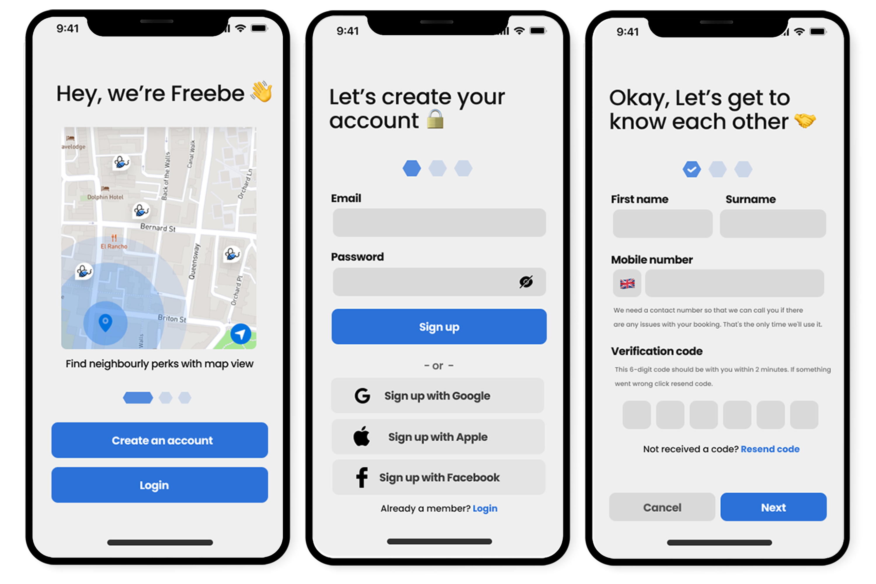
Introductory screens
Splash Screen and Create an Account
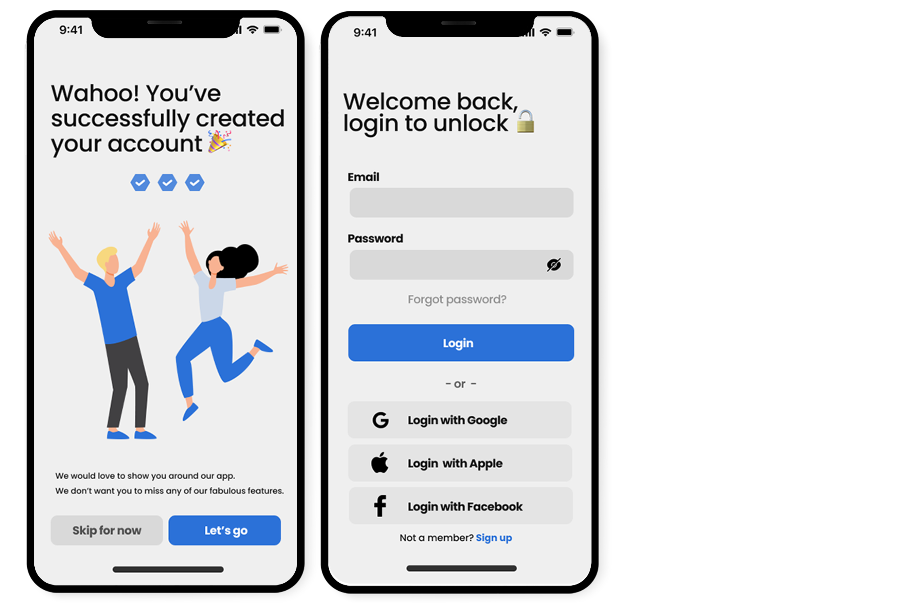
Success screen and Login
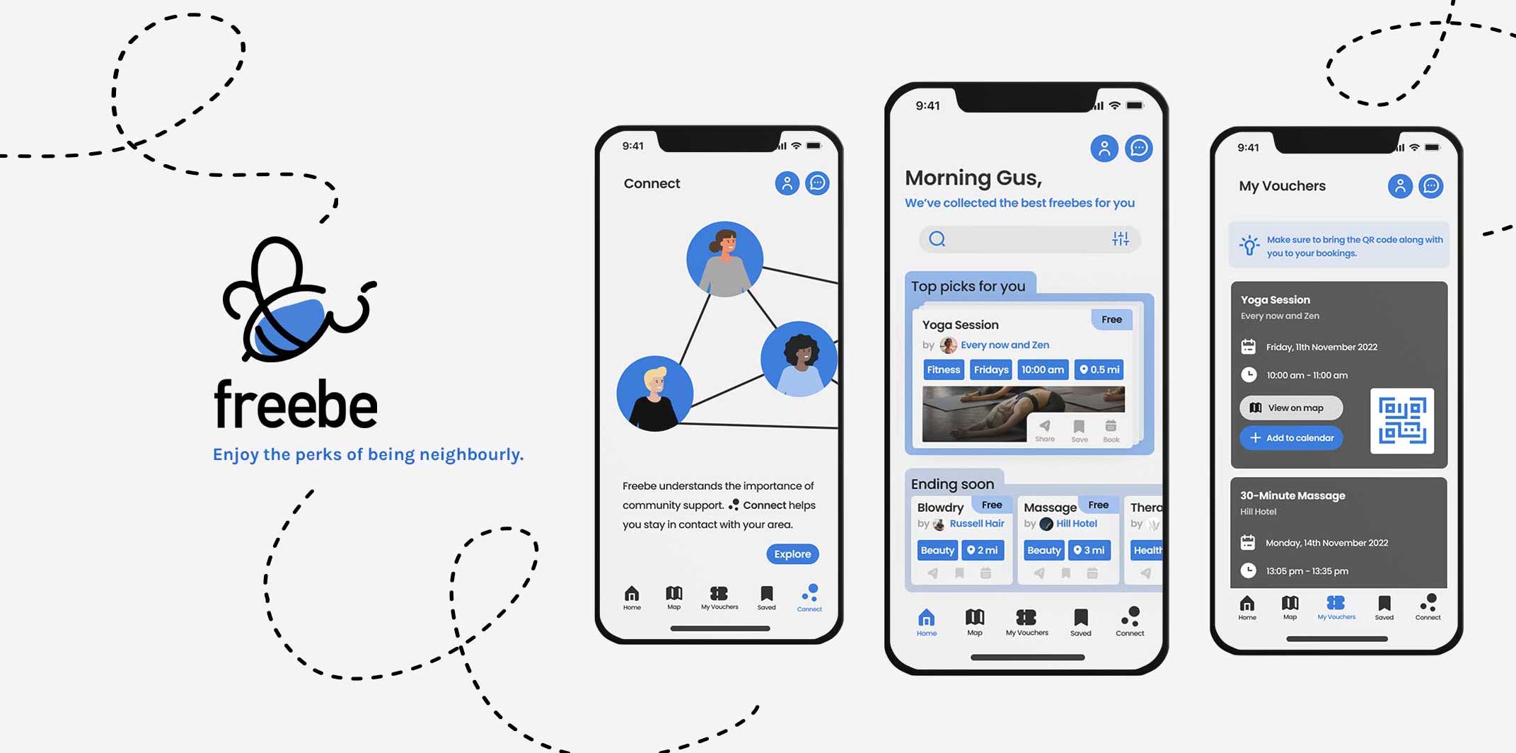
As you can see I wanted to keep the design clean and with minimal distraction to keep my user focused on what was being asked of them. I created a simple splash screen so my app has time to load but isn’t too flashy to match the rest of the app. I used a “honeycomb” progression bar to fit the theme of my app. I made sure all my buttons and fields were at least 44px for the user to be able to place their finger onto the button. Acknowledging that my user will need to be able to read the field labels clearly I used a heavier 16pt font. I wanted to give the user quick options for sign up which is why I enabled Google, Apple and Facebook sign up. Instead of “confirm password” I used a “show/hide” icon so that users can double check without being put off by the duplicated fields. Throughout this app I opted to use emojis in the headers to give a comfortable, positive tone to my users. Once sign up is complete the user is presented with a successful sign up screen, I used an illustrator to give excitement.
App features
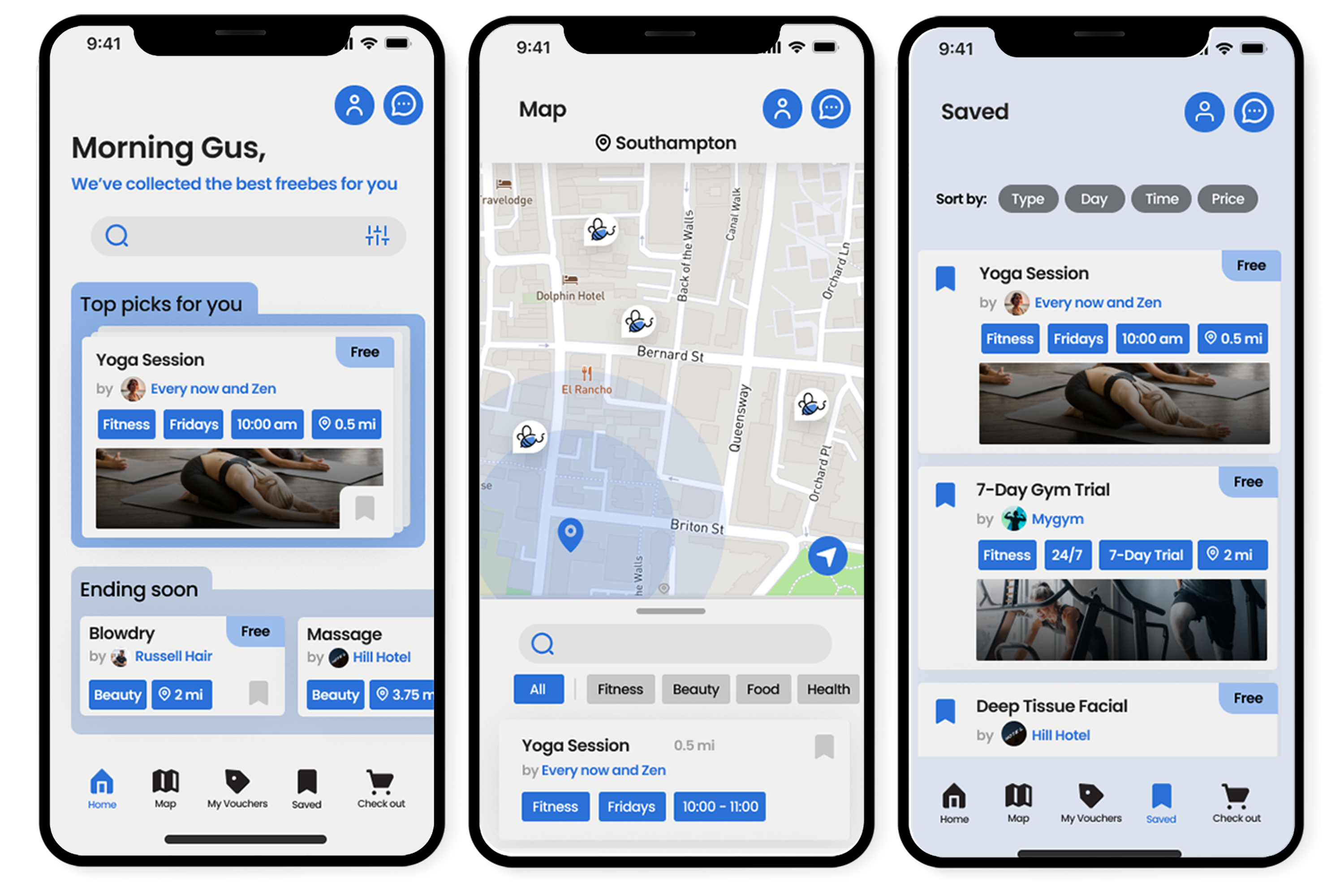
Home, Map and Saved
Nav bar, Message Menu and Conversation
For the home page I opted for a card stack feature similar to successful apps like Tinder. I opted for this feature as users can swipe away any offers that don’t interest them, although they are able can save them and at the same time gives the business the time to shine. I made sure that the card had important information to secure a sale; price, event title, business name, time, date and picture for visualisation. Accompanying all this important information I wanted to add a category label which tells the user whether it’s fitness, health, etc.
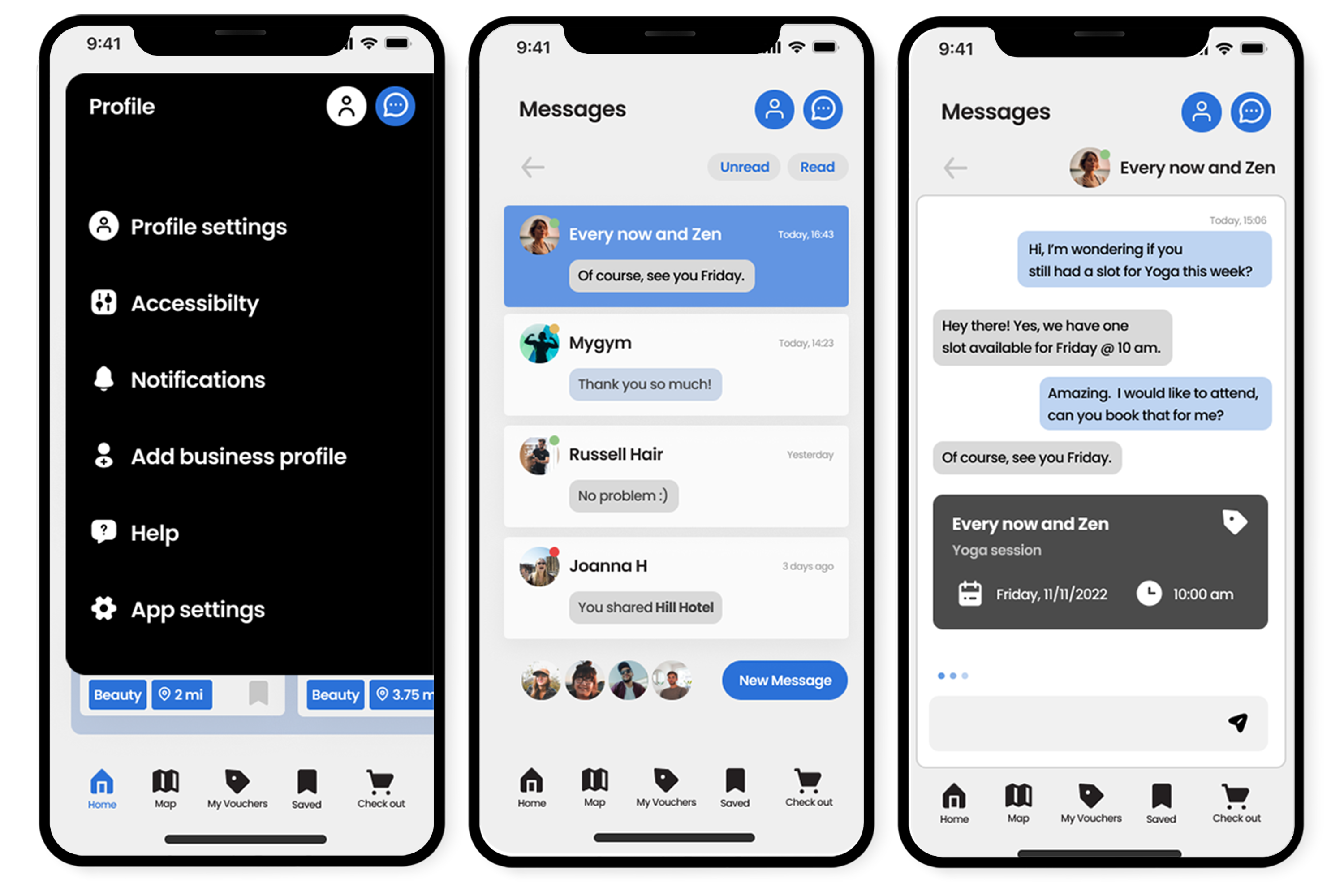
When doing my research I noticed a common theme of messaging being available for users for multiple reasons. I decided to create messages originally for the user to ask the business any questions they may have or even book directly through the business. Then it evolved into allowing users to share offers with each other which creates a great connectivity aspect to this app.
Saved was an important feature I wanted to keep on the tab bar. It was important for my users not to lose any offers that they liked the look of but wasn’t ready to book. This prevents users from booking an event for the sake of not losing it which could increase the likelihood of no shows.
When the user clicks on the person icon it opens a nav bar that displays all the settings the user would need in this app. Important mentions are accessibility, help and profile settings.
Check out
Check out, Donation, Payment
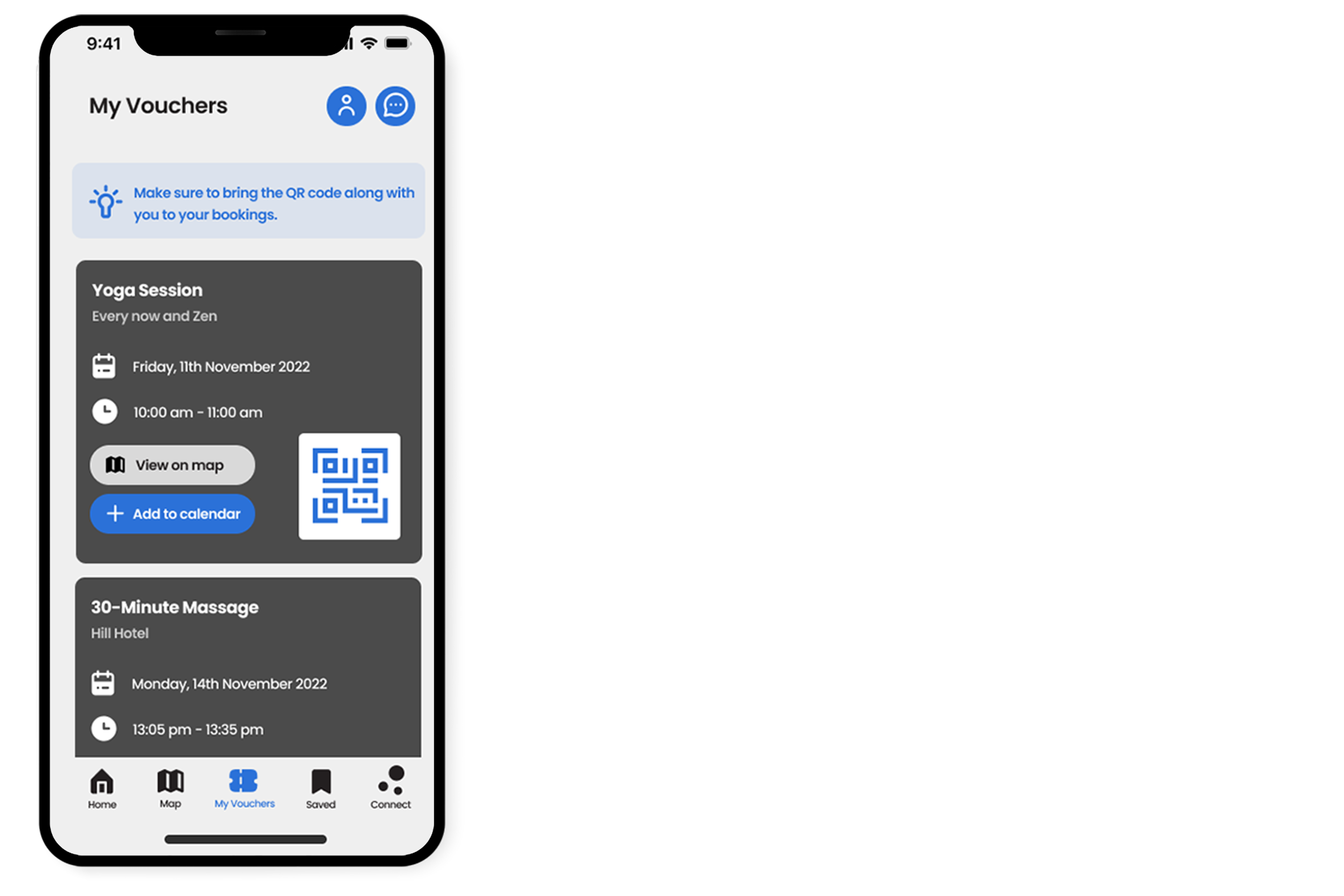
My Vouchers
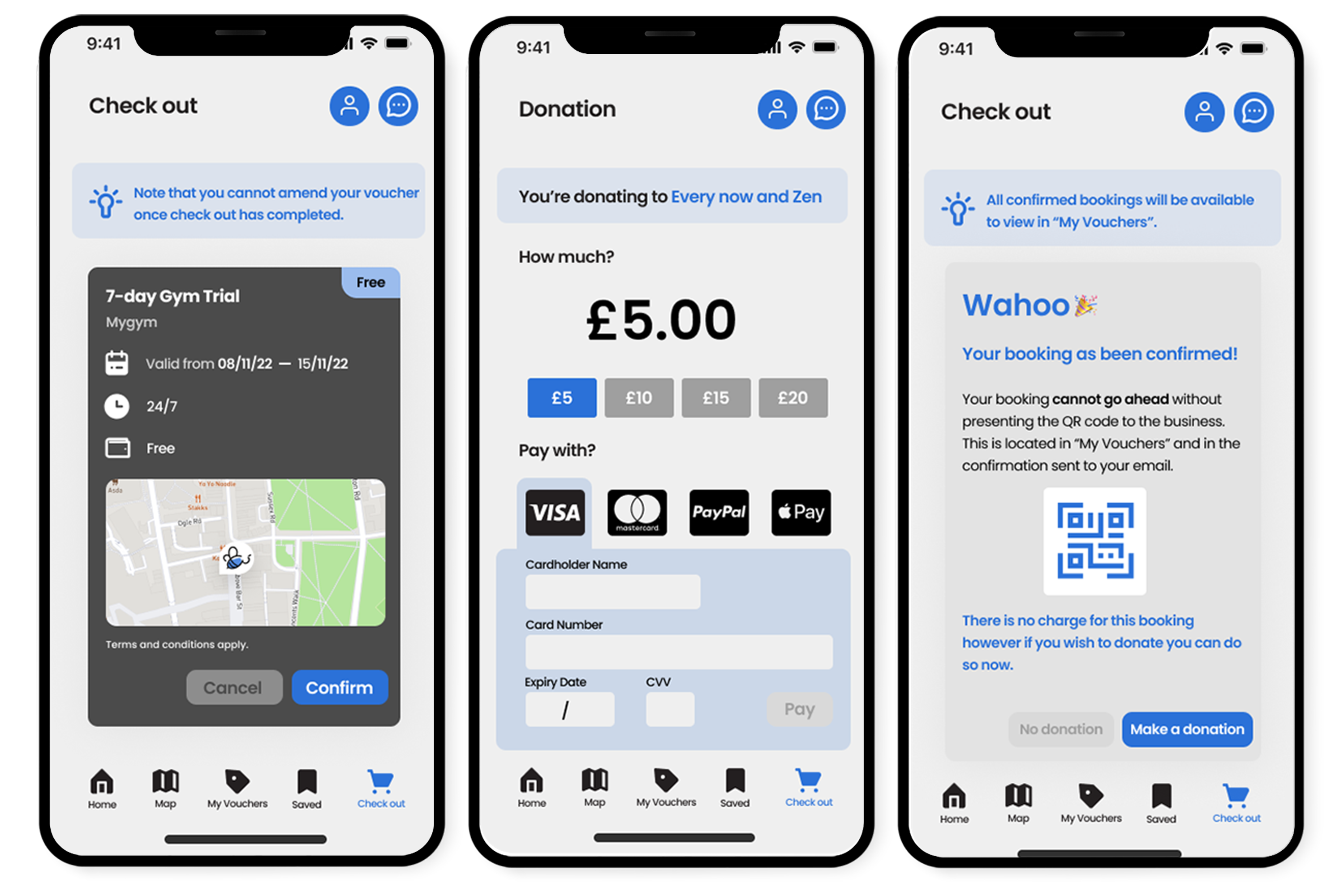
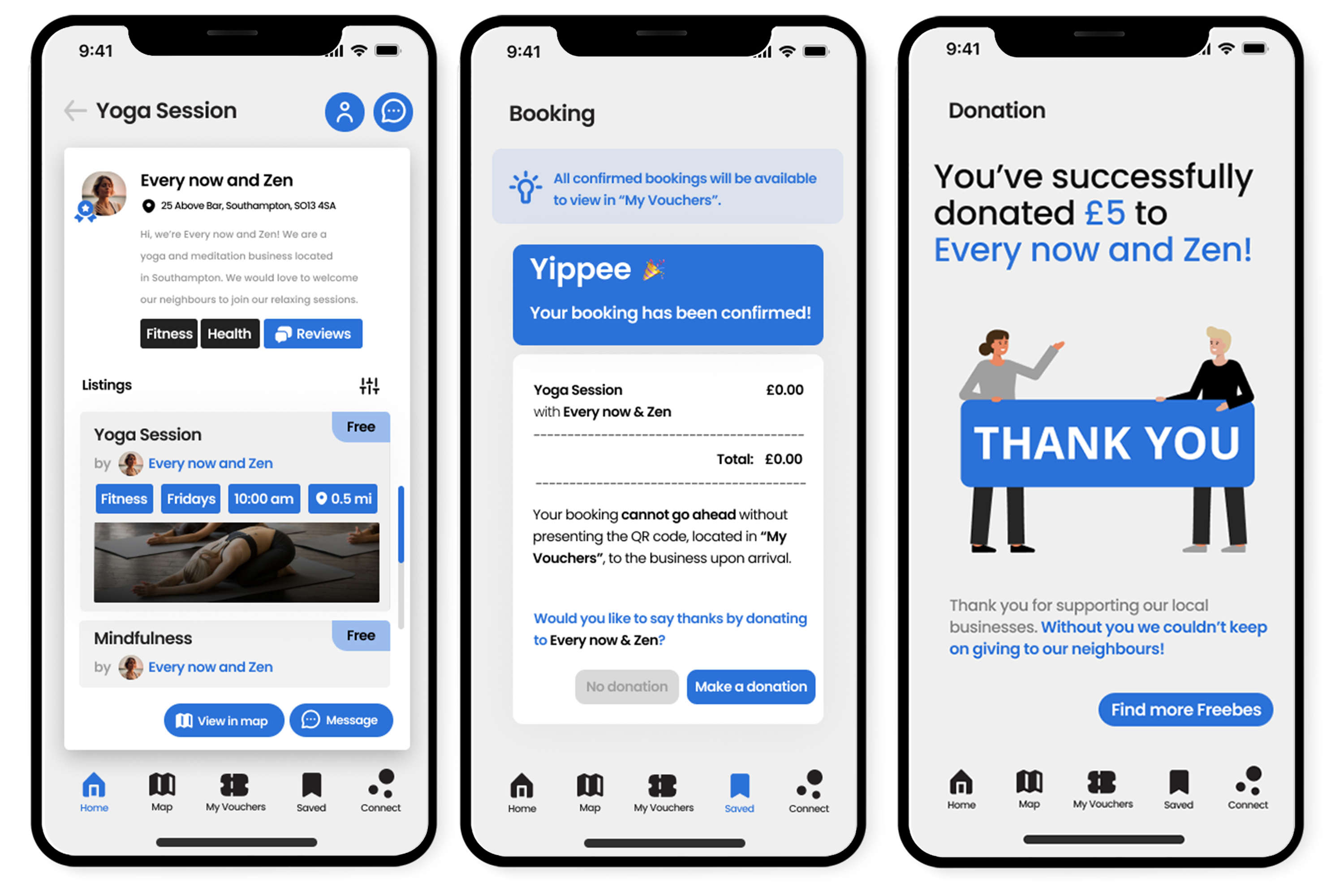
My vouchers was fundamental in keeping the user coming back to the app. Although it was necessary to send the booking confirmation to their email for safe keeping, the user would need to come back to the app to scan their QR code to check-in at the business. Cart is where the user can add any listings they wish to book, this is a feature that changes later on from user-testing. It features locations, fee and event time and date.
Check out directs the user through the payment screens, even if a payment is not needed. It allows the user to fully understand that this listing is free however a donation can be made during this time.
Donations are a feature that boosts business interest. It can be a way to encourage users to pay something for a gesture of goodwill. I wanted to create quick options for the user to click on or if they wish to donate a different amount they can type in the field. Easy payments options are presented for the user with Apple Pay and Paypal.
Business
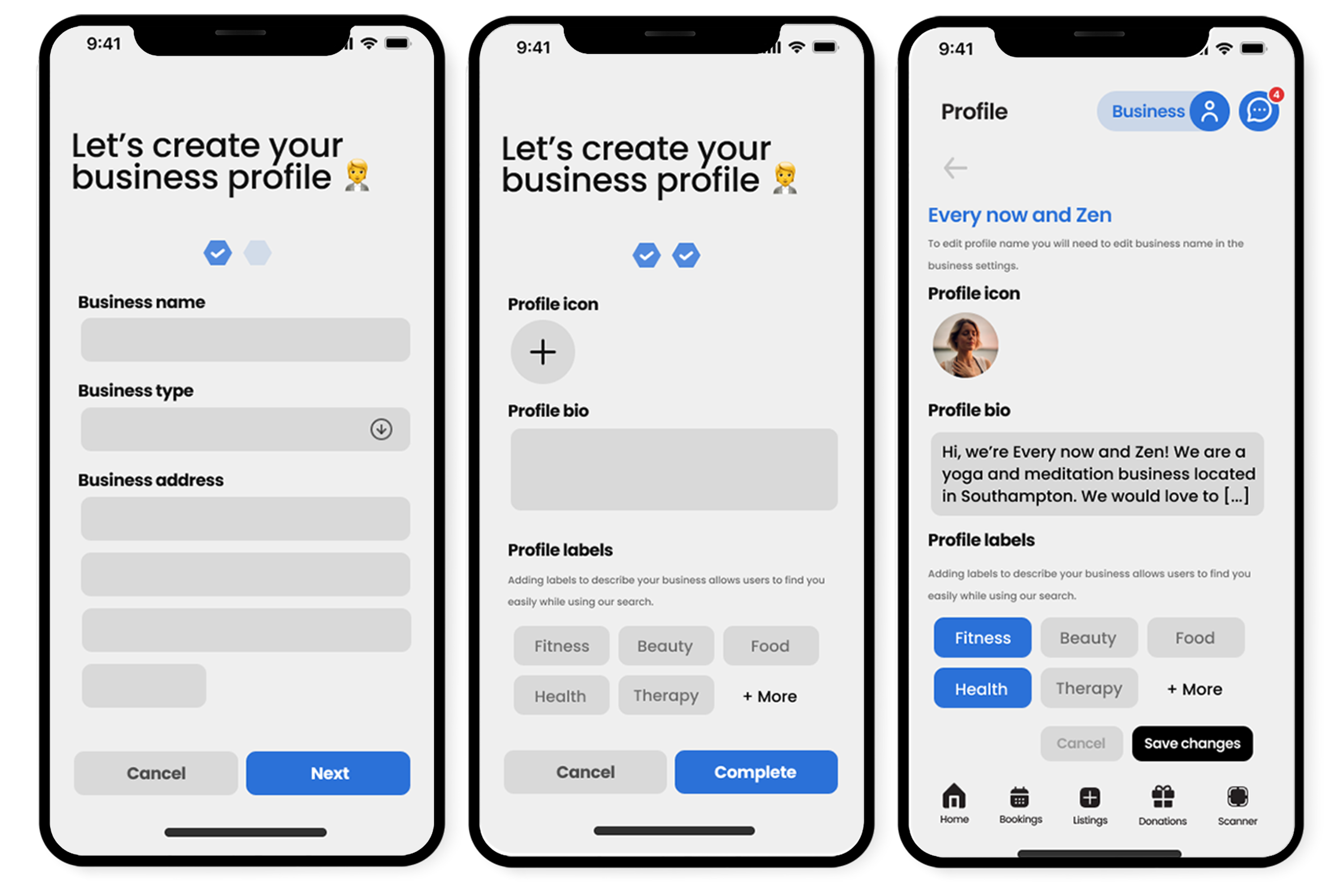
Create Business Profile
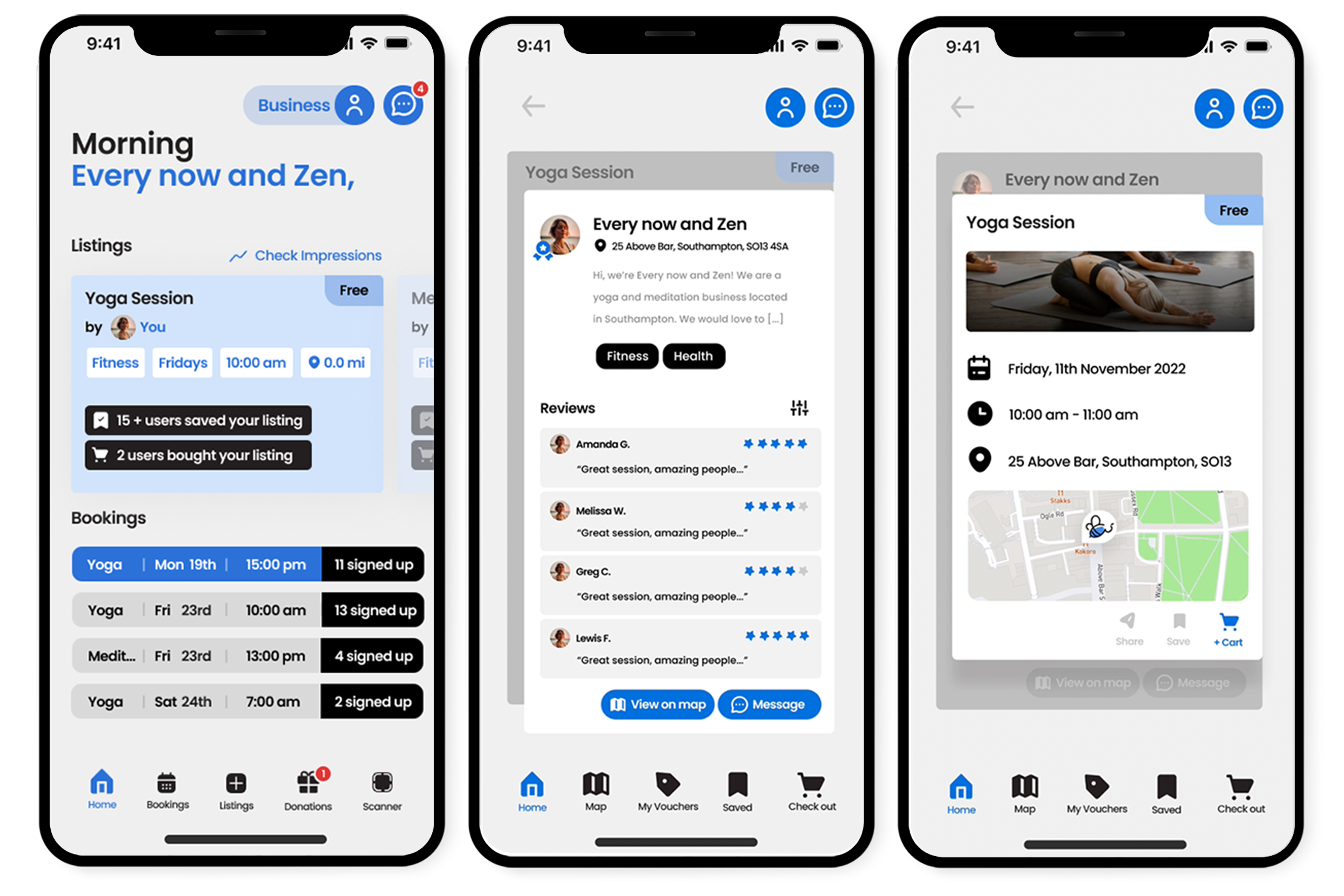
Business Home, Profile Reviews and Listing
I created a clean, minimal design for a business sign up similar to the personal account. Business users then will have a completely different home page that focuses on statistics and engagement for the owner to work with. It also has a scanner feature so that the business does not need to buy external technology to scan the QR code. This app could possibly be the future of booking appointments with in-app payment as many business owners have a fee on every card transaction. Profile reviews was a vital feature to include as it gains trust with the user of the app, it's also an important selling aspect for the business owners.
Usability-testing
I was fortunate enough to be able to a thorough usability-testing with my design mentor (acting as a user). During this unmoderated usability-testing the user works their way through the static prototype screens and voices their thoughts at each stage, talking through which buttons they would click to get to the next screen and how the user-interface helps them make decisions. My testing feedback was very positive, very complimentary on my user-interface. My user-experience guided them through many screens with ease, with a few exceptions that I find helpful to know. After testing I went through and made any user-experience or interface changes to my designs that were not doing their job to help the user’s journey.
Some of the issues my user-testing made apparent:
Prototype
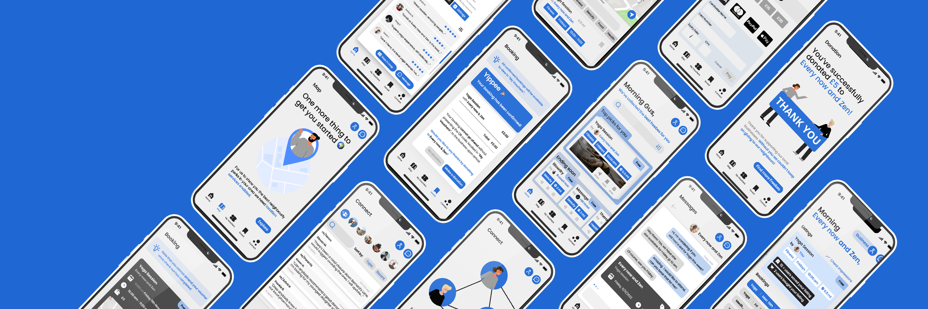
As I had some really interesting user feedback to implement into my screens I found that the app needed some additional screens to truly represent how important this app is to communities. I introduced a new feature “Connect” that allows users to talk in a forum with their fellow neighbours. This was a bonus feature that made the solution to my original problem, brief one, even stronger. We went from 27 static screens to 55 fully prototyped screens.
Revised: Introductory screens
Introductory Screen and Create an Account
Top Picks Data Collection, Success Screen and Location request
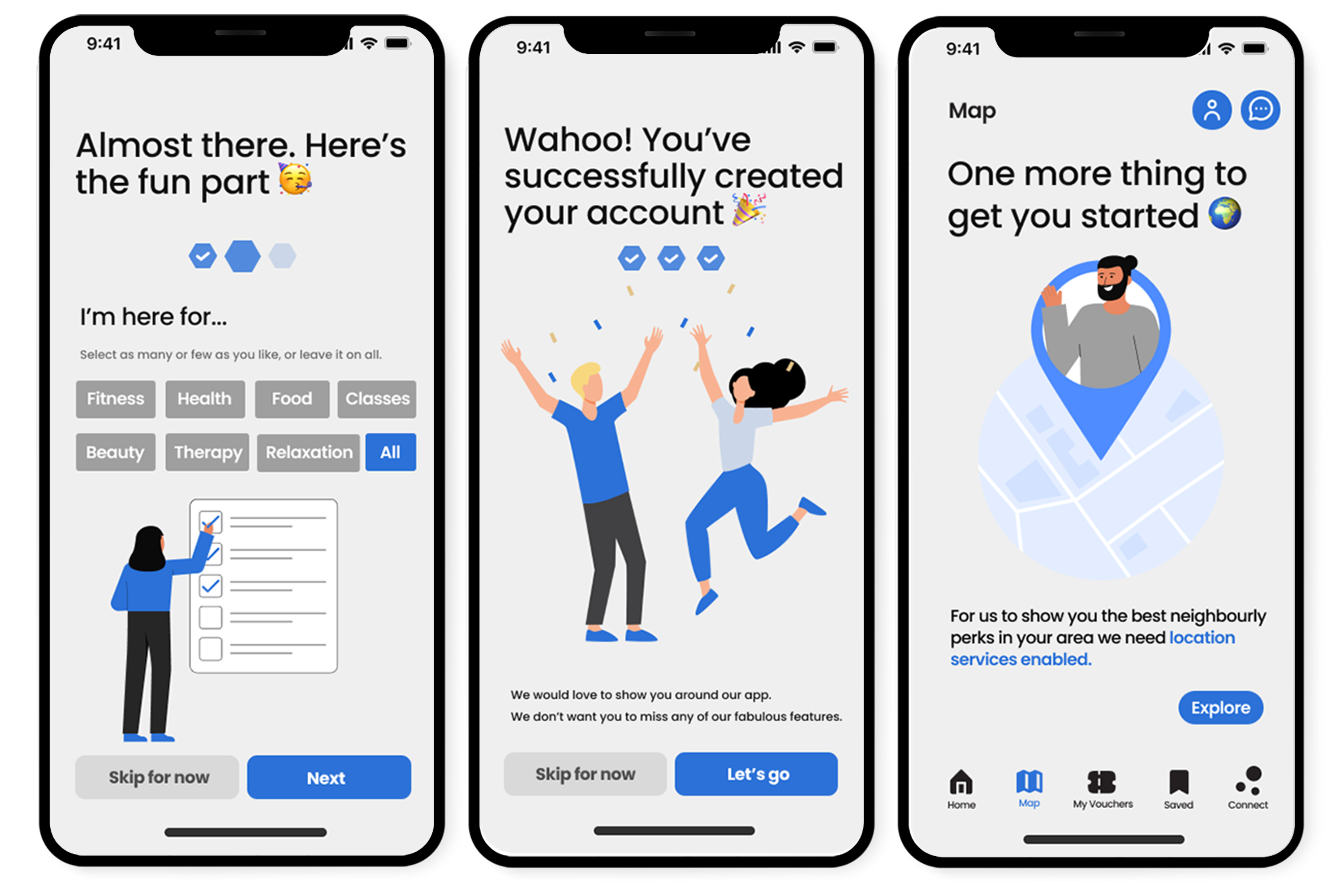
With my user-testing I tweaked the prototype to make the user-experience positive throughout. Create an account was changed to few data requests straight from the beginning to make the sure didn’t feel overwhelmed. Fields that required personal data such as mobile number were explain below. Any screens that referred to login as “sign up” were changed to give clarity and consistency. An additional create an account screen was added for users to pick what they were using the app for to gather data for “Top picks” on the home page.
I moved to “location enabled” (Hick's law: Minimize choices when response times are critical to increase decision time) request to a location request screen when the map icon is selected to separate too many data requests at once.
Revised: App features
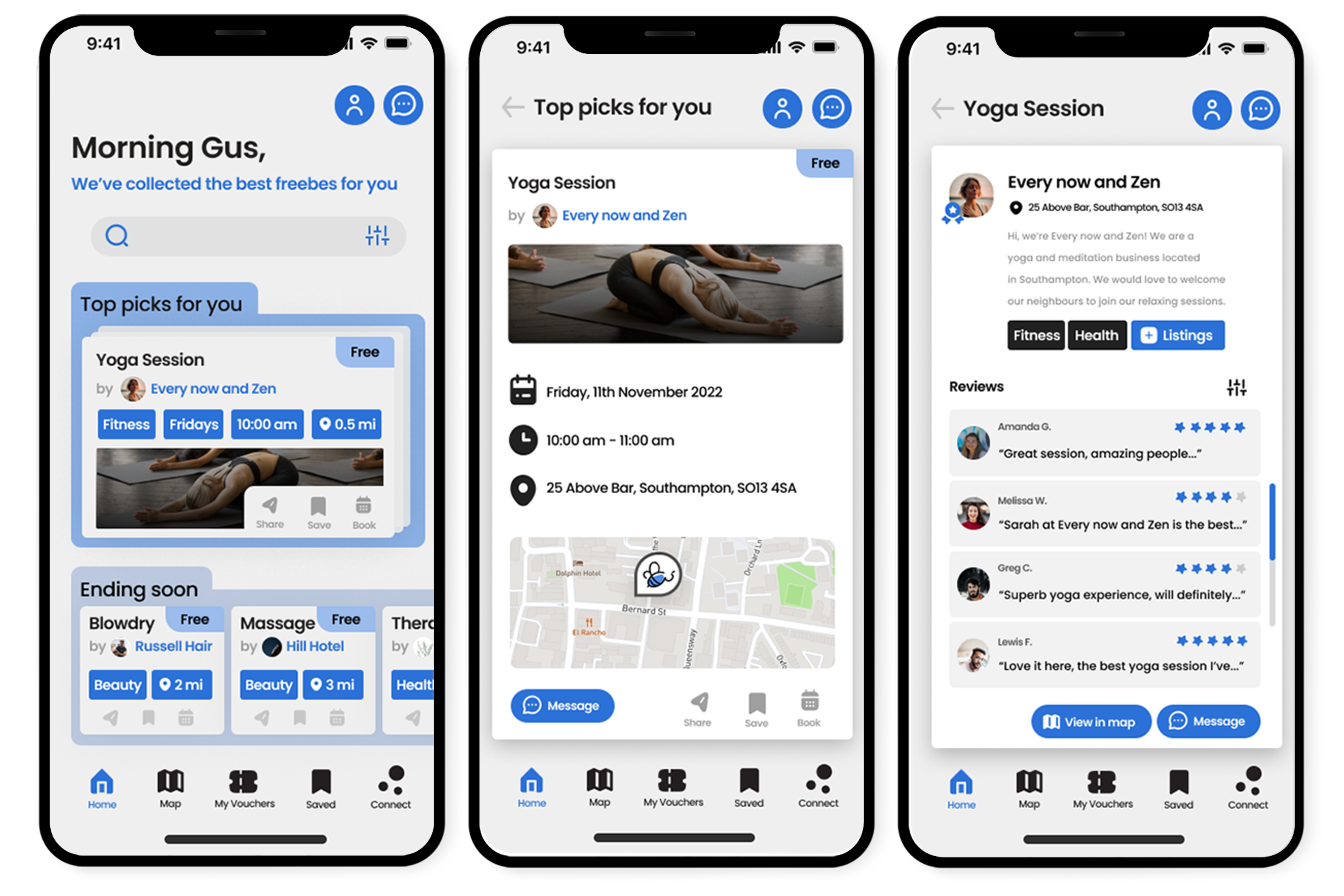
Home, Top Picks and Profile Reviews
Listings, Booking Receipt and Donation Success
The check out section in the nav-bar was removed and any words like cart were changed to “book” for bookings. When a booking is complete, the user has a “complete success” screen with receipt of transaction detailing the completely free booking. After donating the user is presented with a “thank you” screen and a call-to-action button that directs them to go back to the home page, labelled “Find more Freebes” (the Serial Position Effect). I also went back to my cards and added two new icons, book and share.
United Nation Sustainability Goals
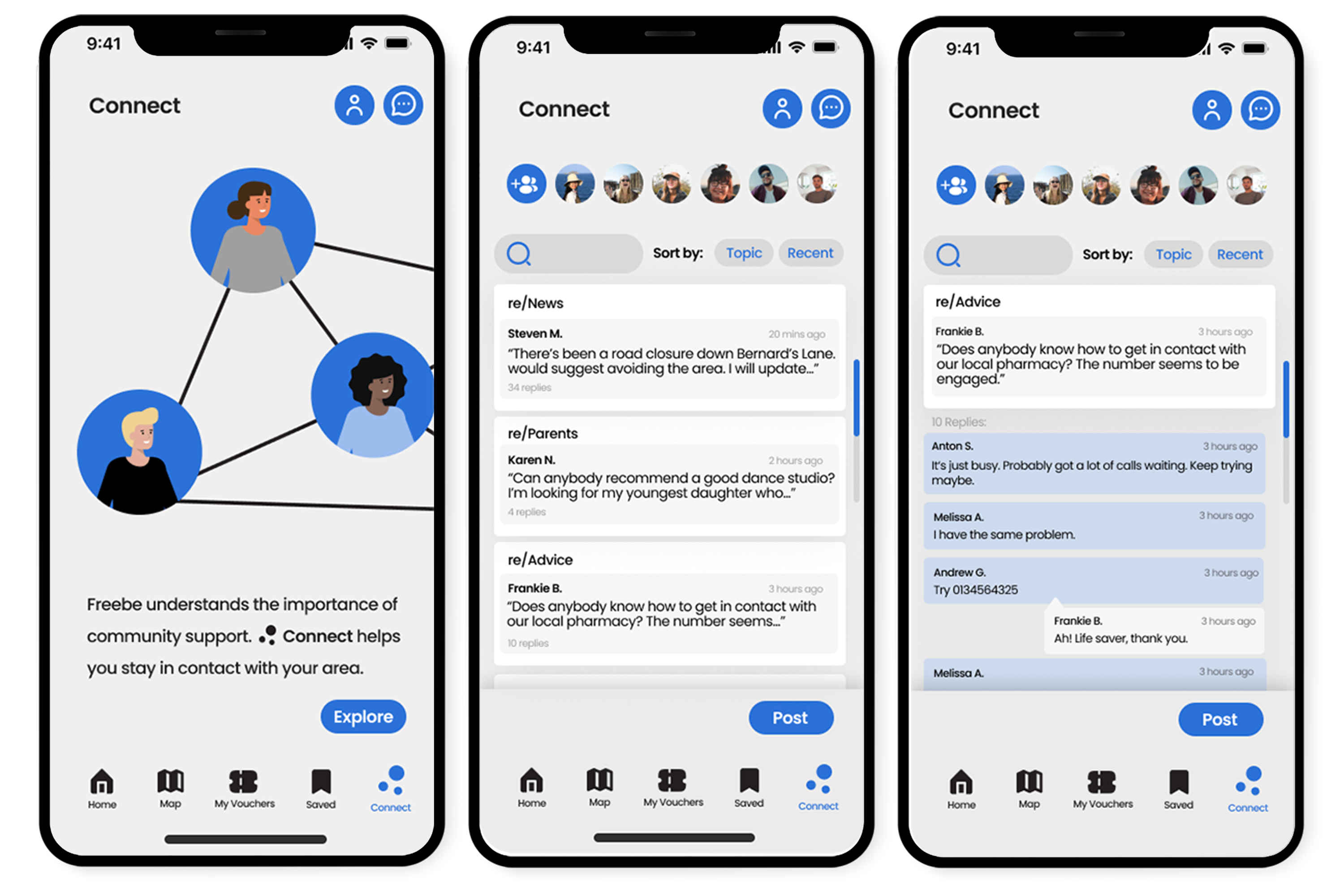
Connect intro screen and Forum
Share with friends, Directions and QR Scanner
I wanted to expand the app by adding “directions” feature to the app which helps support my solution to the United Nations Sustainability Goal 11. By making users aware of the local businesses around them you are deferring them from travelling far to get the same service; reducing traffic and air pollution. I also included “walking distance” feature to encourage my users to walk to their destinations instead of driving. This entire project was aimed at finding a solution for Goal 3 of the UN Sustainability Goals. This apps entire purpose is to promote users to put their mental health first and that everyone should have access to these well-being services. Trying to get people in the habit of taking time, day or week, to practice positive well-being is vital in preventing early deaths — suicides but also heart problems as heart related issues are connected to bad mental health. With later development, the “Connect” feature of this app also allows neighbours to talk about issues their community is facing and possibly encourage a better future for all.
Developed Prototype
Tap the splash screen to start
I frequently aim to fully animate my prototypes as it's something I enjoy, and with more practice I get closer to achieving the real thing (fully developed application) without coding. This time I tasked myself with creating micro-interactions, Progress bars help make wait times tolerable, regardless of their accuracy (the Doherty Threshold). As I had some time left at the end of my project I animated the progression bar (it has a unique mirco-interaction, which I loved creating) and the loading screens actually buffer. I also enjoyed animating my splash screen, I found some difficultly at first but with persistance to create what I had in mind, it finally came together.
Project Overview
In summary I think my app solution to brief one works very well. It demonstrates how important it is to stay connected, supportive and present in your community. A strong community has the potential to solve many problems we are currently faced with. In terms of product design I have learnt many lessons during the project. I was adaptable to feedback from start to finish and stopped after every important decision to consult with my peers, lecturers or mentor. For the first time I was able to do an unmoderated user test; I understood the benefits of doing this type of research. It also gave me the confidence to seek user-testing out in future projects. It was great to fully prototype on Figma, instead of reverting back to my trusty XD. Experience in adding features like micro interactions and a splash screen animation will benefit me. For viability, I have researched into how this would work in the real world and haven’t decided to let my creative side take over. It was great to step into a business style role to build this concept from the ground up. I am proud of what I have achieved in twelve weeks, while balancing my other projects.
Timeline
Timescale We had a twelve-week timescale for this project while balancing a second group/client project, and a case study that supports research for this project. I struggled to initially get into this project while waiting to primary research for my case study (information I needed to back up my claims) but once my ethics form was approved things started to move fast. I used a project timeline inside Figma to make sure I completed what I needed in time for presentations or feedback.