HOPELESS IN THE KITCHEN?
Well, 79% of young adults between 18 and 34 years of age are. For this mobile device project our team decided to make the younger generation more confident in the kitchen. Did you know there's been a spike in baking and cooking since the pandemic? and over 23% of people who cook use their phone for assistance. With this same age making up 38% of gamers we figured we'd make cooking into a mobile experience so you can combine the two. INTRODUCING LOCKABLE, the lock and learn device and free downloadable app. With our smart device you secure and lock onto your current appliances (that's right, no need to buy a whole new set of kitchen gear!) you can now use the app to cook meals perfectly without any mistakes. Be the food guru amongest your friends and family, let bad meals be a thing of the past! Fulfilling the United Nations Sustainable Goal 2 by reducing food waste.
Research:
Logos
A LOGO IS A SHORTCUT, A VISUAL LANGUAGE
that is quickly recognisable and memorable. We came across an article that talks about negative space in
logos and thought it was interesting how “the human brain tries to fill in what’s not there and makes
sense of it.” Negative space uses the space around and/or the between to create an image.
With this we liked the idea of making something for the eye to look at, analyse and be memorable.
The logo above is the letters E and D but make up a plug for their electrical business, we liked this because it forces the user to stop and think.
THE DIFFERENCE BETWEEN NEGATIVE SPACE
in logos, said another article, is establishing three different categories: in a wordmark, a symbol
within a symbol and within a letterform. These types of logos create smart visual puns whilst also
communicates a dual-meaning from a simple logo design.
When researching the types of logos we wanted to gain inspiration from, we looked at their black and
white versions before anything else. We wanted the logo to stand alone without the use of colour to
interupt it — using this article when making this decision. Adding colour should be further down the line, if not the last step, when designing your logo.
BY USING BLACK AND WHITE IT RESTRICTS OVER-COMPLICATED DESIGN
that relys on colour to be interpreted. It also allows you to create a logo where colour may not be
appropriate like invoices, or general printing; greyed out logos (where a colour logo was printed in
black and white) looks washed out and un-crisp. Finally, black and white allows you to focus strictly on
typography, solving one problem then moving on to the next stage. We wanted to strip back to basics and find something creative using lines and shapes.
Illustrations
WE HAD NOTICED A TREND
of designers using illustrations in a professional setting; an example that comes to mind is banks using
illustrations in their app and website design. We wanted to understand the desire to ditch stock
photography and primarily use illustrations in all aspects.
We found an extremely interesting article that dives deep into ten reasons why illustrations are
more effective in learning. Not only do illusrations remove unconcious bias, they have an increased
relevancy over stock imagery. We collected a board on pinterest with some interesting illustrations to use.
ILLUSTRATIONS CAN BE ALTERED
far more quickly, even just to adjust parts of the cartoon to brand-specific colours.
It also came up on top over stock imagery in represenation as “one type of person can’t represent the
spectrum” as animation and illustrations are easily adaptable to include all races, genders and cultures
– and changed in various settings.
FROM A BUSINESS STAND-POINT,
it is cost effective as film and photography are expensive as the creative process includes a lot of
manpower. Whereas illustrations are usually created by one designer, and the image can be constantly
adjusted and reused. From our own experience using layers on illustrator to reuse components on another
project is very time effective.
Photography
WE FELT IT NECESSARY TO ALSO RESEARCH
when to use stock images over illustration. I concluded that photography images are more traditional and
work well in advertisment. It can create content in a short span of time, “for instance, a suitable
stock image can allow you to create a design piece in half an hour while it might take you a lot more if
the same needs to be illustrated”.
PHOTOGRAPHY IS PREFERRED
when selling cars, food, electrical goods and holidays because “there is nothing imagery about an
image”. A consumer won’t buy an product based on the illustrations of the product, although some may
argue Apple do a great job of selling their products using a 3D device and animation.
STOCK IMAGERY CREATES A VISUAL EXPERIENCE
that can transport the viewer, tapping into the senses of nostalgia. It was apparent photography of food
did better than illustrations which we would bear in mind when creating the app. For example, companies like Uber Eats use both photos of food and illustrations, this was something
we would take inspiration from and learn from their experience.
UX/UI App Design
WE HAD DONE SOME EXTENSIVE RESEARCH
into UX/UI when doing our previous group project, however — this was on a different platform entirely
and we wanted to follow guidelines already set out by industry professionals like Apple; the human
interface guideline structured out by Apple for the App Store. Reading and taking notes from this guideline was extremely helpful for us to begin to sketch out the wireframes. It gave us a step towards creating a great app for both UI and UX.
THE POINTS WE WANTED TO TAKE AWAY
from the guideline in particular are the importance of a launch screen or splash screen. With this
feature, a function that launches the moment your app is clicked, shows the responsiveness of your app
is fast. The structure of the app needs to be clear and in an F pattern where the eye scans. There needs to be depth in your headings, sub-titles and images. Using drop-shadows and outer-glow to produce an call-to-action buttons. Making sure to follow closely to what other applications have already done.
WHEN ASKING FOR DATA
present pre-empt choices, where possible, to make data entry as quick as possible. Use standard gestures that people are
familiar with as they don’t appreciate being forced to learn difference way to do the same thing. Use a
keyboard pop up to test if your important UI remains accessible while the keyboard is onscreen. Use black and white colour properly (too true black for dark mode is too constrasting). Use skeleton screens so user knows the content is loading. Have on-boarding screens for first time users. Make a progression bar somewhere in your sign up, or any activity that will give the user multiple screens before completion.
Branding:
Logos
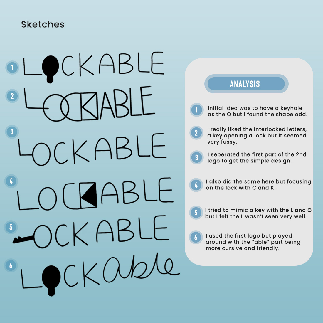
WE STARTED SKETCHING
some logos, playing with symbolism and negative space. These were our initial designs on how to incorporate a lock or key within the product name, “Lockable”. As you can see from the some of the designs, we have considered the research we did prior, using a varitey of “in a wordmark, a symbol within a symbol and within a letterform.”
We wanted to design a logo with dual meaning and play with the mind to fill in what’s not there. As you can see from the analysis above I’ve detailed our initial thoughts and how we felt after the sketch was complete.
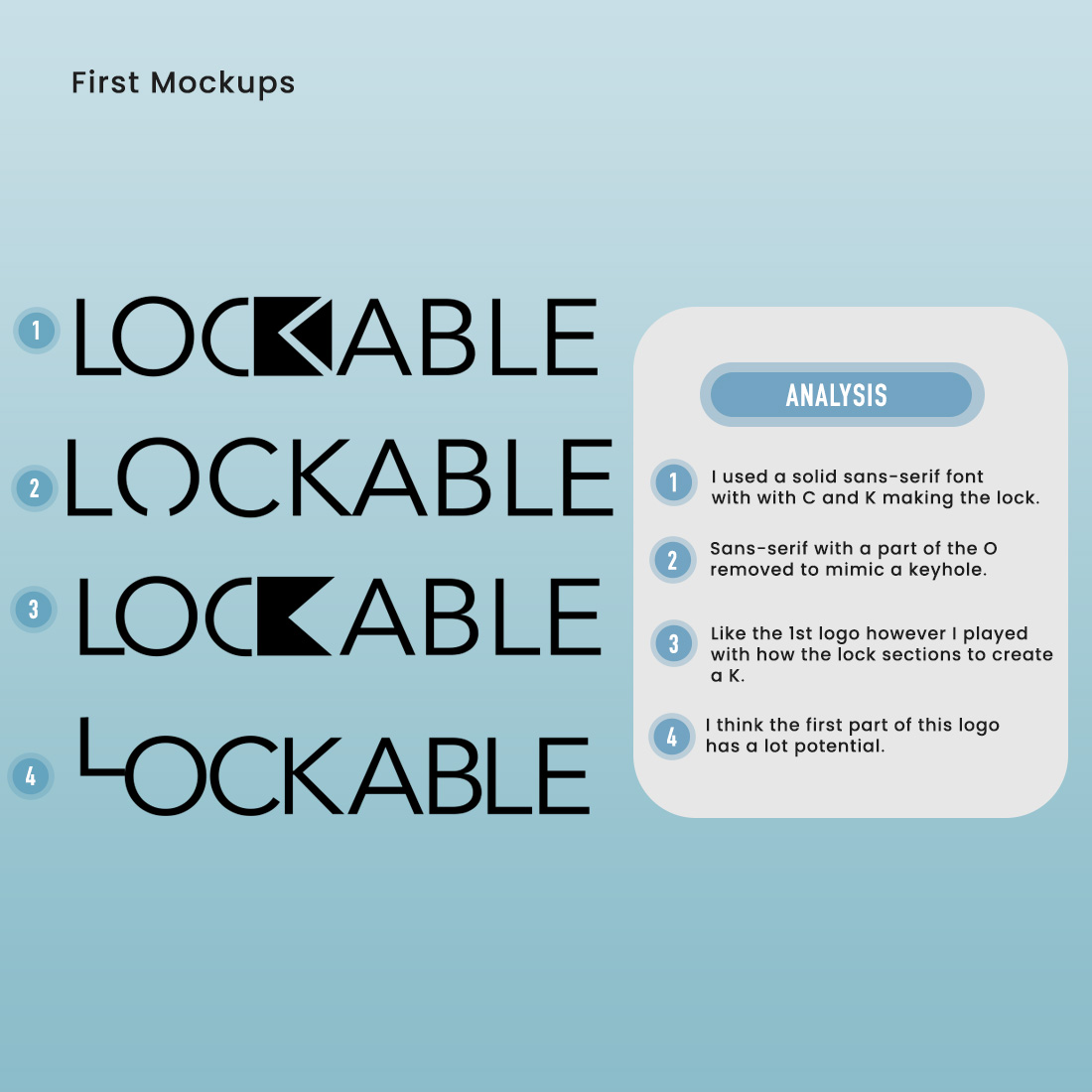
WE DID A FIRST MOCKUP
from our sketches of the promising logos, reducing the logos we wanted to present to the team and focusing on how we can improve the four logos we had narrowed down. In this first mockup session we aimed for sleek, clean designs. Using a standard font to allow us as designers (and the team we were presenting to) to focus strictly on the symbolism of the logo, not the style. With also took this approach with colours, excluding colour at this stage because it overcomplicates the design process and makes you rely on design only. This was something we learned from doing our research in the earlier stages.
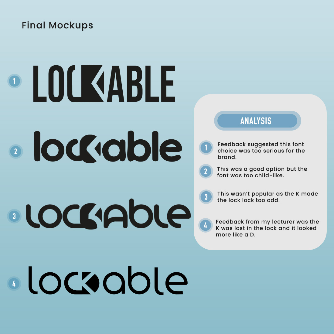
IN THIS FINAL MOCKUP
will added font. We initially presented the first final mockup as the final logo to lecturers but feedback suggested the font choice was not appropriate for the product. It was advised looking at fonts with more personality and curves.
With this feedback we researched into console logos and products like the Oculus logo did support the feedback we needed to take on board. We went back to producing some logos with smooth curves which is when two and three were produced. Recieving positive feedback from both these designs we wanted to refine the logo with a thinner weight font for a clean and light apparence to mimic the product itself. Typography represents the tone and values of your brand just like colour represents a feeling or visually represents a message for your consumers. We wanted to use a font that would be perfect across the whole app, having consistency. From research we investigated which fonts look best on a smaller screen, and sans-serif was a winner for best reading accessibility.
WE COULD NOW ADD COLOUR AND STYLE
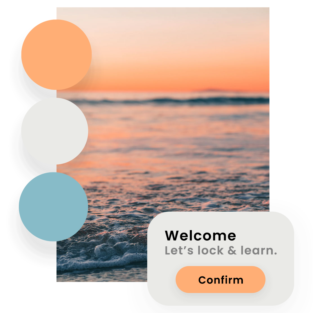
to our design as the logo design was complete in black and white. Choosing a colour palette is a significant process in the branding of a business. Studies suggest that colour improves a brand recognition by 80%. The success of your business relys on the colours you choose because of colour psychology that translates a message to your customers. With this in mind, the colour peach was selected as it brings emotions of excitment and people often associate this colour with food (fruit, veg, spices, sauces and drinks.) Blue was selected as a contrasting colour to peach, additionally blue is reliable and trustworthy which is vital in a teaching enviroment. We did not use a pure white, or a pure black (unless for text) as research suggested this is too constrating for some audiences, especially in terms of doing a light and dark mode for the app.
With the typography and colour branding complete, we mocked up a design layout for a button we used in the app, therefore, preparing for which colour would be best as a primary call-to-action button and which colours would be used secondary in the background and as font.
PREPARING TO COMPLETE THE BRAND DESIGN
our design lecturer advised logo four’s lock had the letter K entirely lost and from first glance, it looked like a “C and D” — and the last revision of the logo we had adapted on the C and K visibility.
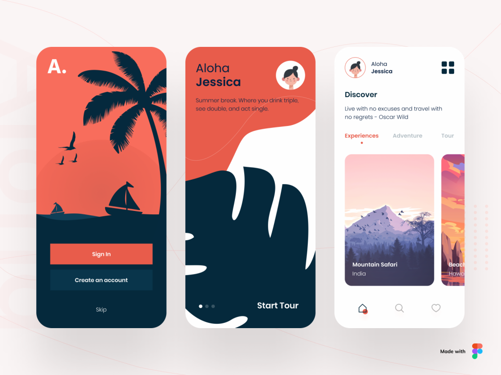
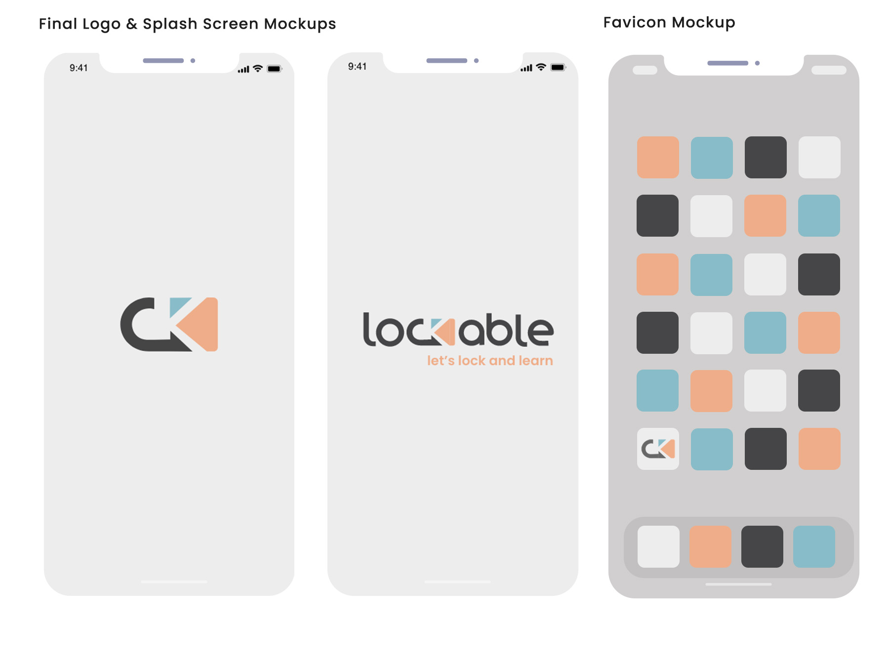
With a splash of colour from our palette, we produced this creative logo that works seamlessly as a primary and secondary logo. As the product and app would intitally be used for three teaching skills (cooking, golf and tennis) we applied colour as three different elements, keeping orange as the c-t-a and accent colour.
In the mockup above you can see the splash screen with the secondary logo in the middle (following Apple’s guidelines) and then the secondary logo will dissolve into the primary logo once loaded, with our tagline: Let’s lock and learn. On the far right, you can see a mock up of the app favicon that would be sat amongst many different coloured app favicons which is why we prepared ours for the best visability. Apple guidelines suggest “keep the background simple and avoid transparency” and “test your icon against different coloured apps”, with using our logo we followed their advise of “design a recognisable icon” and “use words only when they’re essential or part of a logo”.
Sitemap:
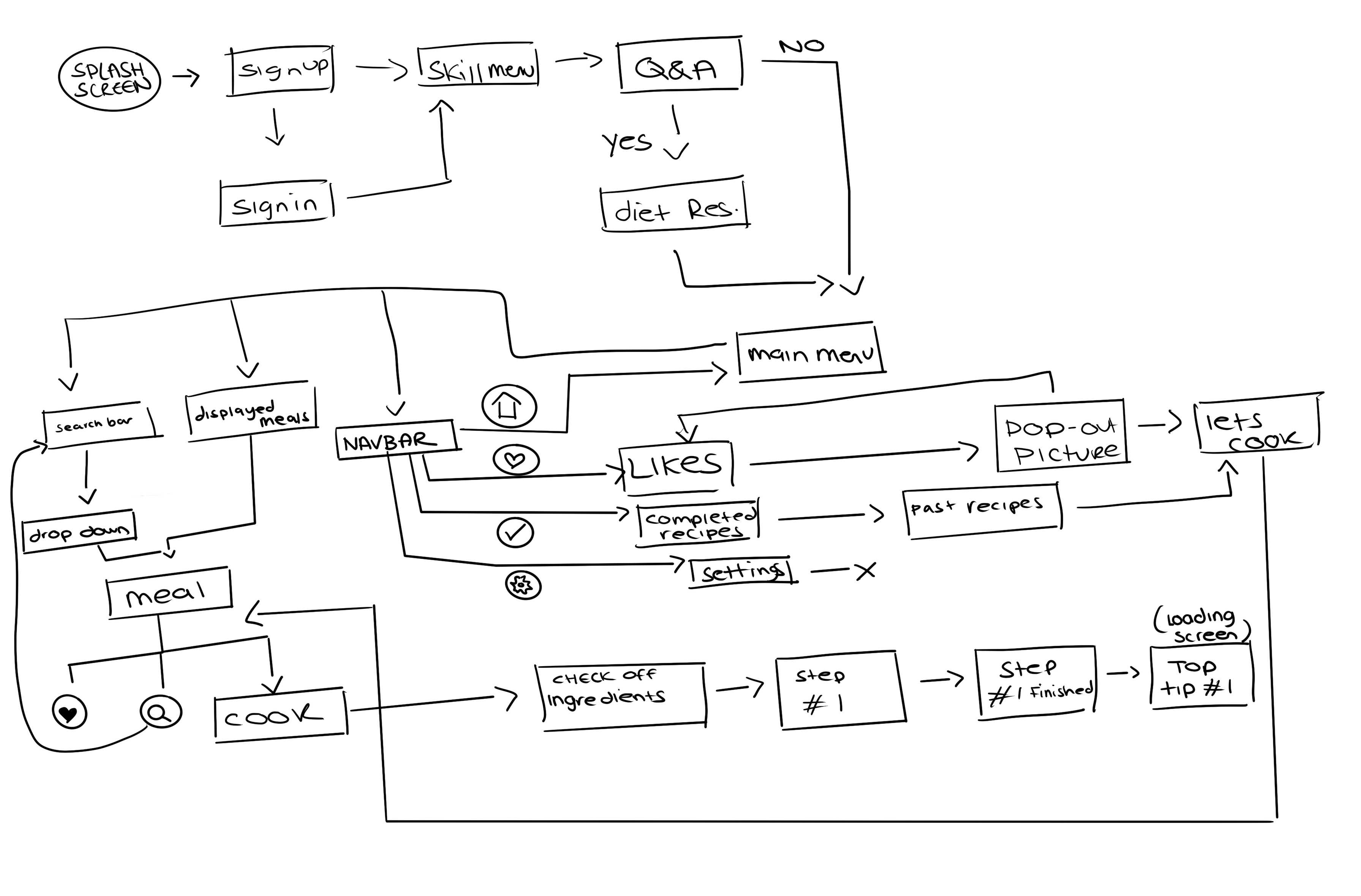
IN PLANNING OUR APPROACH FOR THE PROTOTYPE
we decided to sketch out a sitemap. A sitemap can help you navigate what your site or app goals are before you begin wireframing or creating content. By choosing exactly what you want from your application and then mapping it out, you can make sure that every part of your design is reinforcing your goals. It’s an effective planning tool across the industry. By using the sitemap as a starting point you are able to eliminate unnecessary app screens. In a design way, it’s a flow chart you can follow to achieve your next goal in the prototype production.
In our sitemap we started out with splash screen (something Apple’s guidelines advised) and then navigated through the important screens our user would need to complete before getting the end-goal screen, the finished meal. With such a small time period for this prototype to be complete, we made sure to focus on the main route to the cooking screen — eliminating the like page, recipe book and settings screen for the moment. This was something we could add later on.
Wireframes:
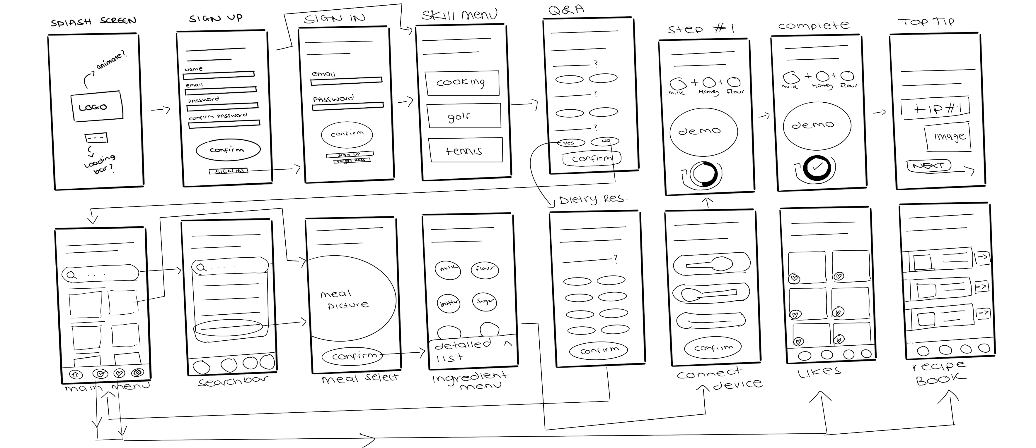
WE BEGIN WIREFRAMING
our sitemap. In this instance wireframes would be a quick design process where we can play with the outline of content and it’s position. It allows us, as designers, to plan ahead and prepare to repeat the same elements or buttons to speed up the prototype production. However, in the industry, wireframing is an important presenting tool. It allows the client, developer, or designer an opportunity to view the product without getting distracted by font, colors and images at such early stages. With our sitemap, we can now easily design each screen because we already now which screen links to another, adding important features like “Already a member?” Or forgot password.
A similiar process to the logo design, excluding colour at this stage is paramount to the structure of the design process — allowing the designer to focus on the usablilty of their screen and the interface being proposed. As we did not include notes on the wireframes, we utilised a key to signify specific shapes as design elements like buttons. In our wireframes, you can the oval circle symbolise C-T-A and pill boxes, simple line at the top of screen is a header and sub-header. Circles were the nav-bar buttons and sometimes for a check list.
Initial Protoype:
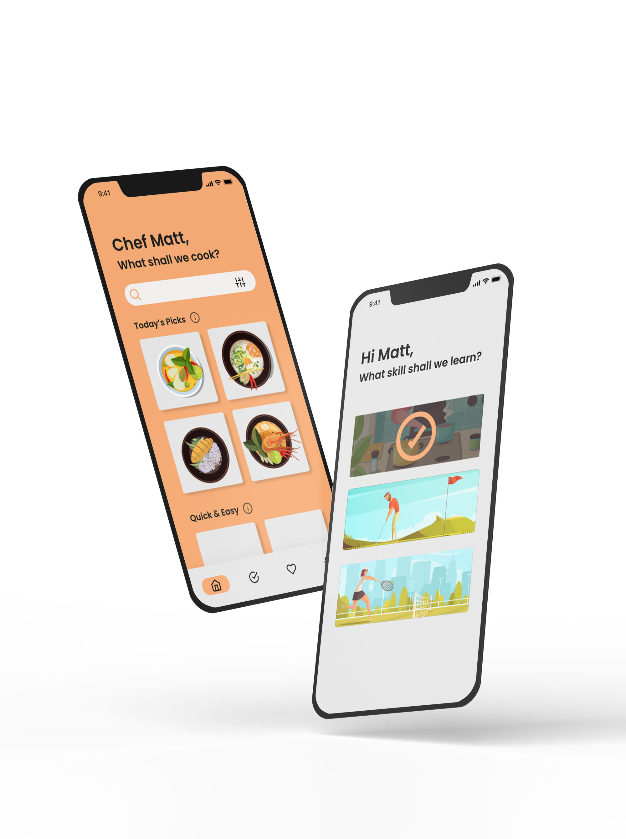
AS THE DEADLINE FOR THE LOCKABLE PROPOSAL LOOMED,
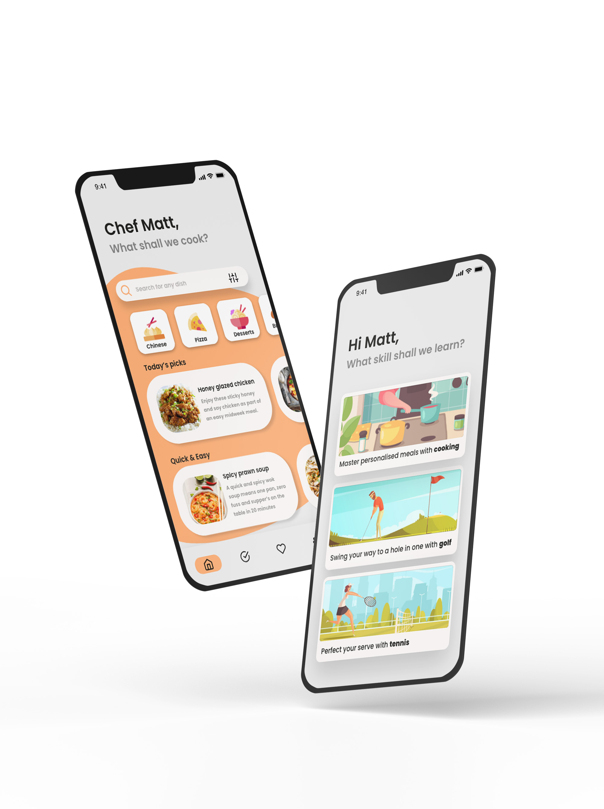
we created this prototype as our initial app design, something we could use as a base to improve on. When creating this prototype the old logo was used a placement before we had time to finialise, as you can see with the splash screen. Closely following Apple app guidelines along the way we created a simple animation for the splash screen while app loaded up. Using our sitemap or wireframe as a guide, you can see we have included every element the user will recongise from other apps; such as, sign up, sign in, error messages, additonal questions to personalise the app. We spent a lot of time making sure the features worked seamlessly in the prototype and weren’t out of character; we did not want to design an element the user hadn’t already interacted with before as research suggests any element the user has to learn about increases the chances of the user leaving the app entirely. By using typical design elements in your interface, users feel more at ease and able to complete the screens quickly. One article in our research explained, “it is also important to create patterns in language, layout and design throughout the site to help facilitate efficiency.” Familiarity can actually enhance your user’s experience and make the job of a designer less complicated by sticking to guidelines, than bringing innovation for every part of design.
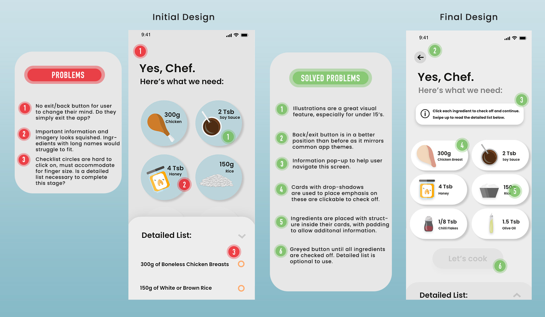
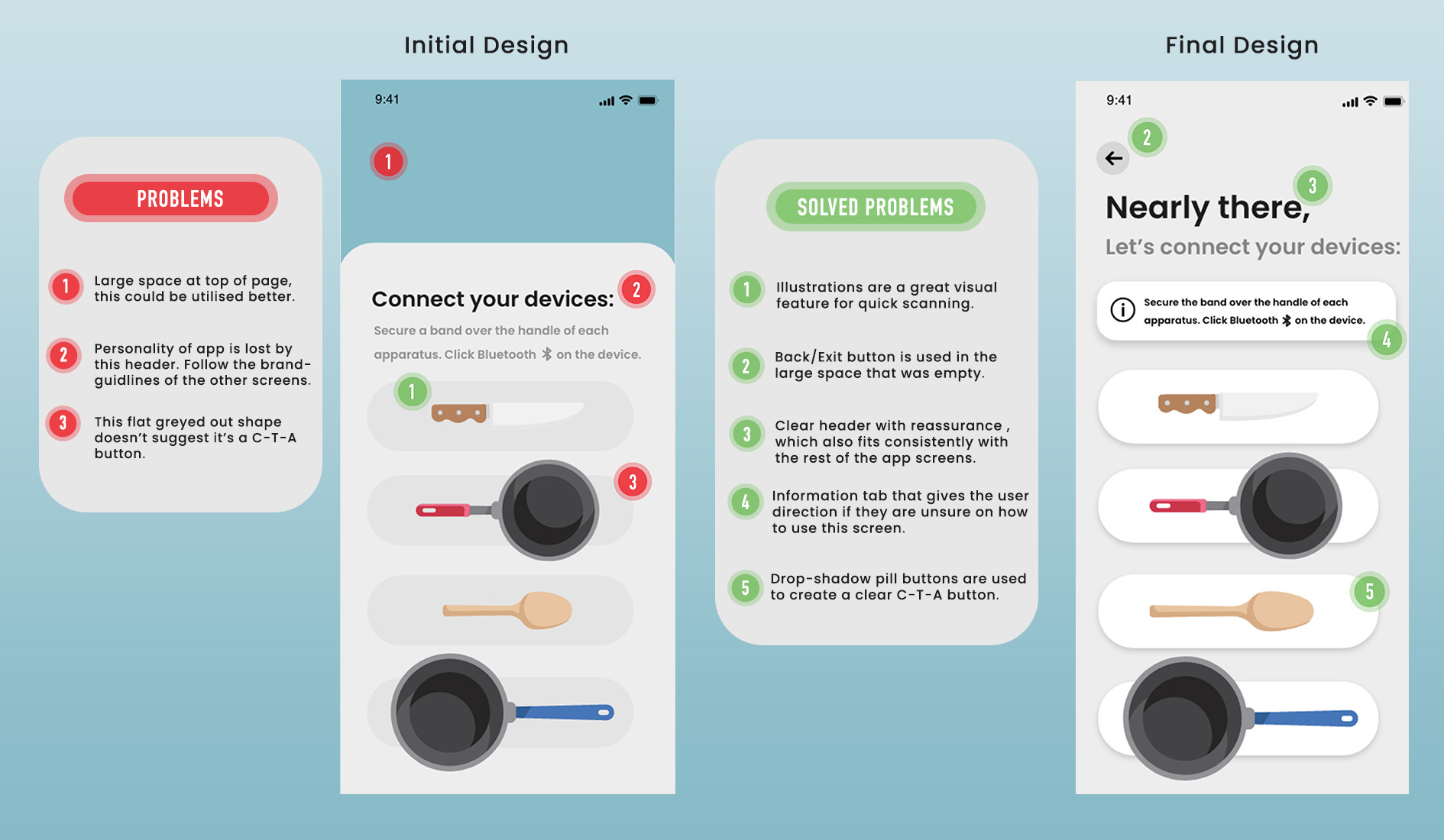
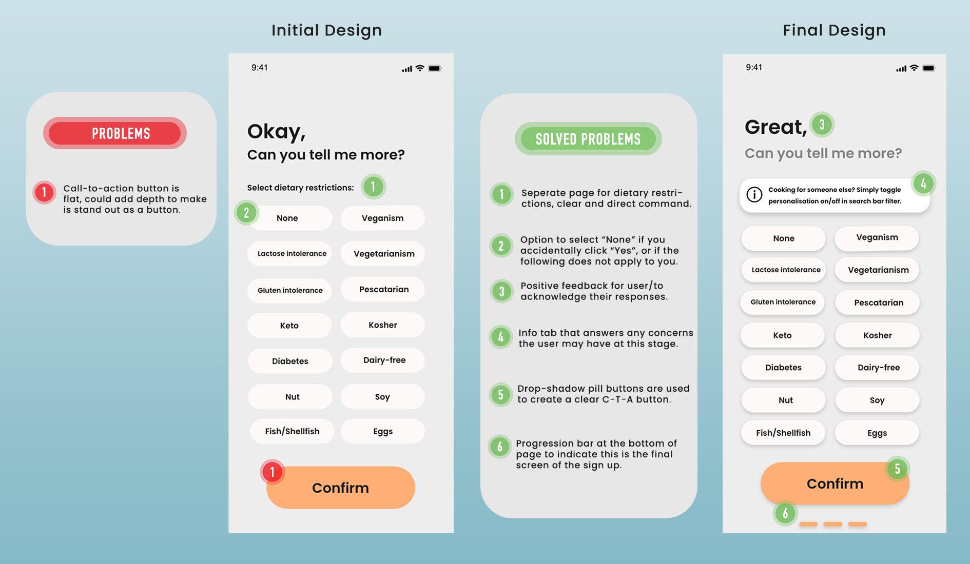
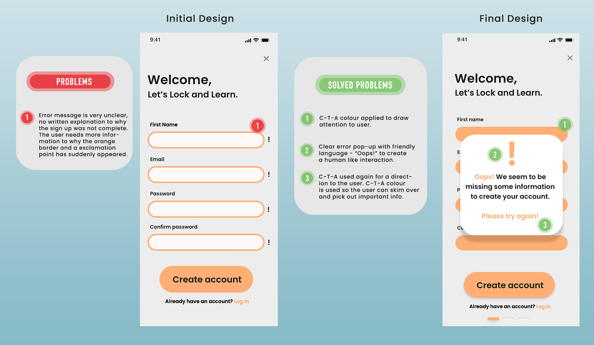
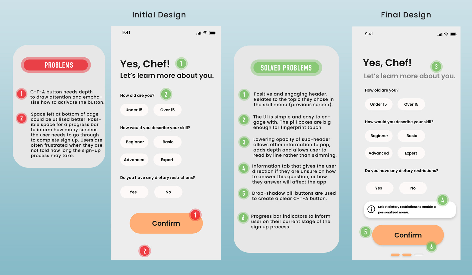
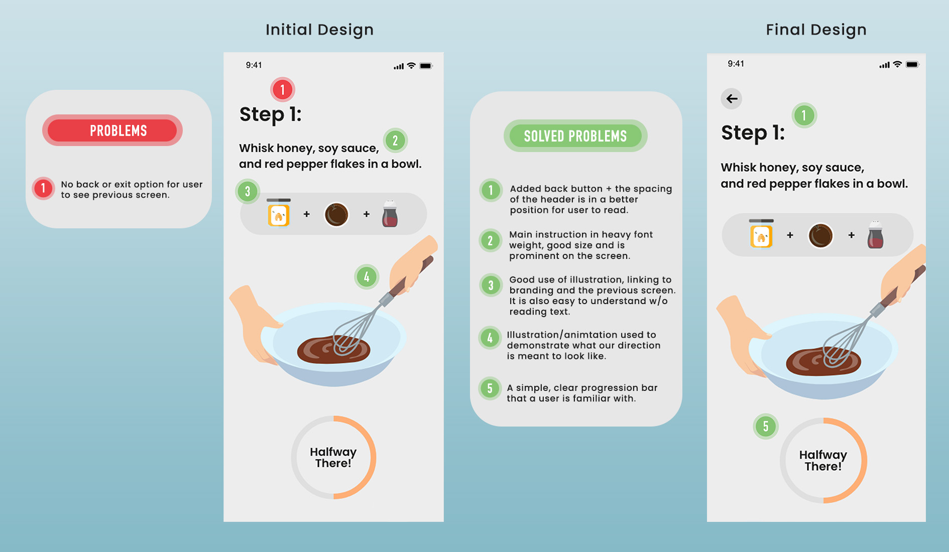
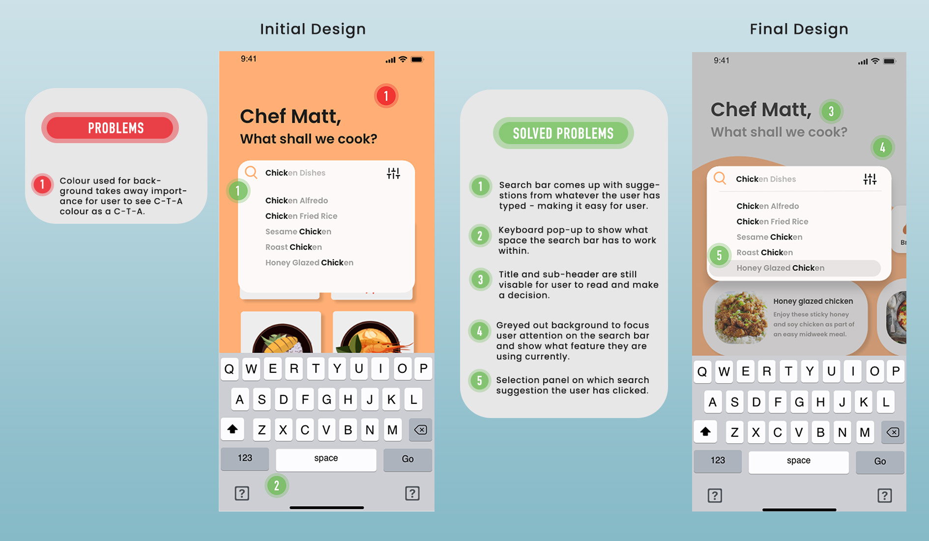
UX Audit:
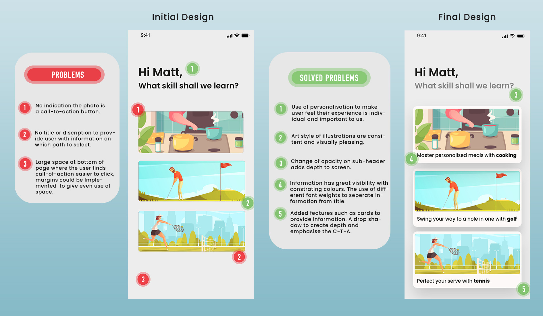
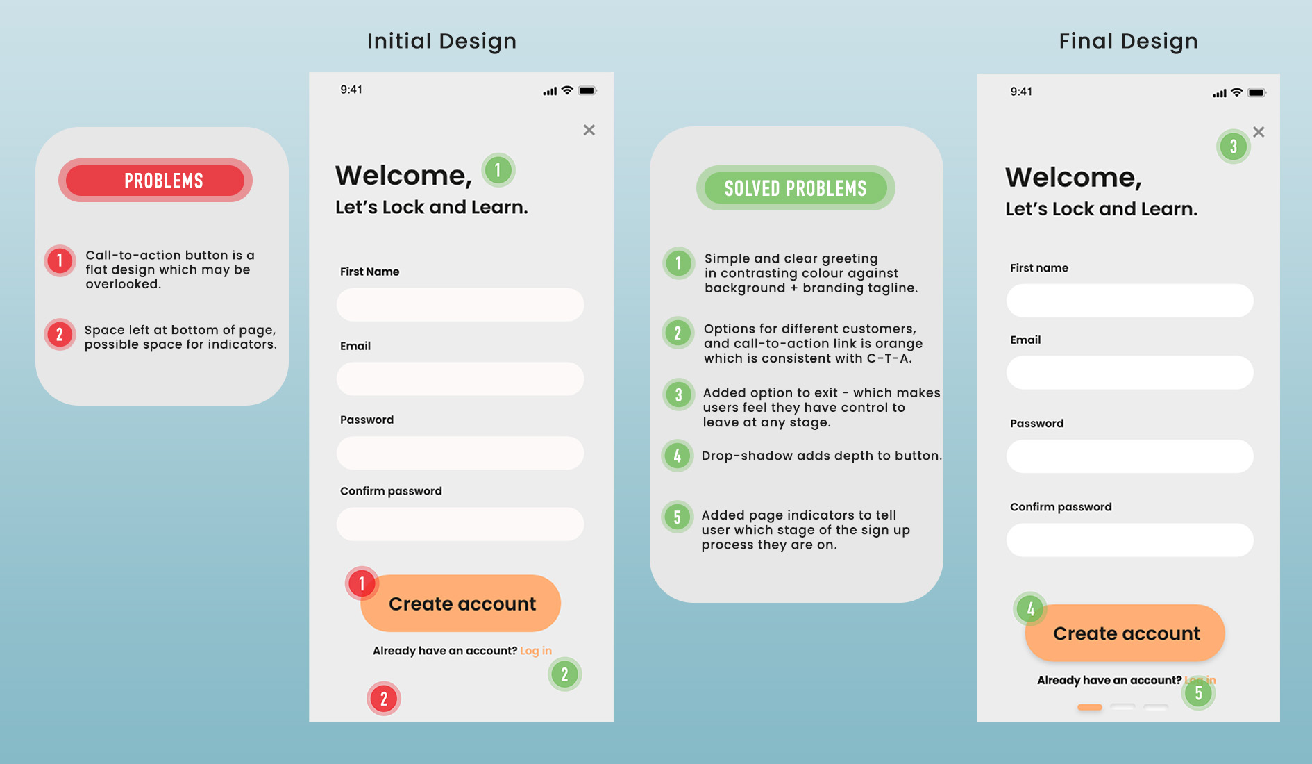
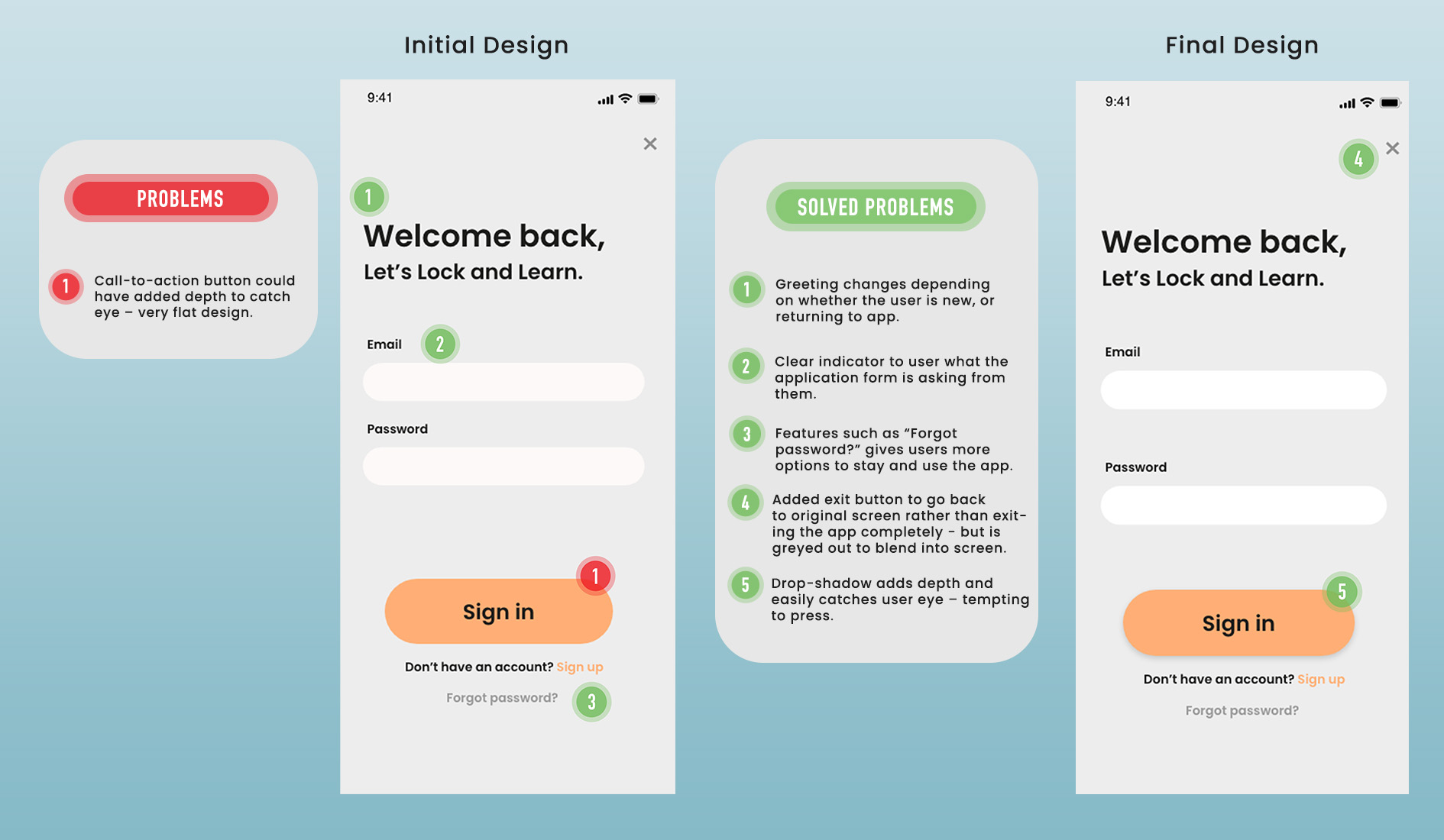
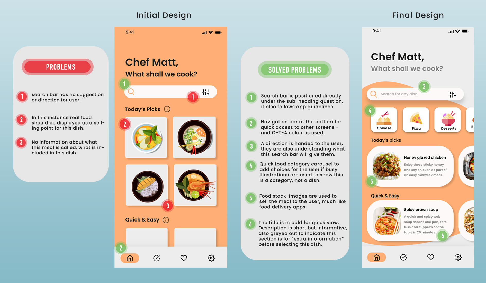
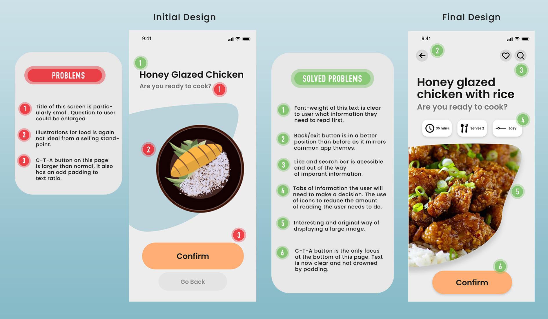
TESTING AND REVIEWING
provides a true overview of the design and its intended use. We sent it out to many different people, lecturers, group members, our mentor and students to use it. This means that the prototype can be tested in its true environment and potential overlooked issues can be focused on before being developed. In these review sessions, you can gain prespective from multiple different view points early on and begin to validate design decisions. As you can see from our UX/UI review we have broken each point into problems and solved problems. A few of the problems had been solved during the initial design which is why we’ve included those too: the first rule of prototyping is to test often and at every stage of fidelity.
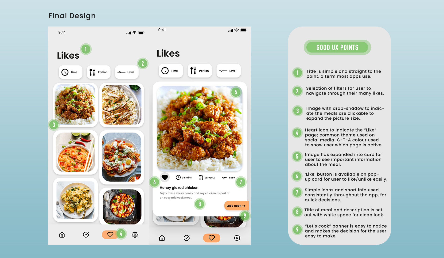
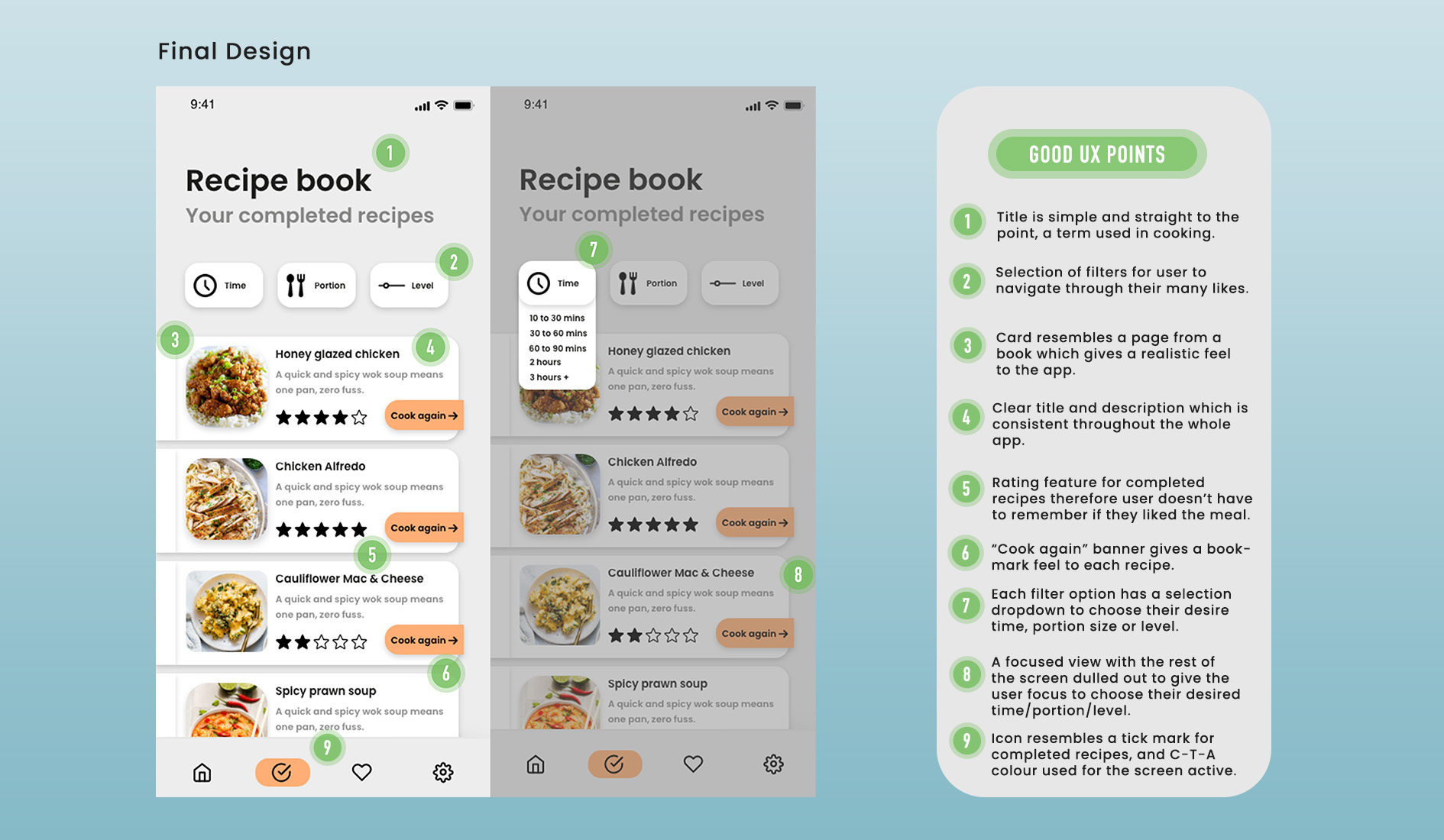
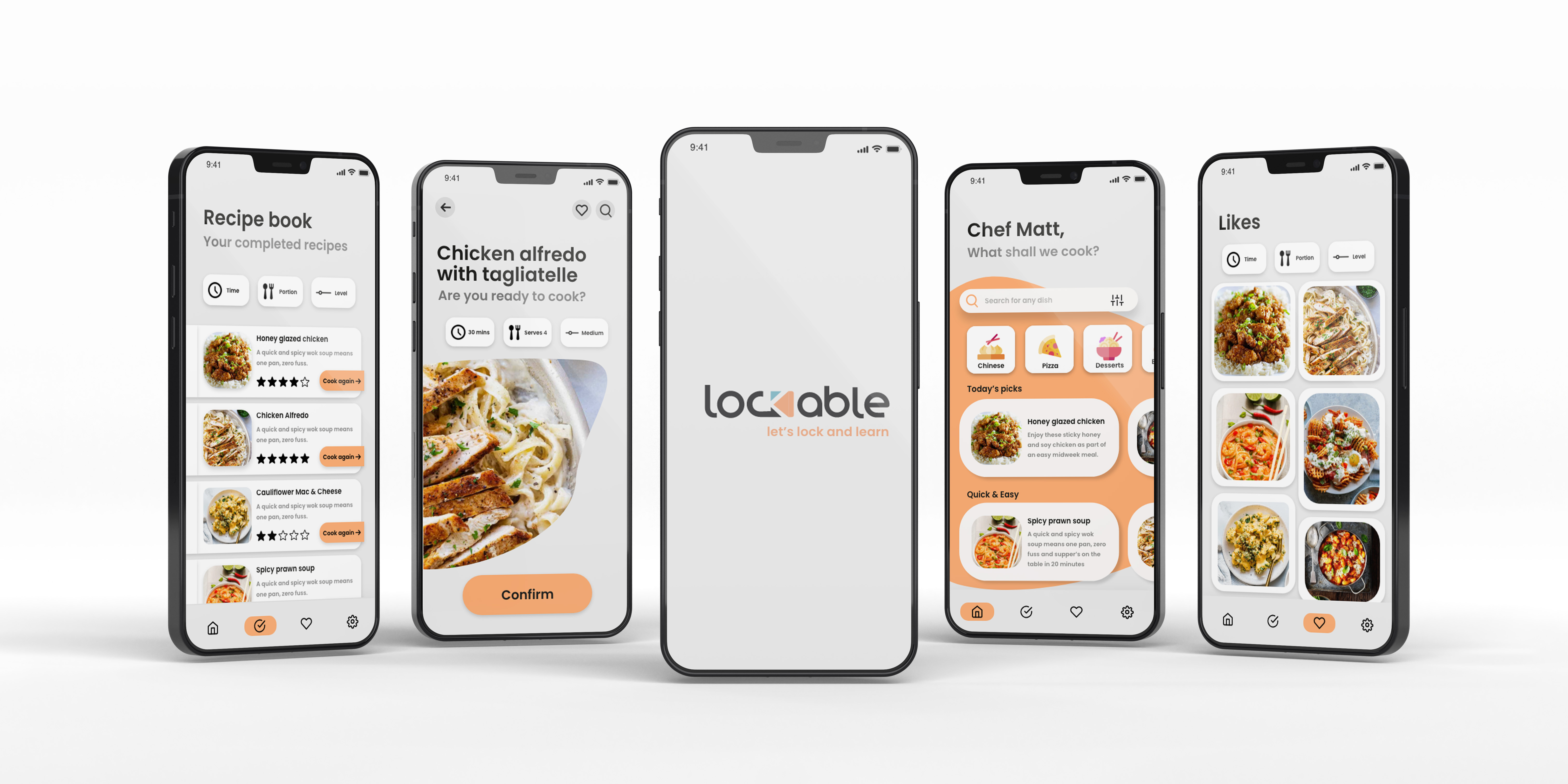
Final Protoype:
FINISHING UP THIS PROJECT,
we’ve included our fully fleshed out prototype for you to use and test. We’ve taken onboard several feedback points from our initial prototype design: for example, the sign in screen being too complicated and fussy for a prototype, therefore opted for this efficient way of all data being shown once you click the keyboard.
As an overview, we believe this app design is very well designed and constructed. If we had longer than six weeks (probably nine weeks with hours spend in own time) to produce an app we would begin to design screens such as a skeleton screen, dark/light mode and a fully fleshed out app from beginning to end. Without the research and reviewing we’ve completed, we would be showing a completely different, inefficient design with lack of good interface.
We’ve poured our heart into this product and we hope you enjoy it.
