During my 12-month internship, I was offered the chance to take on my own piece as UX designer, through to visual and handovers. In this breakdown I showcase the App Connect SaaS Log Viewer enhancements.
Software
UX & Visual
8 Weeks
Brief
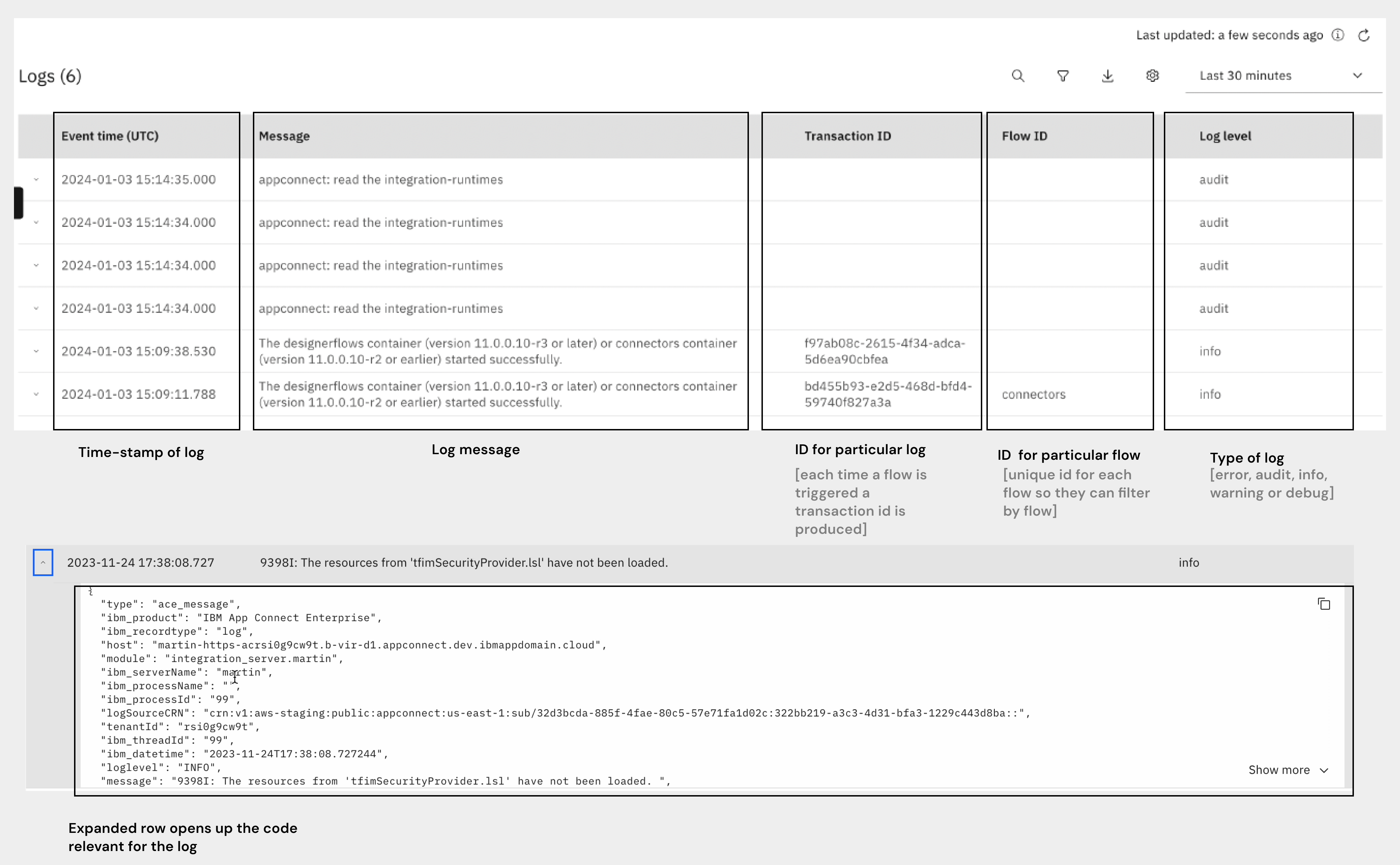
IBM App Connect is application integration software that connects applications and data sources, plus the ability to create custom connectors (IBM, n.d.). In simpler terms, this software creates a system that allows users to create automations between applications and data. "Logs" refer to the system logging system where all instances of change, error and debugs are recorded.
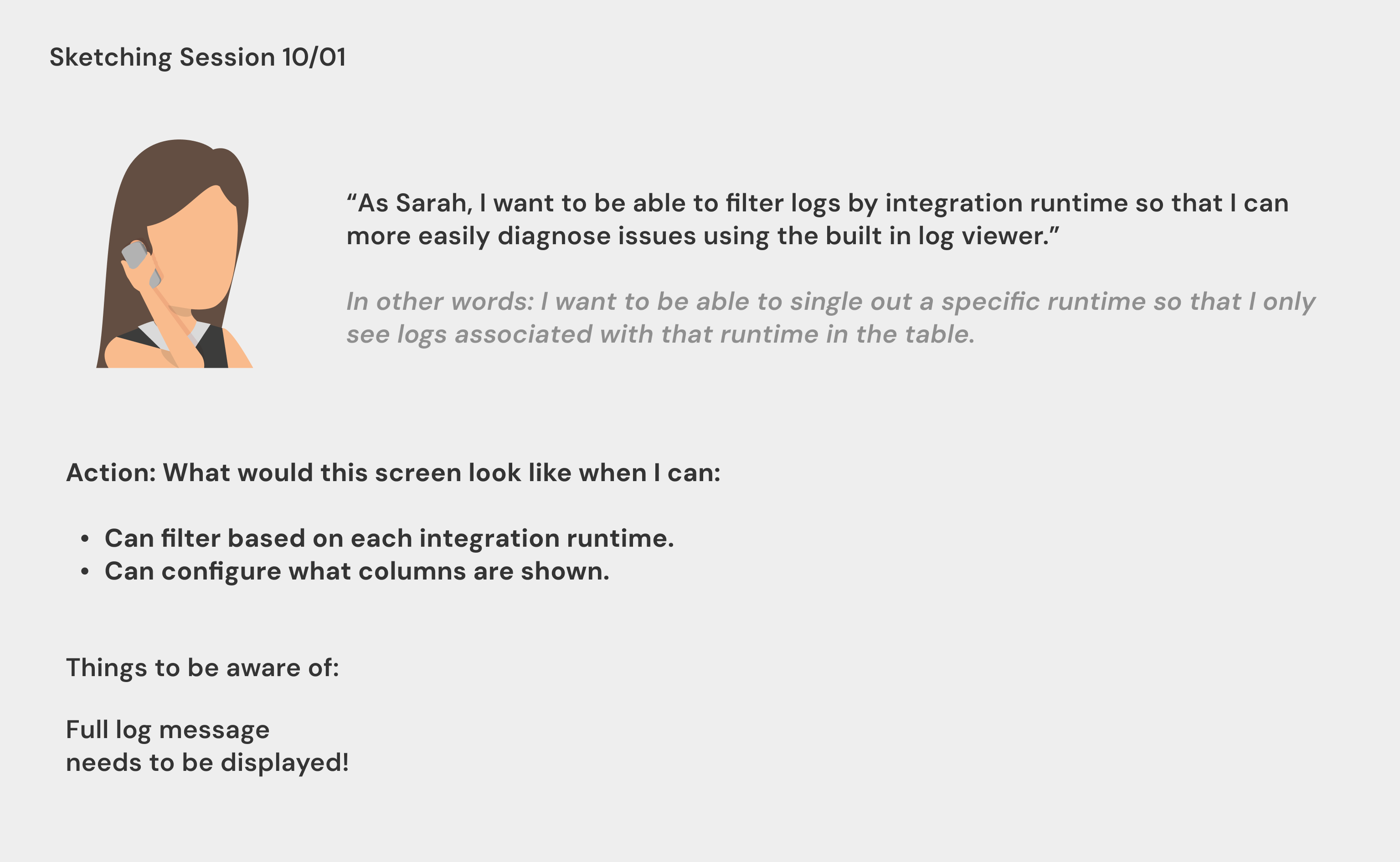
"As Sarah, I want to be able to filter logs by integration runtime so that I can more easily diagnose issues using the built in log viewer."
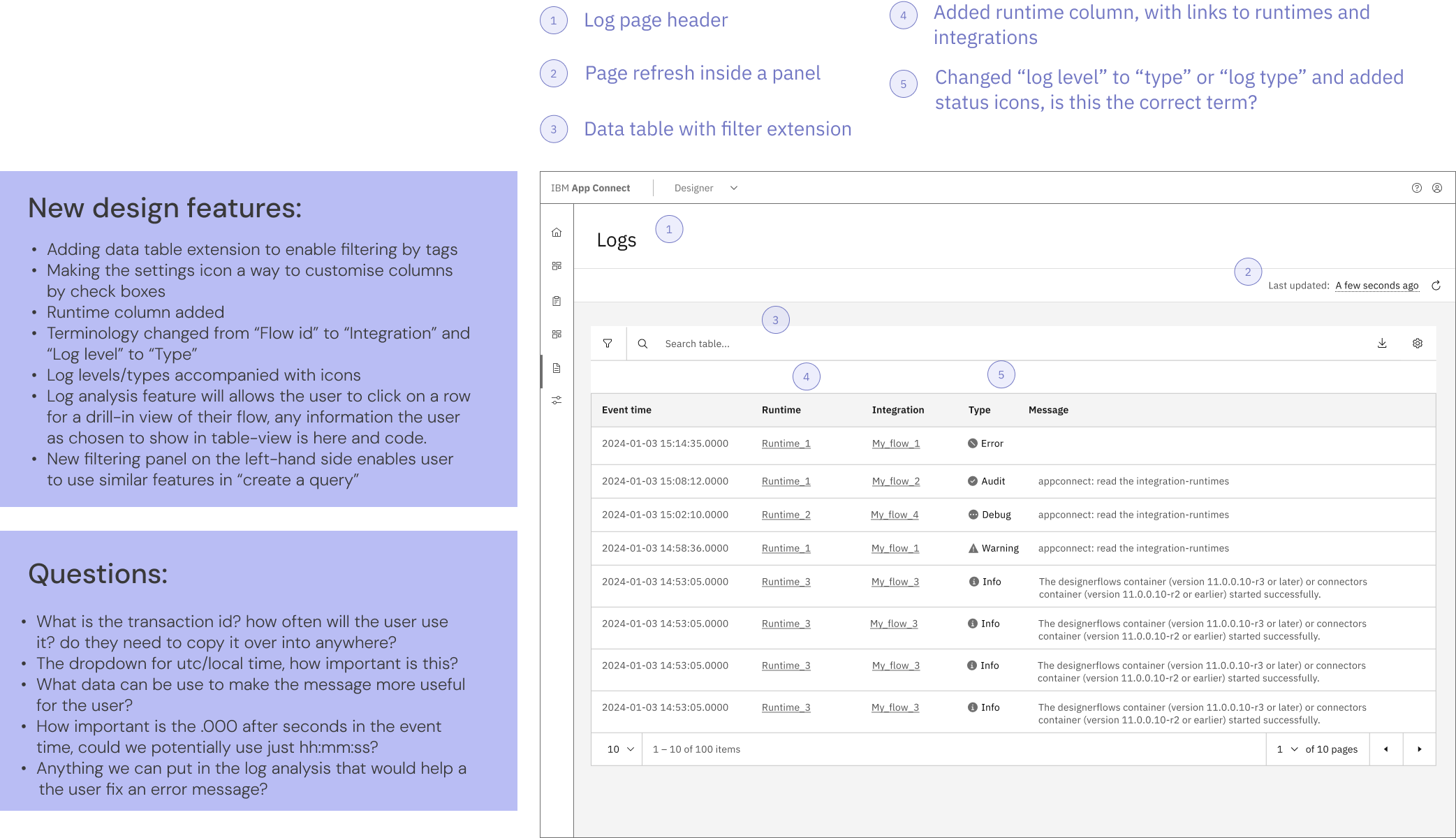
Additional columns
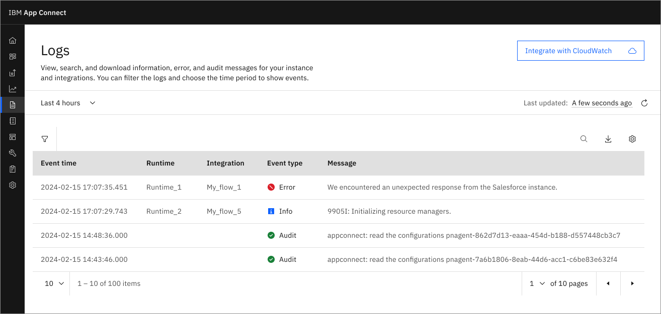
Adding an additional column for integration runtime causes the error message to be small, requirement is that messages need to displayed full-sized: need solution for this.
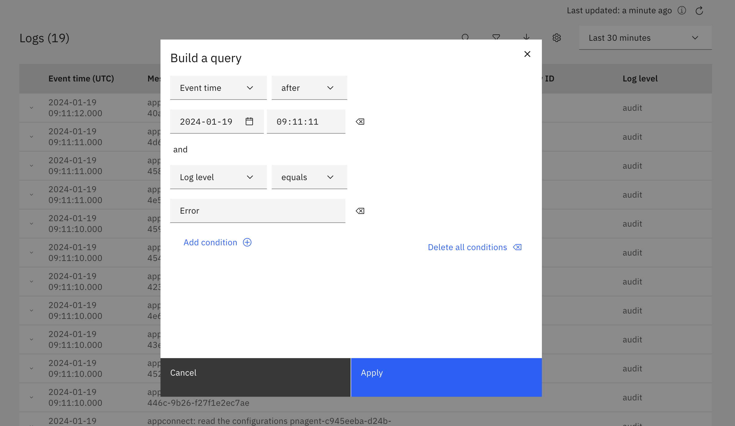
Filter by integration runtimes
Customers are unable to filter their log instances by integration runtime which leads to users hacking the instance to be able to filter. It causes confusion for some users when wanting to diagnosis issues, which increases support calls.
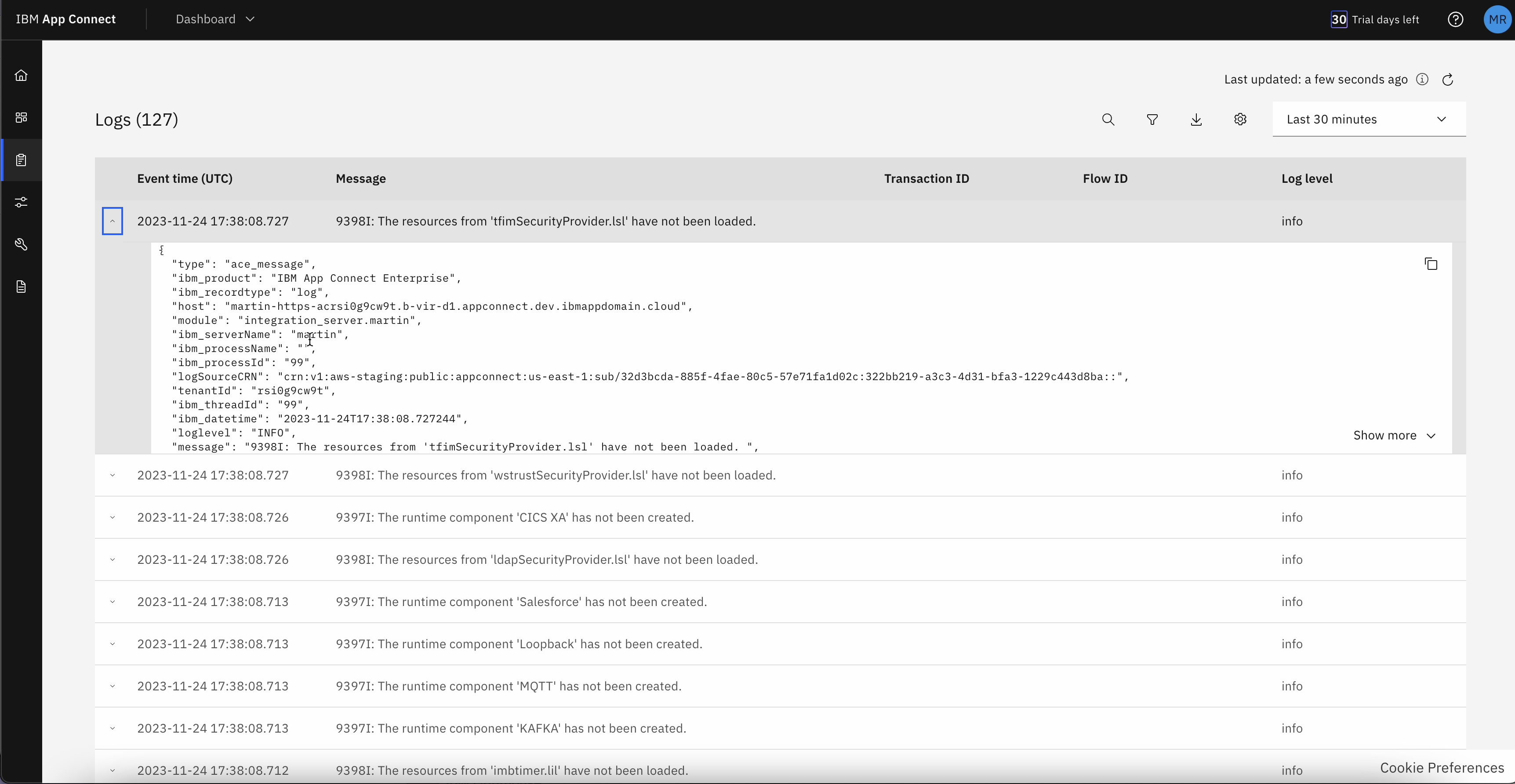
Original UI: Logs in App Connect
Empathise
In order for me to redesign this page, I needed to understand the users, and how the user is using the information inside this table.
During the meeting with a Software Architect about this design piece, I asked about the experience of this page. We went into detail about what each column represented to the user. From our conversation, I was able to create this breakdown where I labelled the columns by its action, how it’s populated, and how the user utilises the information to diagnose an error. This process helped me break down boundaries such as potenial to misunderstand the terminology used within App Connect, and the function of the logs. Without this meeting, my understanding would be completely different.
When I started to understand this table, I was able to understand the journey of this page. It was apparent to me this current design was designed for technical users, a user who has a high skill level in coding and technology, from the terminology used in the columns. This design neglects the needs of our wide range of users.
Define
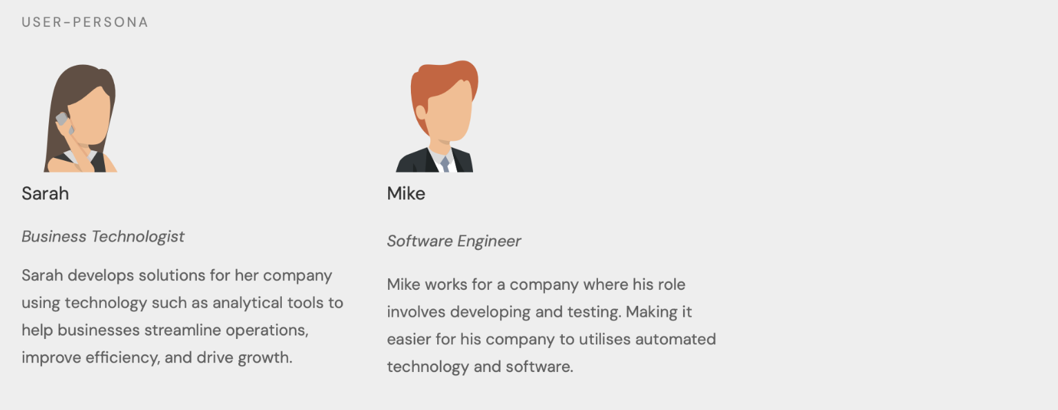
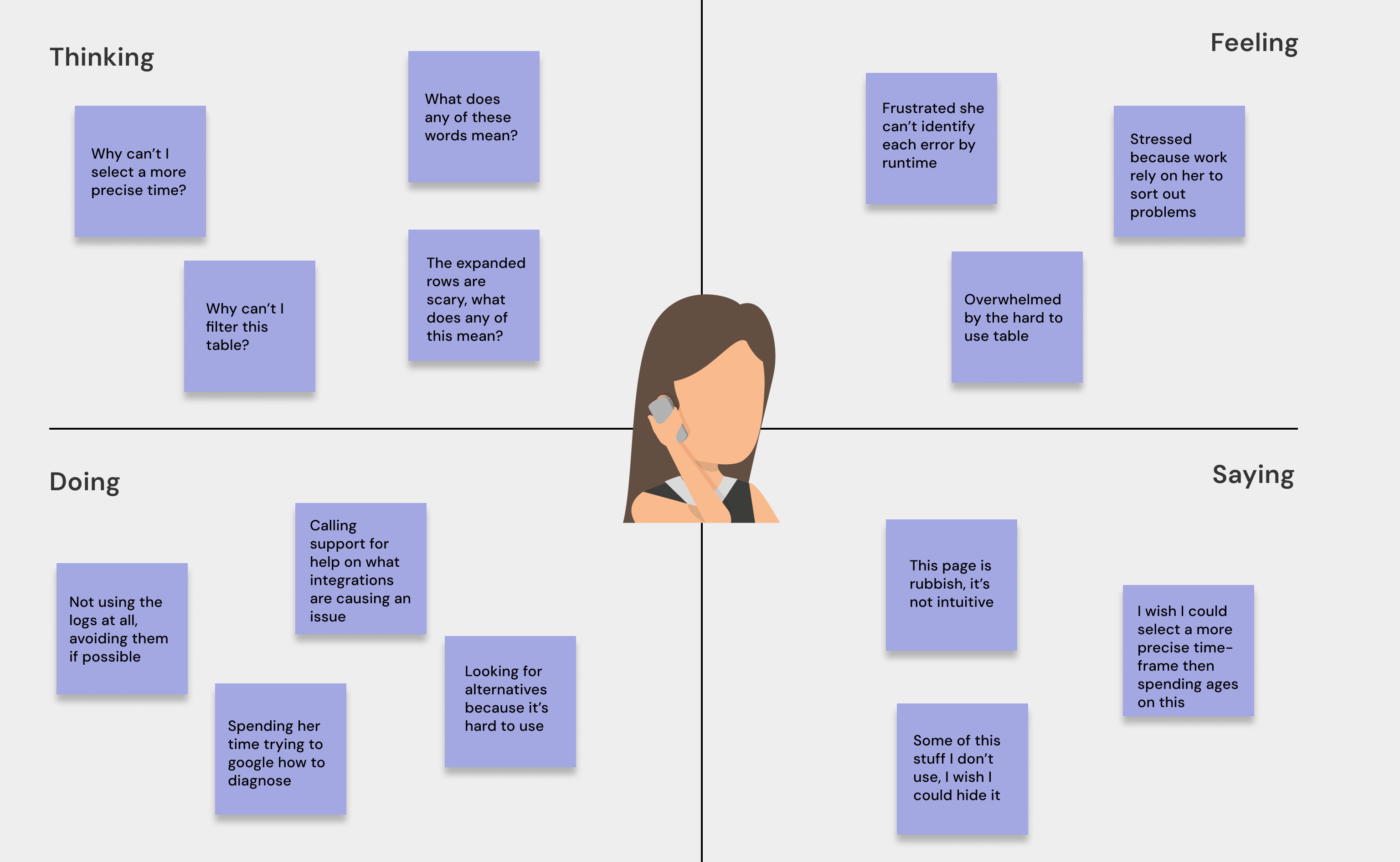
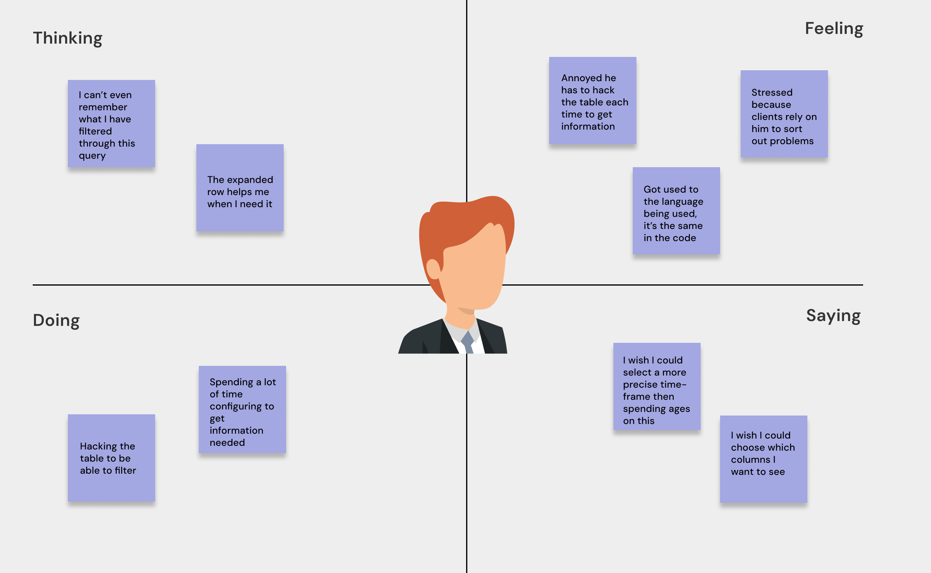
In order to design effectively for our customers, we design with our user-personas in mind but first we need to understand how our user feels when using with this page*.
The research was supplied by IBM research**.
*Personas have been altered to retain IBM confidentiality. **Research provided by IBM has not been included in this breakdown.
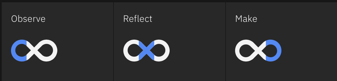
IBM Design focuses on the core principles they have established. According to IBM (2017), the tech of the world should work in a way that is serving users. The Enterprise Design Thinking framework is at the core of the human-centered design. This framework has been developed to solve the problems that their users are experiencing, at the speed and scale of the modern business. The Loop is a metaphor for the cycle of conducting research, the design process, and receiving feedback. IBM promotes the view that there is no single route to success. Observation is symbolised by the first circle, reflection is the middle cross-over, and designing/making is the final circle.
According to IBM, a better product can be produced through continuous tasks such as observation, reflection, and making. In the course of my journey through this breakdown, you will notice that I frequently pause the design process in order to obtain feedback; these feedback meetings are known as playbacks. Playbacks, according to IBM, assist us in "staying aligned by regularly exchanging feedback."
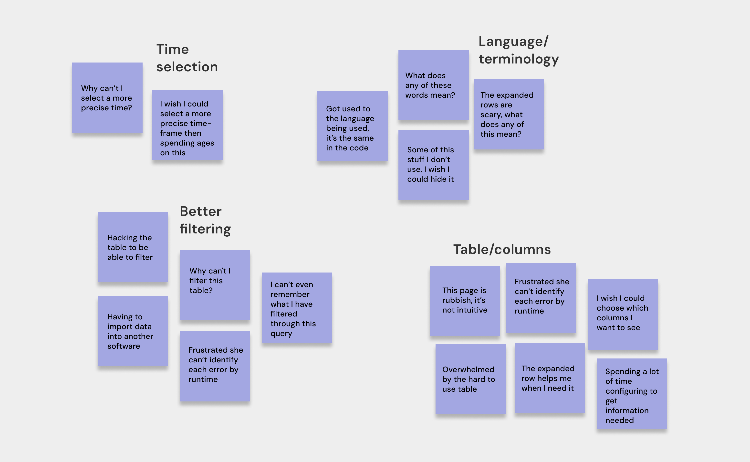
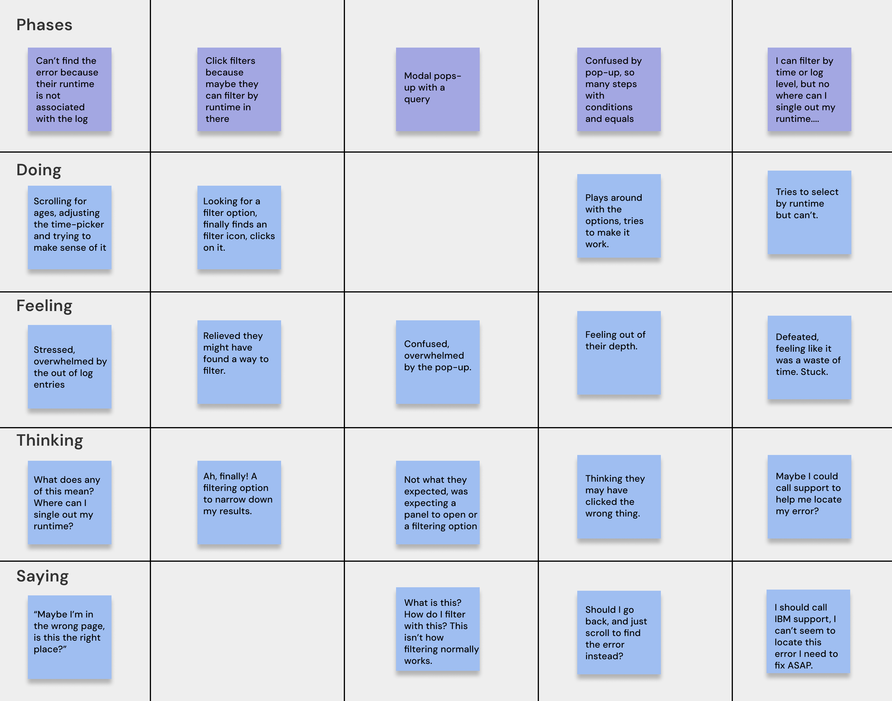
In making sure this design was effective for it's target audience, I paid attention to the user-personas that were created by the research team. We use these user-personas in every piece of work we do. Our briefs are often problem statements with "As Sarah" or "As Mike" to keep our work user-focused. I was taught Enterprise Design Thinking at IBM, achieving a badge as practitioner and co-creator, this allows me to utilise design thinking strategies; such as using empathy maps to understand how our target user is feeling, thinking, saying and doing while using our products. This helps us, as designers, cover a whole array of problems and possibly uncover something we have overlooked. Another, is As-if scenarios where we pay attention to the feeling, thinking, doing and saying at certain points of the user-experience, called phases. At the end of these sessions, we group them together (if we can) to impact a wider issue.
Design Thinking: Empathy Mapping and As-is Sceanario Map
Ideate
In our App Connect team we had weekly sketching sessions as a team to gather ideas from all backgrounds, and this helps gain as many different approaches to a problem as we can. Each week we take on a different problem. I hosted my first sketching session, bringing this design issue to the team. Sketching this way encourages us as designers not to fear getting ideas down, bad or good. It also encourages us to generate ideas sustainably as we are not using resources like paper or technology. We have often conducted these sessions remotely on Miro to reduce our carbon footprint.
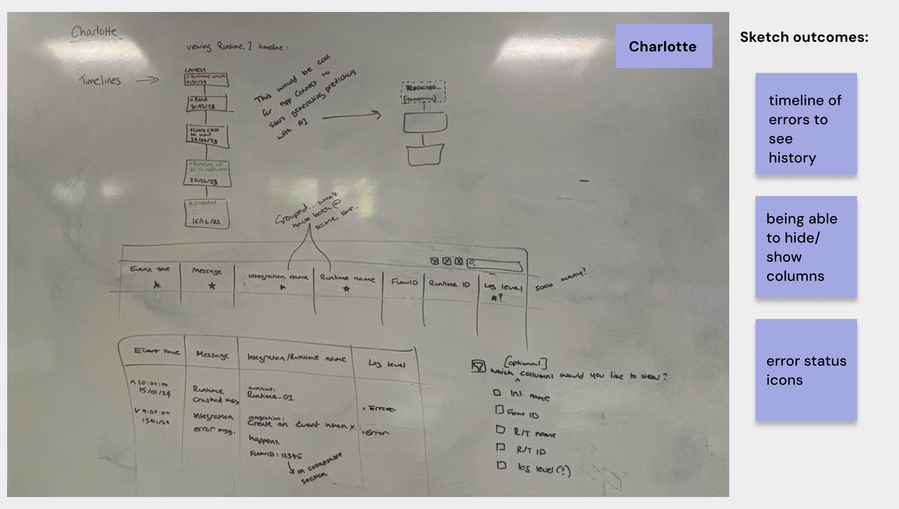
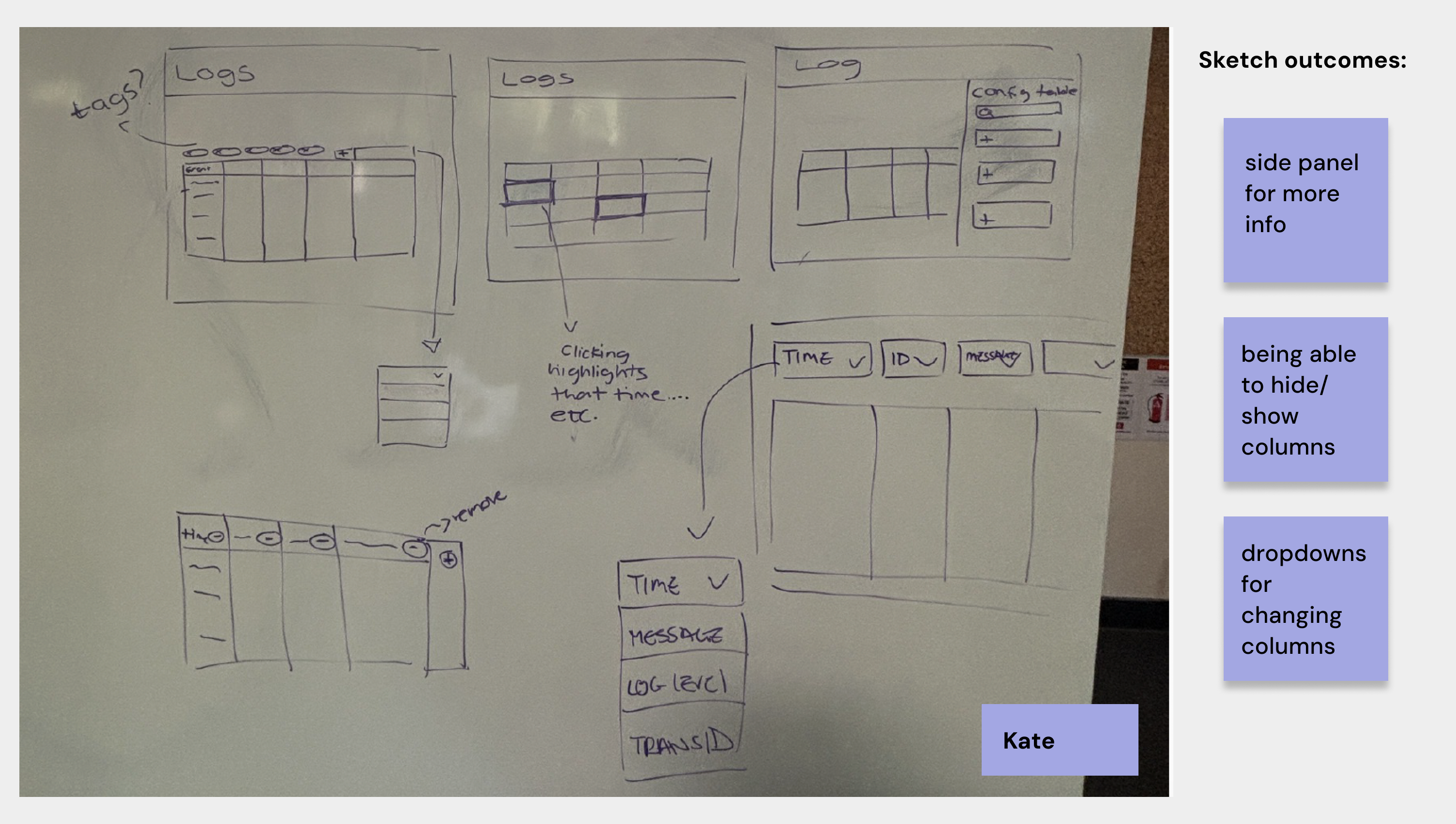
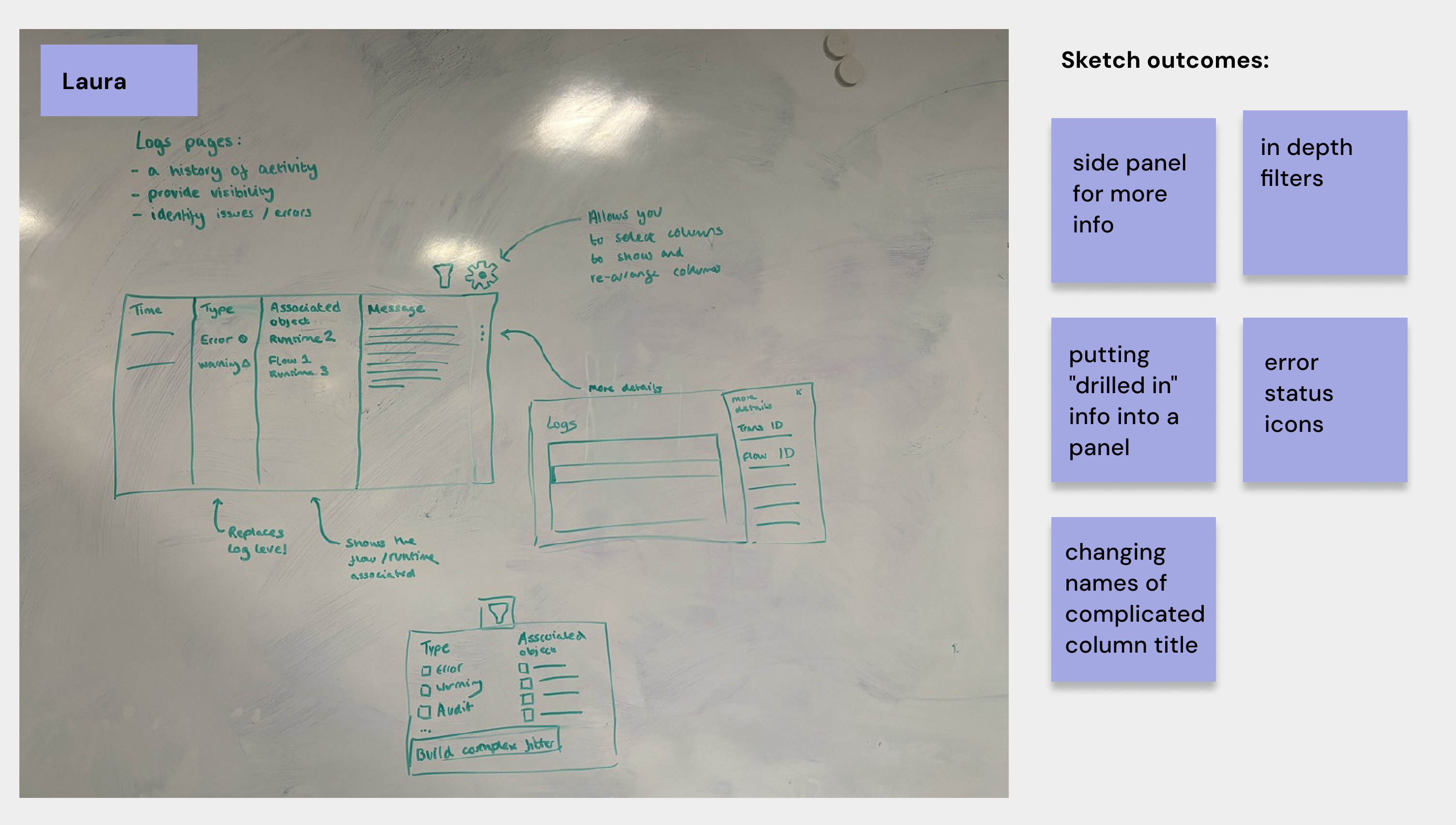
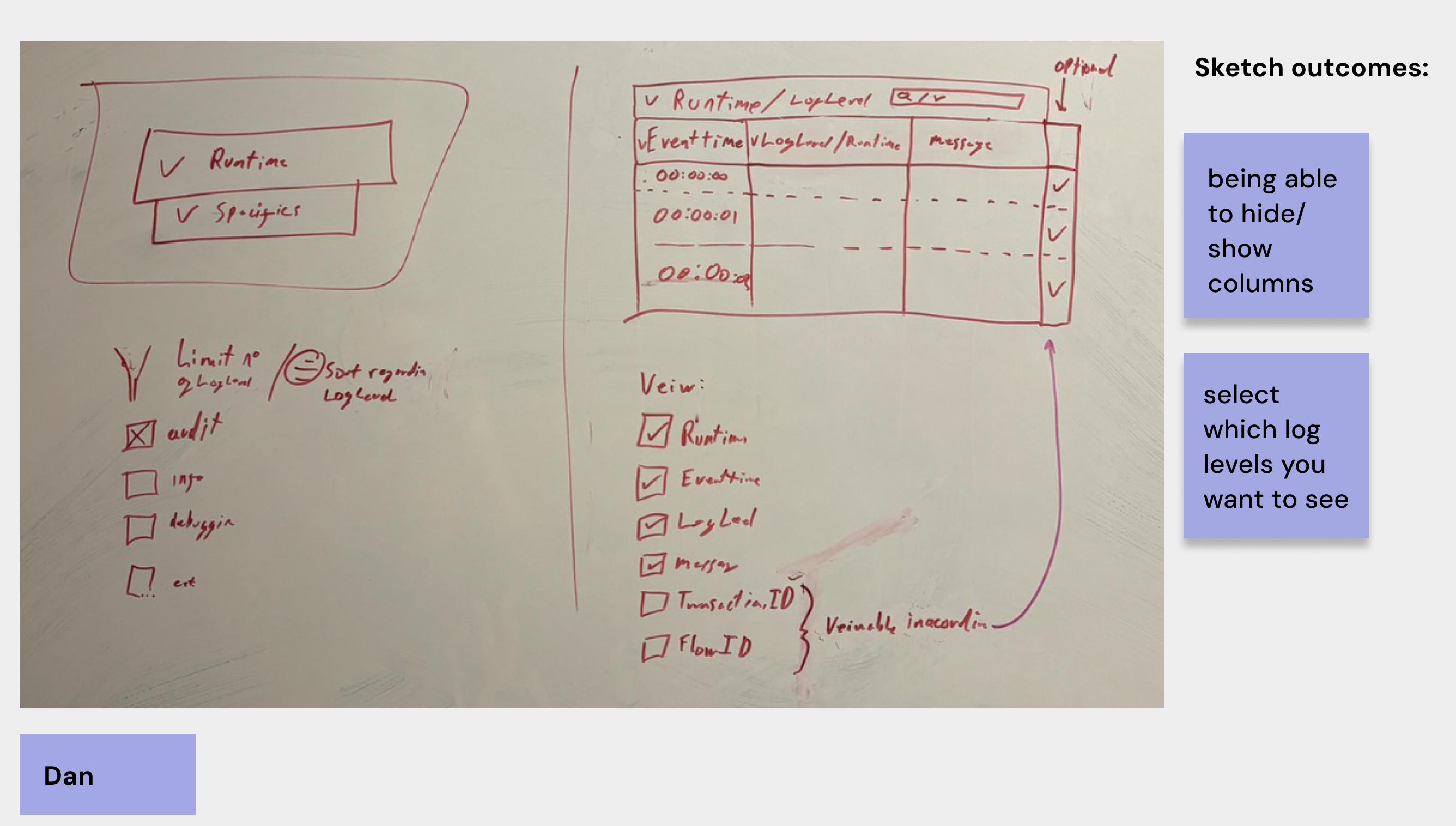
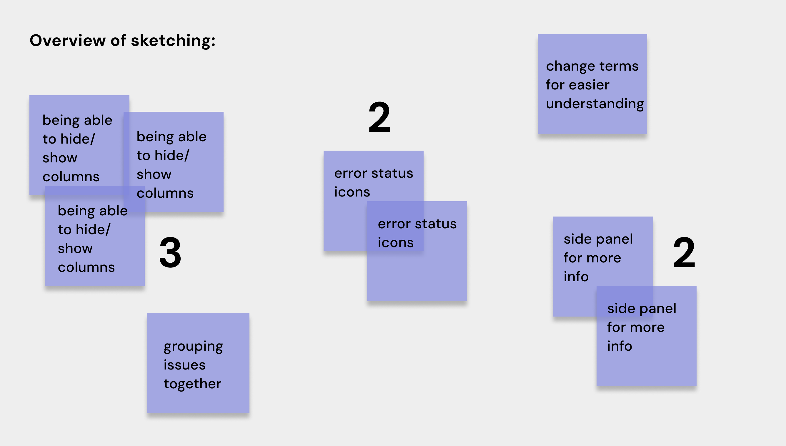
Sketching Session Wireframes:
This session was a success, the ideas generated were great and all different from each other (a lot of the time sketches can be very similar from being in the same meetings and digesting the same information). Each designer stood up and talked through their sketch, we gave time for feedback which generates a good discussion, more ideas are usually generated around this which is why we like to post-it down any ideas mentioned.
At the end of the session, the sketching host will record sketches, bring all the ideas mentioned and sort through the most common themes. For this issue, I noticed a theme of: being able to hide/show columns, adding error status icons and adding a side panel for more information that is not particularly helpful inside the table. We all agreed that changing the terms would be better for easier understanding, especially for our user-persona Sarah. Finally, grouping issues in some way would be beneficial to lower the cognitive load for the user.
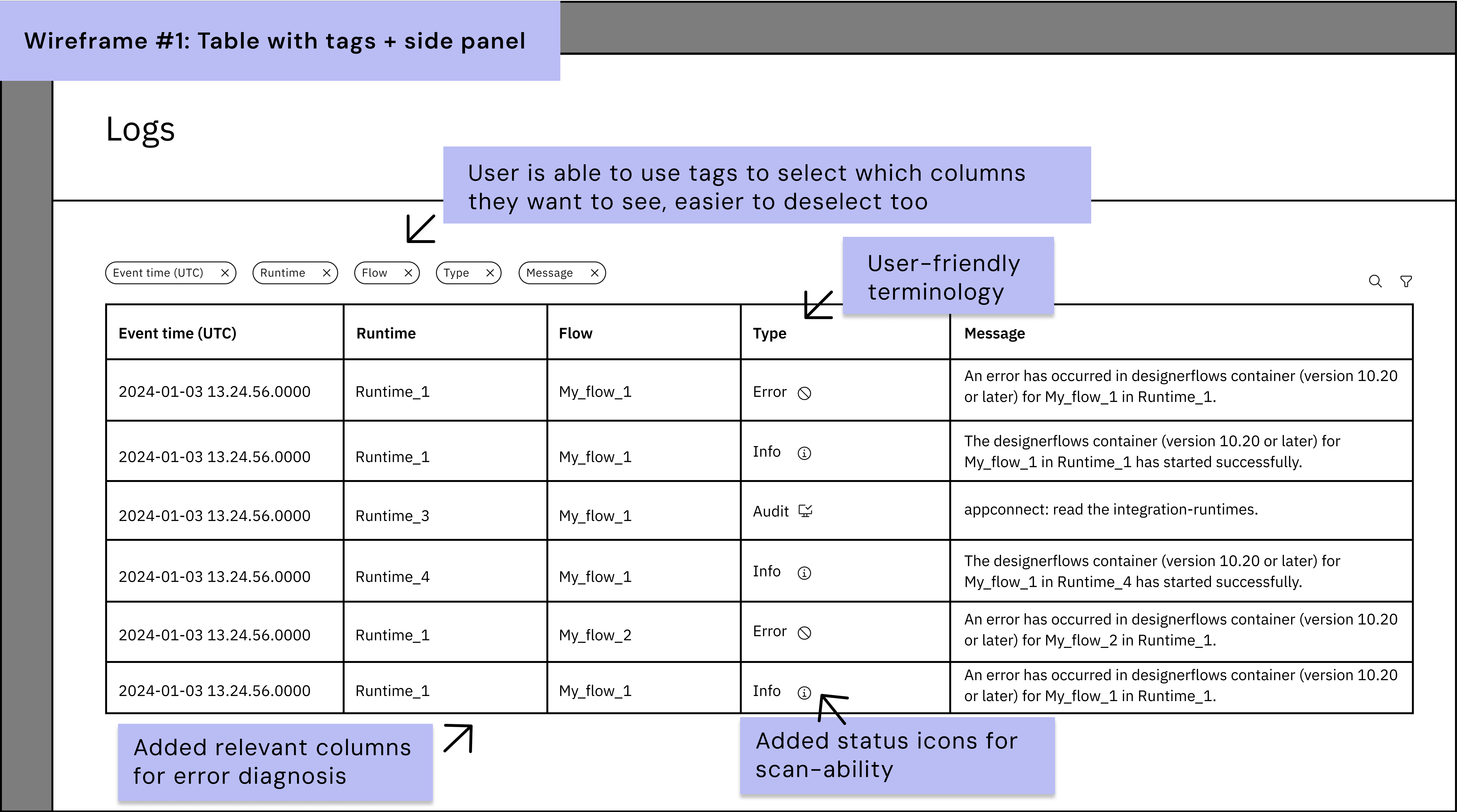
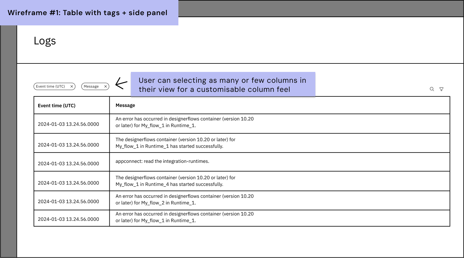
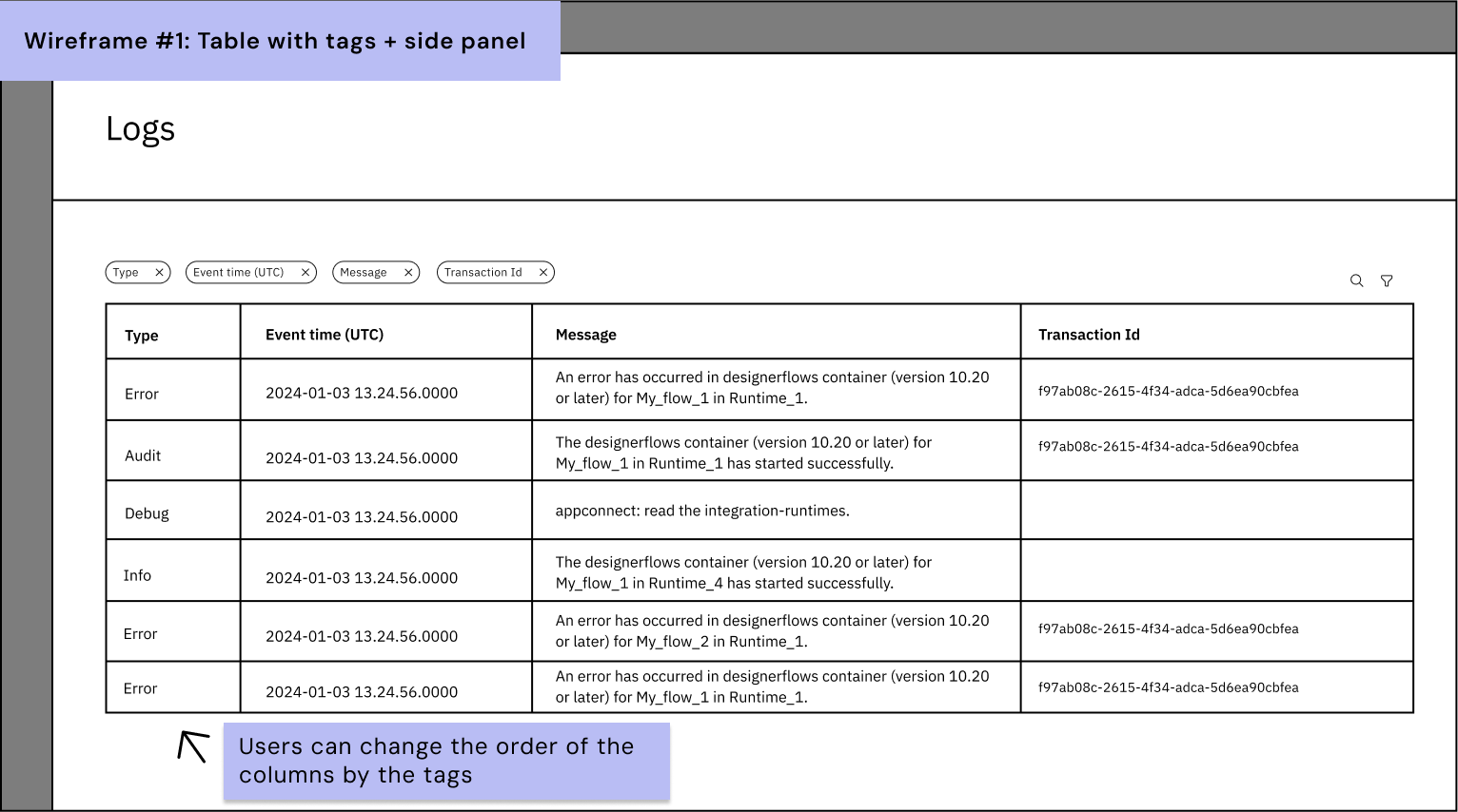
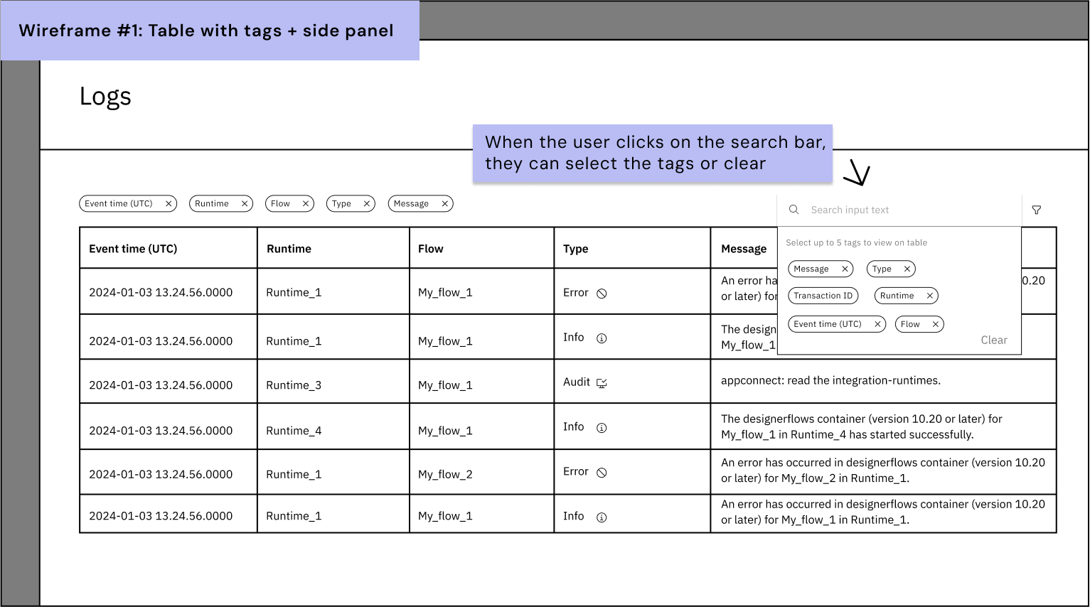
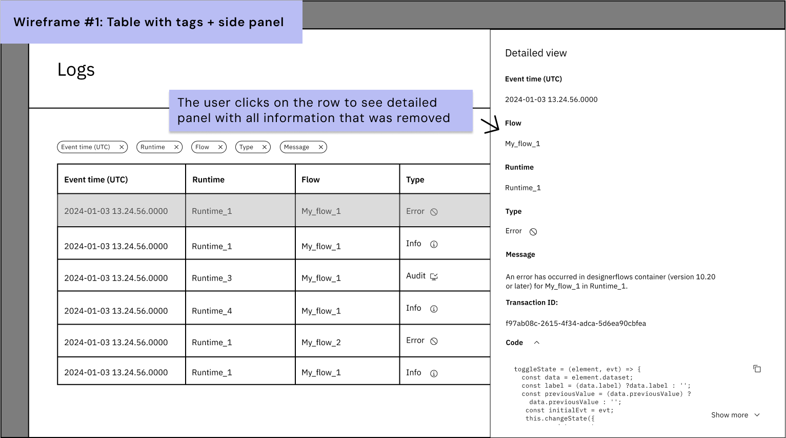
Lo-fi Wireframe (Idea #1)
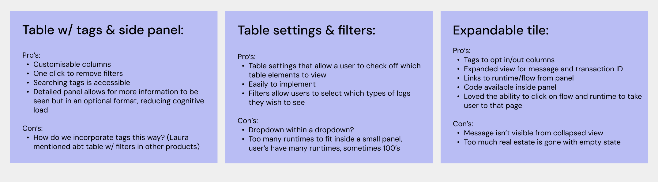
Idea #1 brings together outcomes from the sketching session: additional columns for runtime and flows, status icons for quick scanning and user-friendly language. Additionally, I focused on how we could incorporate a customisable table where the user can select and deselect the columns in view. This would allow for messages to always be full-width which one was of the important needs from Product Managers. In this wireframe the user can select which columns they wish to see by adding tags, when you click the logs page the defaulted tags will be shown but the user can easily deselect the columns they wish to hide by clicking the “x” close button on each tag. When the user wants to bring those columns back into view they simply click search and add from the suggestions populated.
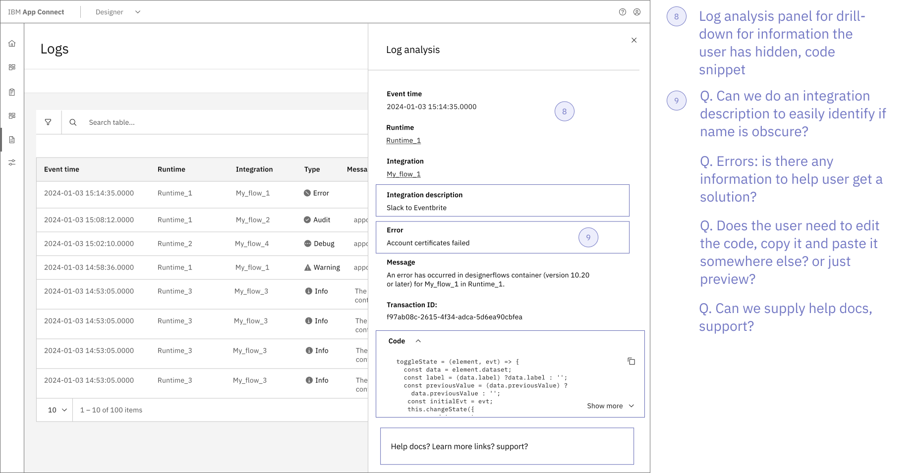
In this approach user’s will also have the ability to place the columns in whichever order they feel most helpful for their diagnosis, Miller's Law suggests having more than 5 columns would slow down the user (Yablonski, 2022b); having type of logs first for better scanning abilities, focusing on the type of log before reading the other information. In the case that the user does need to see the information quickly without toggling their table view, they select on the row they are interested in and it will open up a side-panel with all the information, including the columns they’ve hidden. This side panel works well for hiding information that is overstimulating for Sarah such as Transaction ID and the code that was previously hidden in the expanded row. This approach allows for Mike to open up a more detailed view when needed.
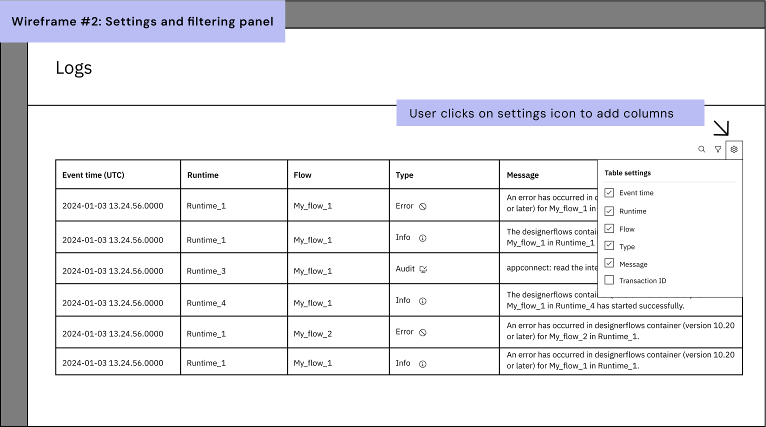
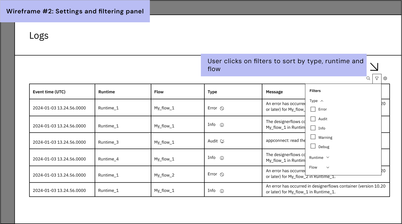
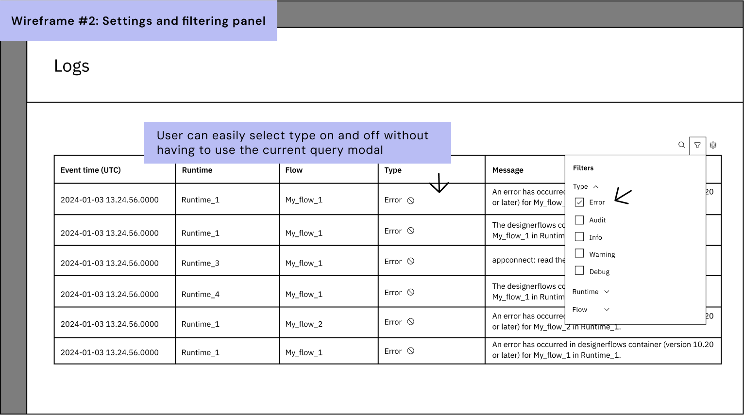
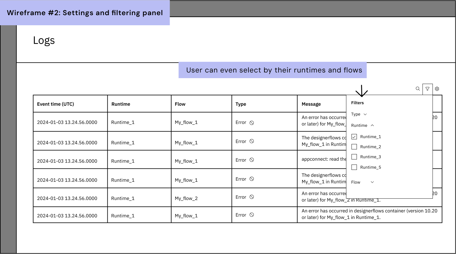
Lo-fi Wireframe (Idea #2)
Idea #2 utilises a simpler approach with table components I know already exist in the Carbon library. This is something I had to think about in terms of time-saving as a new brand component would delay development, without good reason for new components, they often will be shut down. In this case, we would make the filtering system a lot easier to use. Rremoving the pop-up query modal which interferes with the user journey. This causes the user to click more buttons, something we want to avoid. User satisfaction decreases when they need to click more options to get a result; this hypothesis can be support by Hicks Law (Yablonski, 2022), Fitts Law (Yablonski, 2023) and Principle of Least Effort (Chang, 2016). I have designed a settings panel that opens to allow our users to customise the table columns. In terms of filtering, a similar approach with accordions for each filtering type: type, runtime and flows.
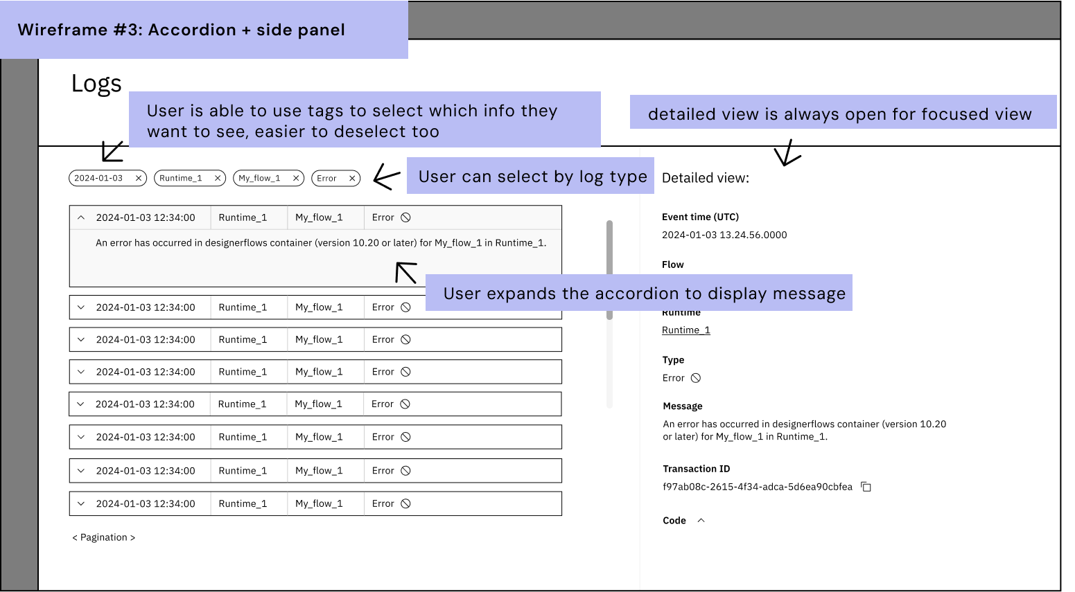
Lo-fi Wireframe (Idea #3)
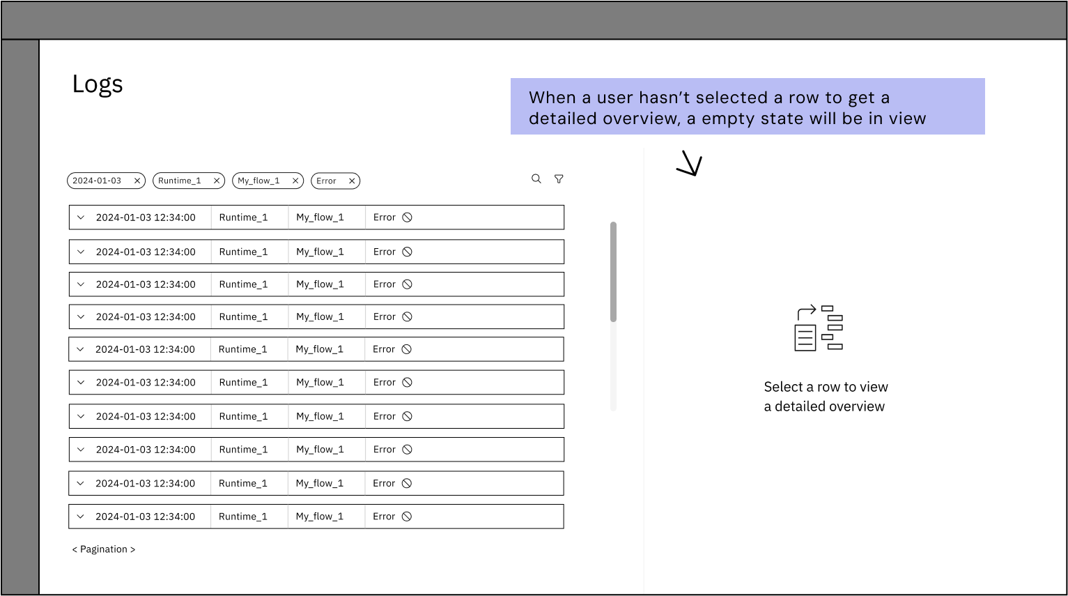
Idea #3 is an idea that is referred to as “out of the box” idea. It often helps challenge the design by coming up with something that is entirely different from the original design; in this case a table. I experimented with an accordion, and used half of the page dedicated to providing extra information to solving the error diagnosis. In the previous ideas, when the side-panel opens the table will be temporarily unusable whereas this idea, it removes to repeated behaviour of clicking in and out of the side panel. Additionally, this idea allows the user to scroll down the accordion for other log information for comparison against the information already displayed in the side view.
Peer Feedback
I presented these three ideas to my team in our critic session. Critic sessions are non-judgemental spaces where we can talk through our designs to get feedback on. At IBM, their design thinking strategy is the Loop (IBM, 2018b), this is where you are circling round to get feedback, called Playbacks, at every stage of in design process. There were a few designers absent for the sketching session who were able to attend the critic session which was great for input from fresh eyes. In this session I demonstrated each idea, the user-journey and allowed time between each idea to gather feedback.
In this peer-review session, I obtained some pros and cons of each idea. The team were thrilled by my idea and suggested some really great input on how to progress further. The outcome of this session proved that idea #1 was the favourite but ideas from #2 or #3 could be incorporated into #1. For example, the settings panel in #2 would be a good addition, and the hyperlinks to the runtime and flow pages from #3. When discussing the plausibility of idea #1 in components, Laura (a visual designer who designs components for the Carbon Design System) suggested there was a table very similar to my idea that had a filtering system. This meant I could use the component and save developer time building a new component.
Prototype
From the peer feedback, I was able to combine the concepts and produce an idea with the next level of quality: mid-fidelity. The Carbon Design System library provides this; all in grey-scale helps to minimise the emphasis on colour and fine details - this will come later. This stage enables you to get a more realistic picture of the concept design and help you to fine tune the components required.
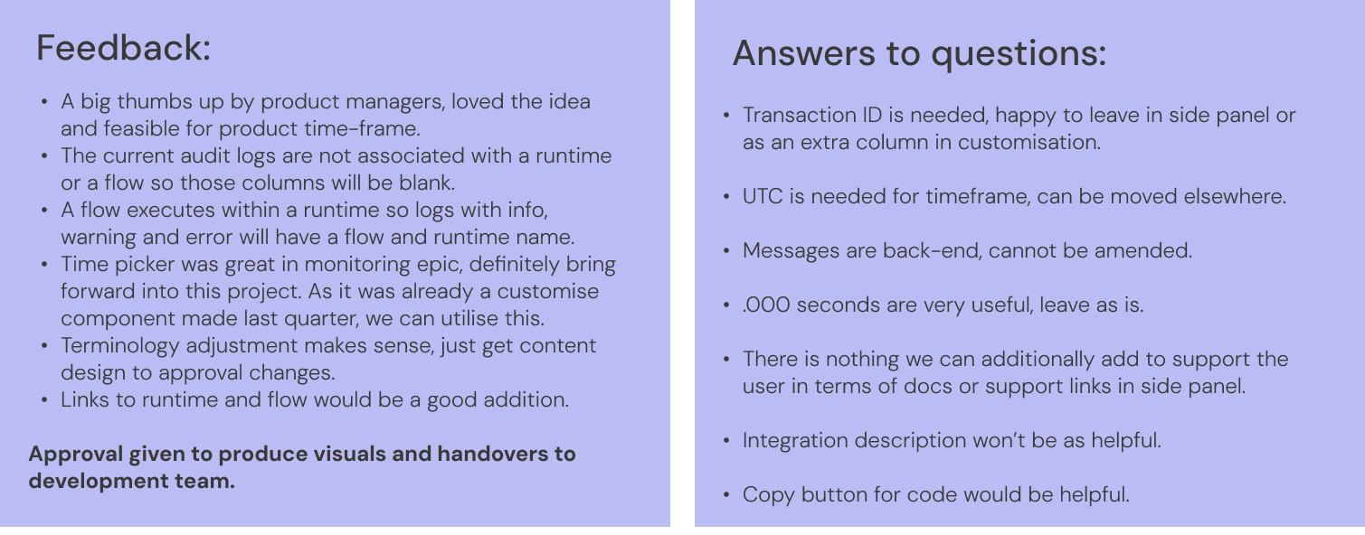
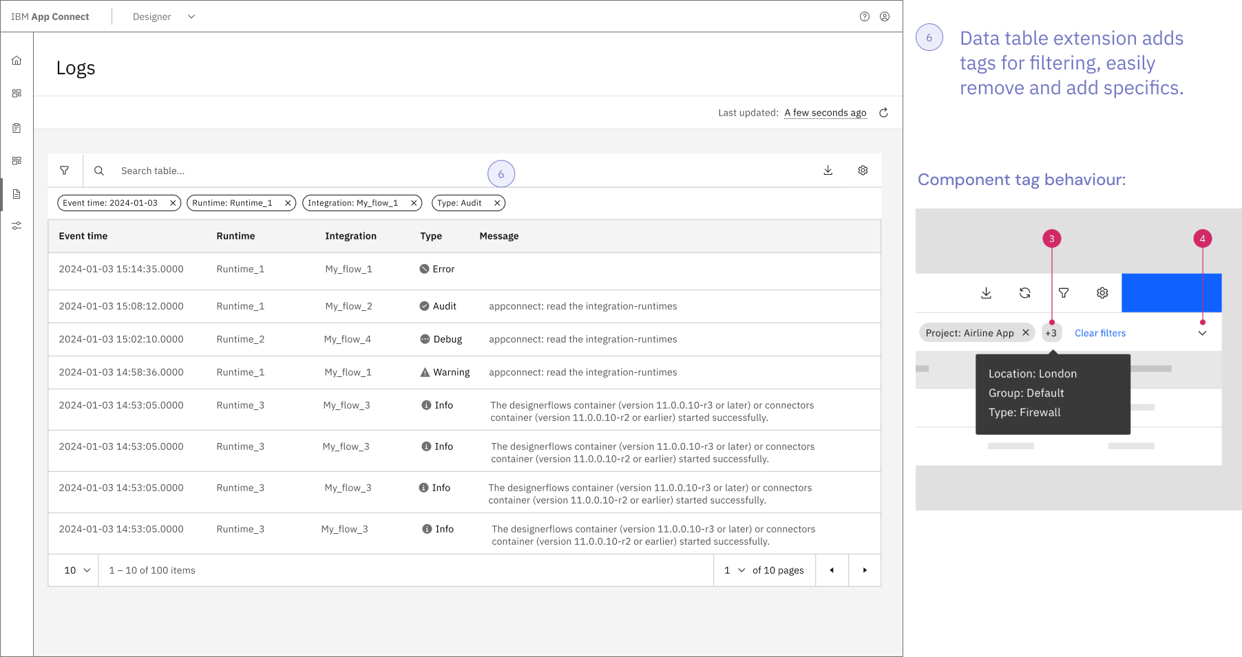
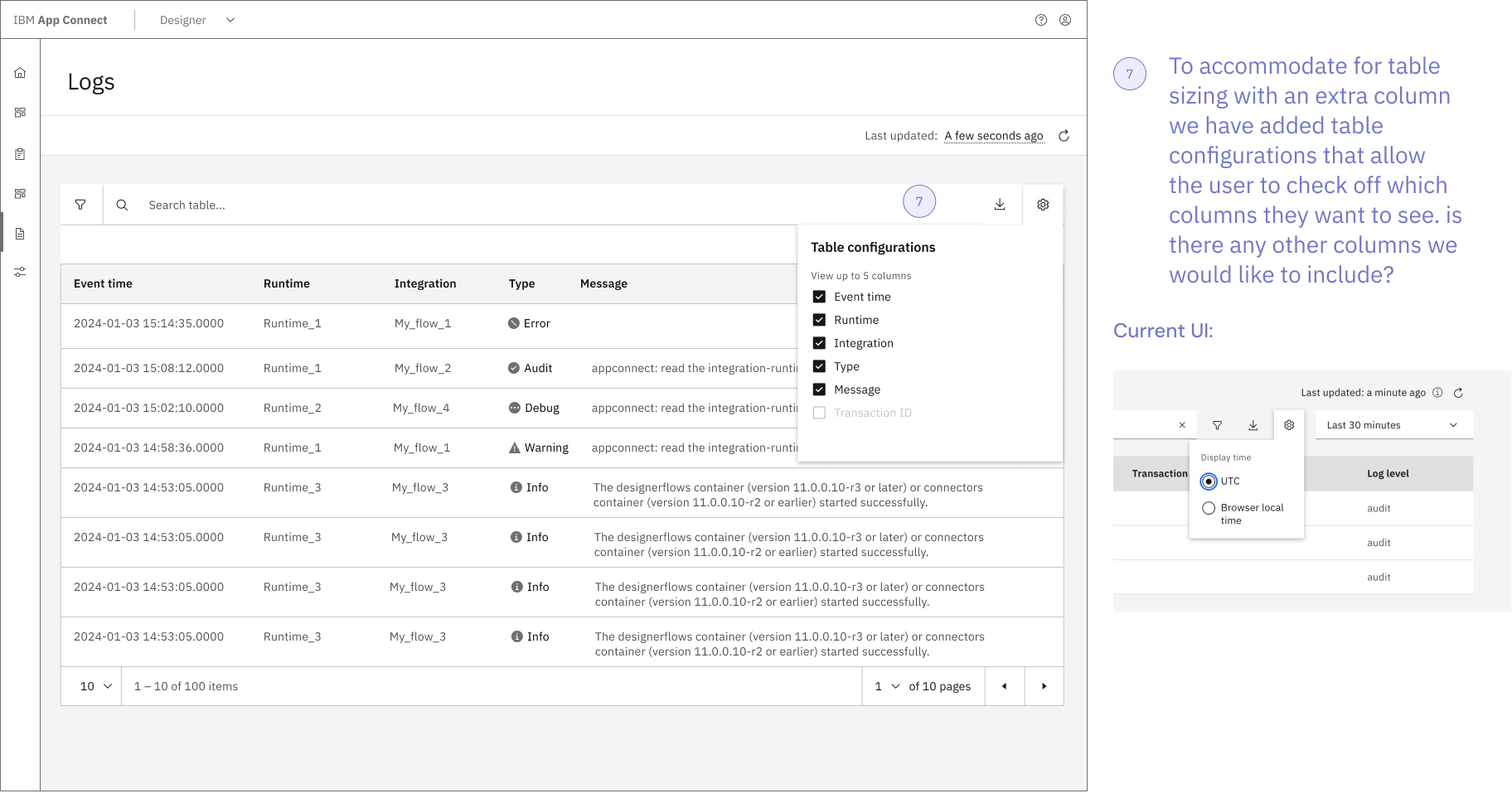
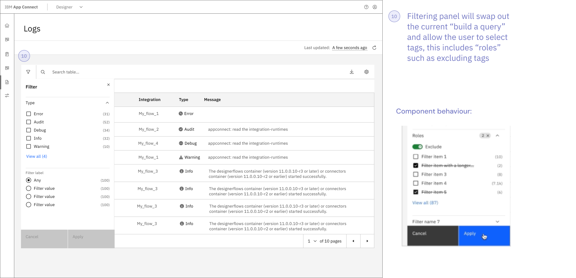
As you can see above, included a page header for design consistency across IBM products. A once floating page refresh button is now sitting inside the page header for better page structure and grouping. The settings button has been redesigned into a table configuration panel allowing users to customise the displayed columns. With the (slide 5) filtering extension panel, the data table has a refreshed look. This includes filtering tags and roles where the user may exclude entries with tags. When the user clicks on a row, a log analysis side panel displays relevant details that may be hidden when a user uses the column customisation and now includes the code which formerly sat inside the expanded row.
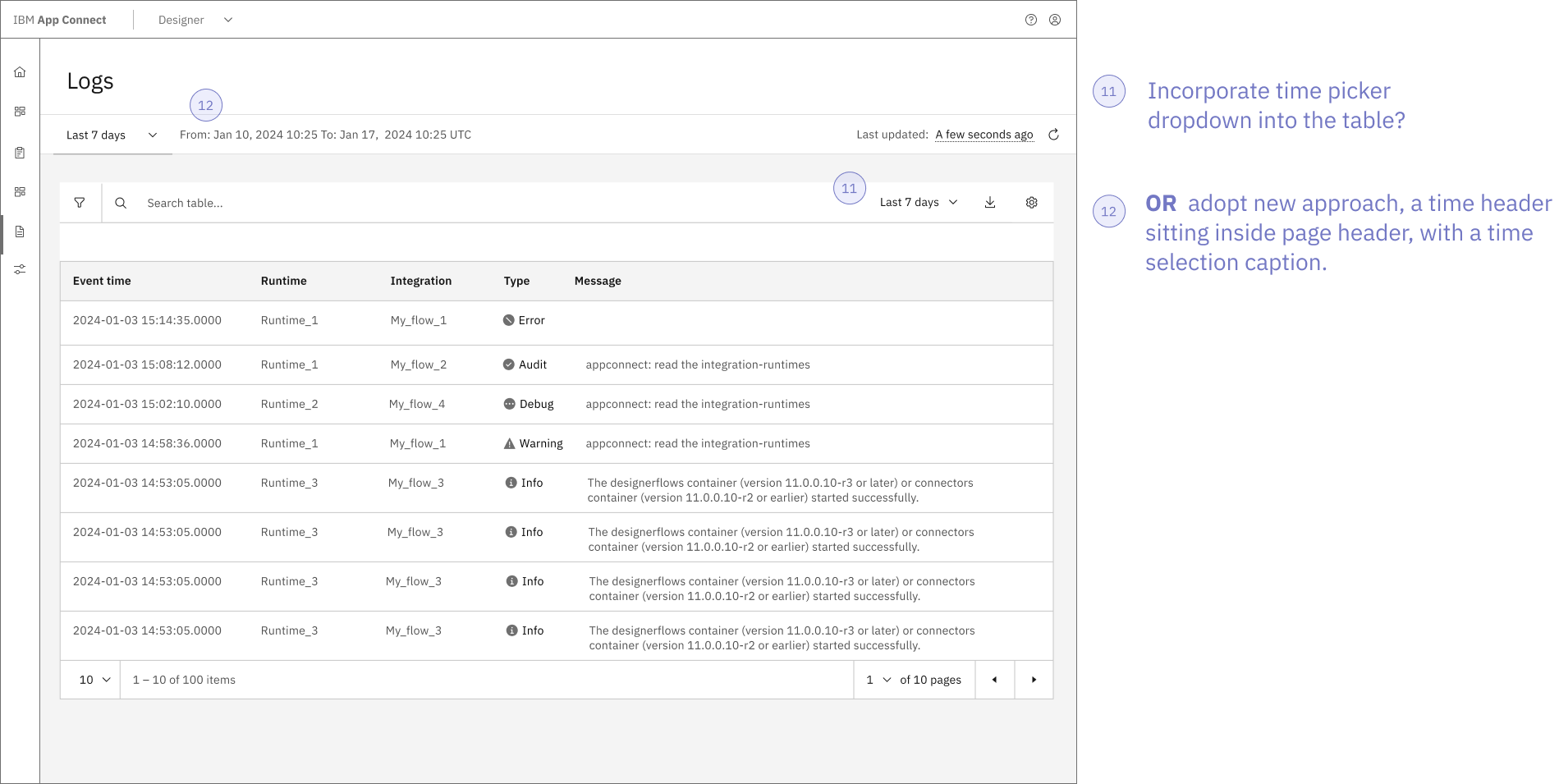
Last but not least, I wanted to incorporate an improved time-picker that sits in the page header panel; opposite the refresh button which groups the similar items together. Bringing this design idea I Implemented for App Connect's monitoring epic, it would support product consistency; this is important as users get familiar to where features are placed and behave, it is not recommended to have different page structures within the same product as users will spend more time adjusting (Yablonski, n.d.). I developed these concepts for a meeting with the product's stakeholders which takes me to my next stage in this process.
Stakeholder Feedback
About ten to fifteen product managers and engineers attended the meeting to provide extra input; whether the idea is feasible for the timeframe and permission to move forward onto the next phases.
This was my first time hosting a stakeholder meeting and I was incredibly nervous but it was a successful meeting. In all the stakeholder meetings I’ve attended there is always pushback on some design concepts, where we have to go back, redesign and do another stakeholder meeting later. However, this was my first or second meeting where the designs had approval across everyone in the meeting and we could go straight into implementation. I additionally got answers to the design choices I needed addressing before the implementation phase.
This experience gave me a lot of confidence in my ability to design for complicated software products like this. My team was thrilled by the outcome of this meeting, especially my design lead.
Finalised designs
In the next stage, implementation, I created a new set of mid-fidelity designs using feedback from the stakeholder meeting. At this stage, I need to create UX wireframes for the user journey, this will help the visual designer create designs for instance what the features will look like opening and closing, where there is an empty state, or error states.
Once UX wireframes had been completed, I reached out to our Content Designer who checks the sentence structure and terminology is to IBM standard. The Content Designer is the best person to check whether the language is appropriate for Sarah and Mike (our user-personas).
Content Designer added details such as page description and adjusted the column titles such as Event Type (instead of Type) and Event Details (instead of Log Analysis).
Implementation
For implementation, I used the Carbon Design System library that is integrated within our Figma instance to build the screens. We must always use their pre-made components as this enables the designs to be consistent across all products from designers across the world. I also make use of their text and colour styles to ensure that they are consistent with IBM’s brand, while also adhering to accessibility guidelines, as these have been tested by the Carbon team. Here are a few examples of how this would look inside Figma:
Event details flow:
Filtering flow:
The document was organised with a flow of screens that addressed how the features should behave. The redlining process, which prepares the document for the development team, is a visual designers task which involves preparing the screens with any visuals aids that help the development team produce the designs perfectly. The process of redlining involves the placement of space markers (as you can see in the image above, $05 indicates that the gap should be 16 pixels) and using magenta annotations for notes. These annotations include the name of the component as well as the storybook link, which is a sandbox where the code is live. This allows the development team play with the code of the component is required for this design. You can see that I have prepared the document for skeleton loading, empty states, and hover states. This is done to ensure that the design is implemented precisely as we intended it to be. In order to avoid any confusion and delays in the handover process, it is important to be thorough with the documents.
When the visual handover was completed, I scheduled a meeting with the development team that is addressing this undertaking this epic. During this meeting, I went through all of these screens, addressing any significant details and answering any questions that the team may have. After a few weeks has passed since the team has begun working together, we hold regular meetings to ensure that the designs are being implemented appropriately and to address any concerns that the development team may have regarding the designs that have been proposed.
A close-out meeting was held by my team after the development team had finished this piece of work. During this meeting, they signed off on this work. Unfortunately, I was not present for this meeting because I had already finished my internship.
Reflection
After 8 weeks, you can see the improvement this piece of work will make to the users of this product. Use the purple dot to swipe between the original design and the proposed new design.
In conclusion, I am thrilled with the way the project was completed. I was over the moon to learn that the Product Manager loved with the redeisgn, and I am looking forward to hearing positive comments from the users.
In hindsight, I wish I had the opportunity to conduct user testing on these designs; however, having had this chance would have resulted in a delay in the timeline of the project. It would have been more likely for me to achieve this goal if I had more time at IBM. The timeline of the product went smoothly, with morning scrums and team planning, there was less chance of me not being able to keep to deadlines as we would discuss any problems and delays often as a prevention method.
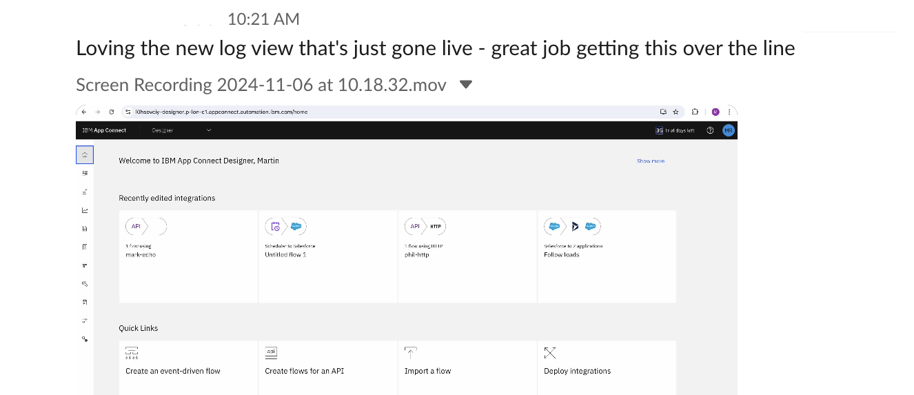
The designs are now live in the App Connect product:
IBM Internship
Check out the overview of my year at IBM where I go through the goals I've achieved.
References
Citations across IBM Internship & IBM App Connect Saas overview:
@_carbondesign. (2024). Carbon Design System. [online] Available at: https://carbondesignsystem.com/elements/2x-grid/overview/?_gl=1 [Accessed 01 Dec. 2024].
Chang, Y.-W. (2016). Influence of human behavior and the principle of least effort on library and information science research. Information Processing & Management, 52(4), pp.658–669. doi:https://doi.org/10.1016/j.ipm.2015.12.011.IBM (2017). Design thinking courses and certifications - Enterprise Design Thinking. [online] Enterprise Design Thinking. Available at: https://www.ibm.com/design/thinking/page/framework.IBM (2018a). IBM (n.d.). IBM App Connect - Application integration software. [online] www.ibm.com. Available at: https://www.ibm.com/products/app-connect. Design thinking certifications - Enterprise Design Thinking. [online] Ibm.com. Available at: https://www.ibm.com/design/thinking/page/badges/sustainability.IBM (2018b). Learn the Enterprise Design Thinking Framework - Enterprise Design Thinking. [online] Ibm.com. Available at: https://www.ibm.com/design/thinking/page/framework/loop.www.ibm.com. (n.d.). United Nations (n.d.). Goal 12 | Ensure sustainable consumption and production patterns. [online] United Nations. Available at: https://sdgs.un.org/goals/goal12. Design thinking activities and tools - Enterprise Design Thinking. [online] Available at: https://www.ibm.com/design/thinking/page/toolkit/activity/as-is-scenario-map Yablonski, J. (2022a). Hick’s Law. [online] Laws of UX. Available at: https://lawsofux.com/hicks-law/ Yablonski, J. (2022b). Miller’s Law. [online] Laws of UX. Available at: https://lawsofux.com/millers-law/ Yablonski, J. (2023). Fitts’s Law. [online] Laws of UX. Available at: https://lawsofux.com/fittss-law/ Yablonski, J. (n.d.). Jakob’s Law. [online] Laws of UX. Available at: https://lawsofux.com/jakobs-law/.