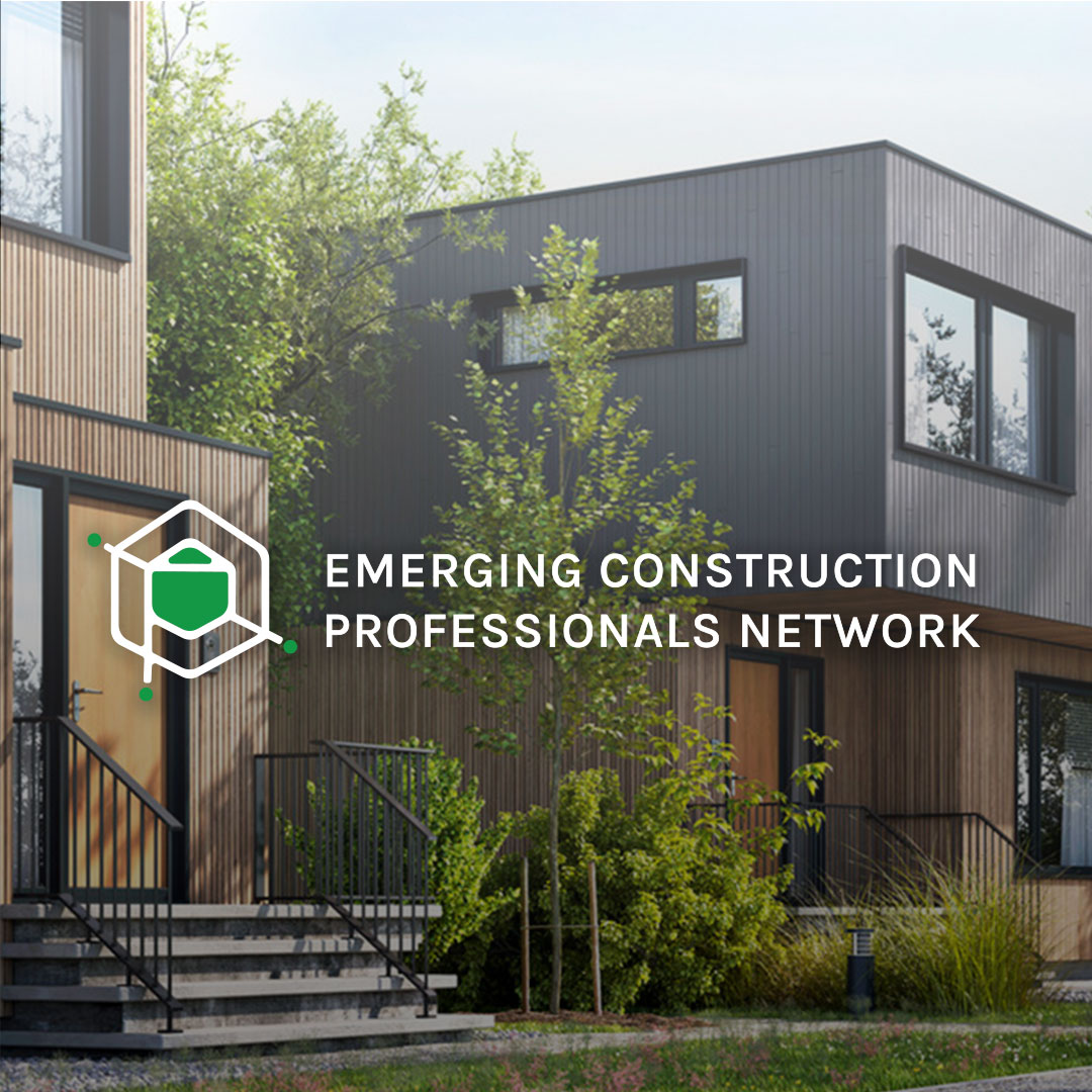
The Emerging Construction Professionals Network is a group of Ridge employees
who have formed their own networking group. I was honoured to be asked to create a logo. The brief was very vague, which gave me a lot of creative freedom. I sent them some very early stages of logo designs, and they all agreed on this little cube with a house in the middle. The cube and house represent construction, the green dots represent the network, and the green house represents Ridge, the group's founder.
I included the letters E, C, and P in the design, though they can be difficult to see in different variations of the logos.

Let's talk about it
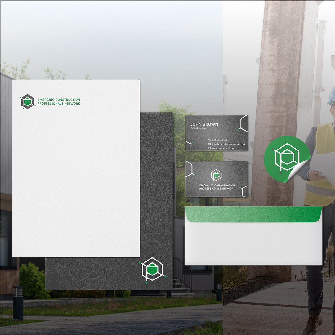
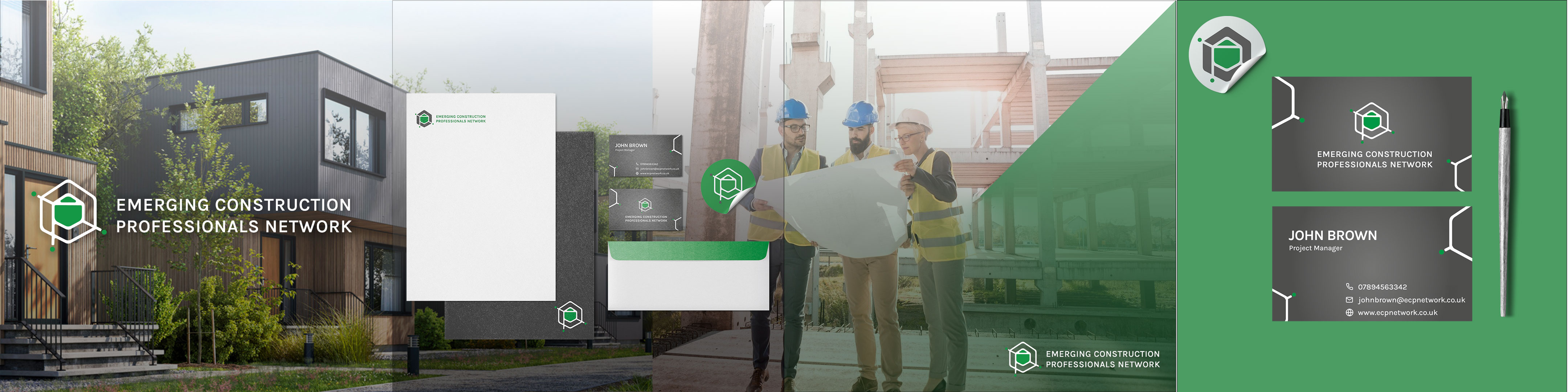
This was my first client project,
and it was a lot of fun to put my skills in logo design to the test. They wanted something that could be used in small spaces, such as a social media profile picture, so I created something memorable while also incorporating the company's letters in a meaningful way. The cube represents the various construction sectors that go into creating a finished product. Ridge, the company's founder, is represented by the house in the centre, which connects the larger network (the green dots), which can be made up of different companies or freelance construction workers. The letters became more difficult to see in different variations, but my clients told me they loved the symbolism I had created. I created business cards to really impress my client by adhering to the colour scheme they requested.
Let's review it
My client was pleased
with my branding designs and has already implemented them in their leaflets. It was a thrill to see my designs come to life.
Let's talk about it
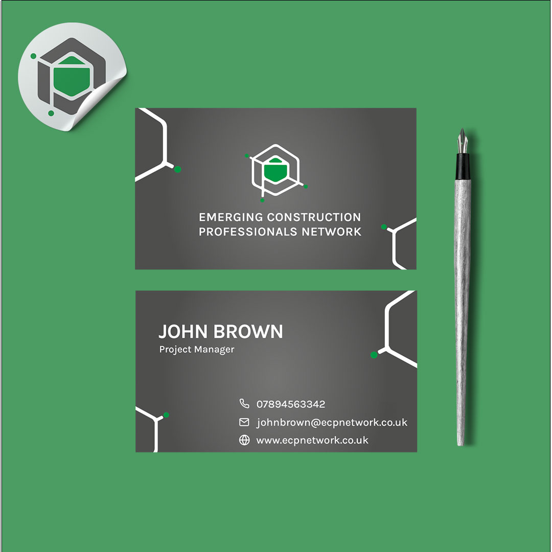
This was my first client project,
and it was a lot of fun to put my skills in logo design to the test. They wanted something that could be used in small spaces, such as a social media profile picture, so I created something memorable while also incorporating the company's letters in a meaningful way. The cube represents the various construction sectors that go into creating a finished product. Ridge, the company's founder, is represented by the house in the centre, which connects the larger network (the green dots), which can be made up of different companies or freelance construction workers. The letters became more difficult to see in different variations, but my clients told me they loved the symbolism I had created. I created business cards to really impress my client by adhering to the colour scheme they requested.
Let's review it
My client was pleased
with my branding designs and has already implemented them in their leaflets. It was a thrill to see my designs come to life.